Android Foldable Phones - Are You Ready?

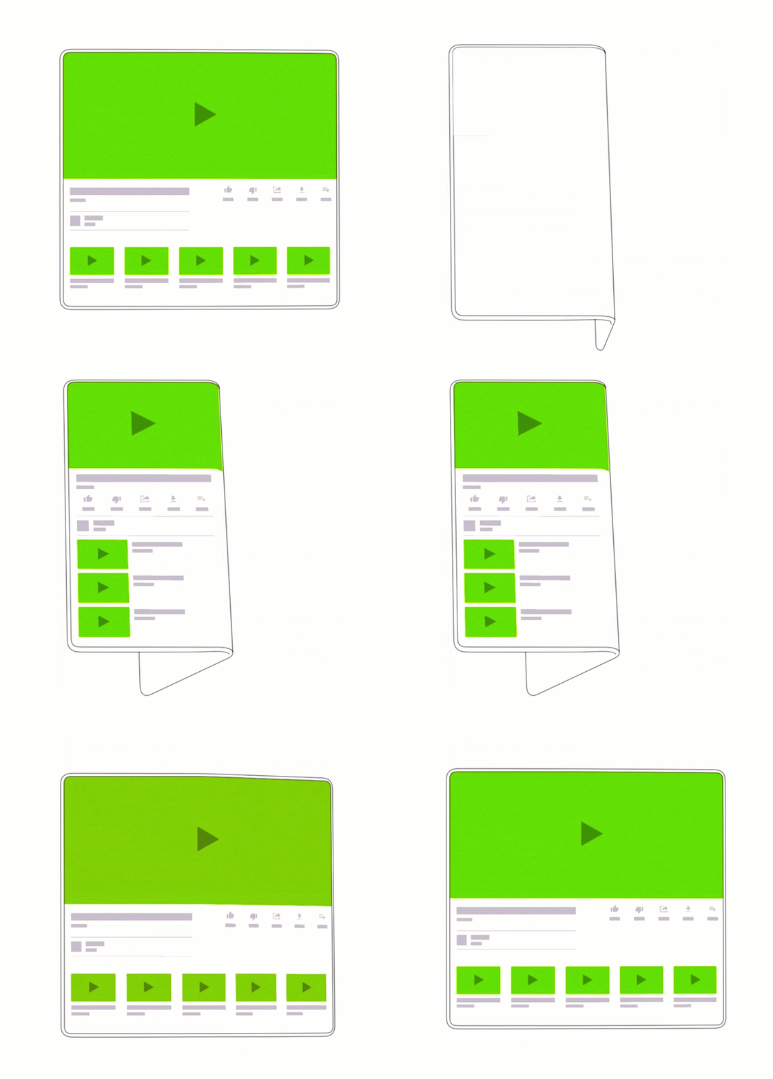
source https://developer.android.com/guide/topics/ui/foldables
Configuration changes
Before foldables became a thing, the most popular case of configuration change that was troubling developers was orientation change. Then, in Android 7.0 multi-window was introduced adding itself to the stack of things that need to be handled. Right now, with foldable phones around the corner, we are facing another when a configuration change can be triggered.
Everyone heard about and faced challenges related to orientation change, so we will focus on multi-window and screen size changes – options that will be utilised more often in foldable phones. Android 10 introduces some major changes, so we will refer to it as the status quo.
Multi-window
As I’ve mentioned, multi-window has been with us since Android 7.0 but I think that it will shine more when foldable phones become more popular. What do we need to know about it, then?
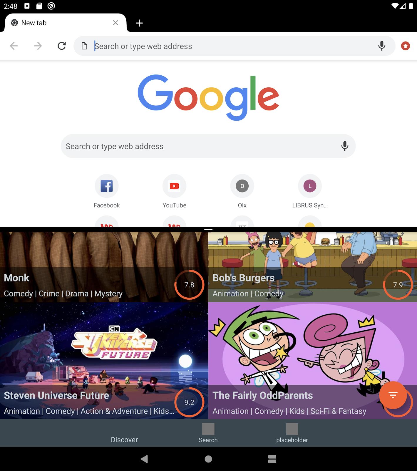
Lifecycle (Android 10)
All windows in the multi-window mode are in the resumed state (Android 10). Before that, only one activity (the one focused on by the user) was in the resumed state, while others were in the started state but not resumed. A new lifecycle event has been added (Android 10), it’s called onTopResumedActivityChanged(boolean). We can use it to detect which activity from the multiple ones is actually focused by the user.
Configuration changes
All of these changes can happen when you are using the multi-window mode: screenSize, smallestScreenSize, screenLayout, orientation. And just like it is with the regular orientation change, you can either handle it by yourself by adding proper attributes to the configChanges manifest options or the system will handle it for you with properly added resources for specific configuration.
Layout attributes
You can define your app’s window and positioning when it is launched in multi-window mode.
Foldable screen
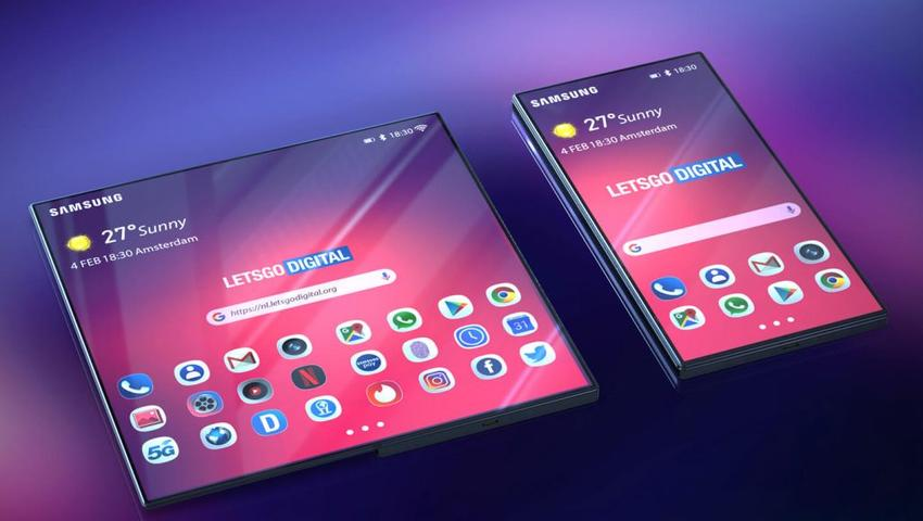
source Let's Go Digital/Samsung
As I mentioned before, the foldable screen is just another case of configuration change.
We are getting two different screens and when the user is folding/unfolding, the device screen transitions from one to another. So what should we know/care about when it comes to this?
Resizable app attribute
I guess everyone remembers this line of code when it comes to Android configuration options : android:screenOrientation="portrait”. You can find it on Stackoverflow whenever someone asks how the orientation change should be handled during a portrait/landscape transition. This simply locks the screen orientation, making your app usable only in the portrait mode. You avoid the orientation change and whatever problems it might entail. In exchange, you sacrifice the responsiveness and immersion of your app, making it less attractive to the user. Of course, not every app should support orientation change, because sometimes, it’s just a lot of work in exchange for a rare use case that will never be noticed by users anyway.
When foldables come into play, devs that handle the configuration change without locking their apps will have less work when it comes to supporting the foldable phones. If you’ve defined the resources for different screen sizes, you are a big winner ^^.
Of course, there is an attribute that can be used to disable the resizing of your app during the foldable phone transition: resizeableActivity=false
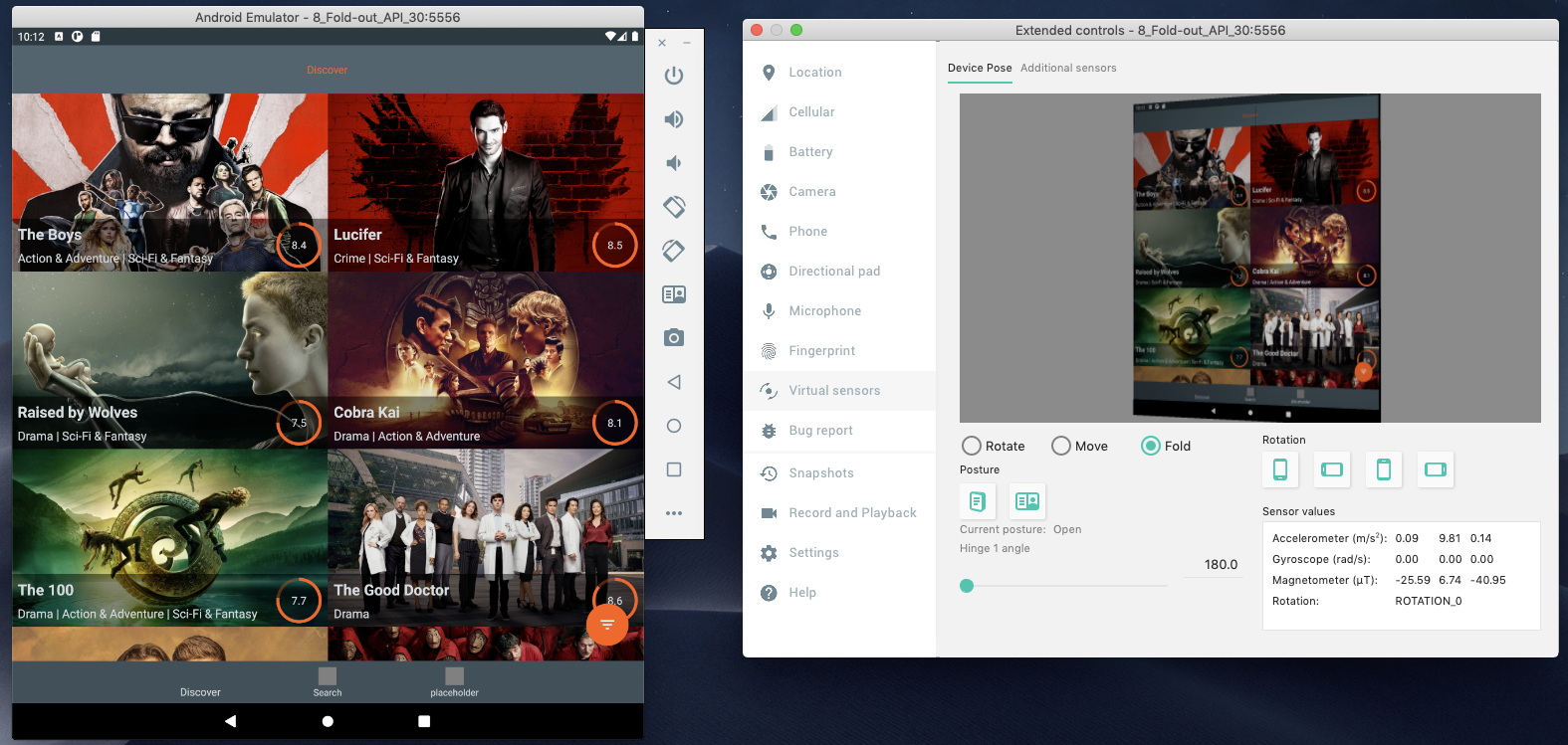
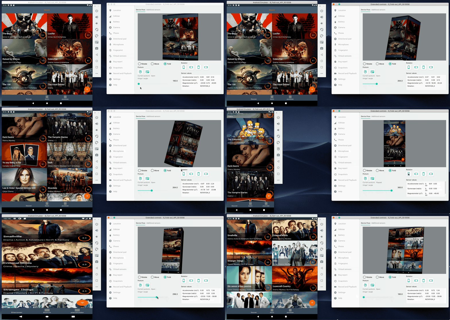
This is what it looks like in practice :
- resizeableActivity = false
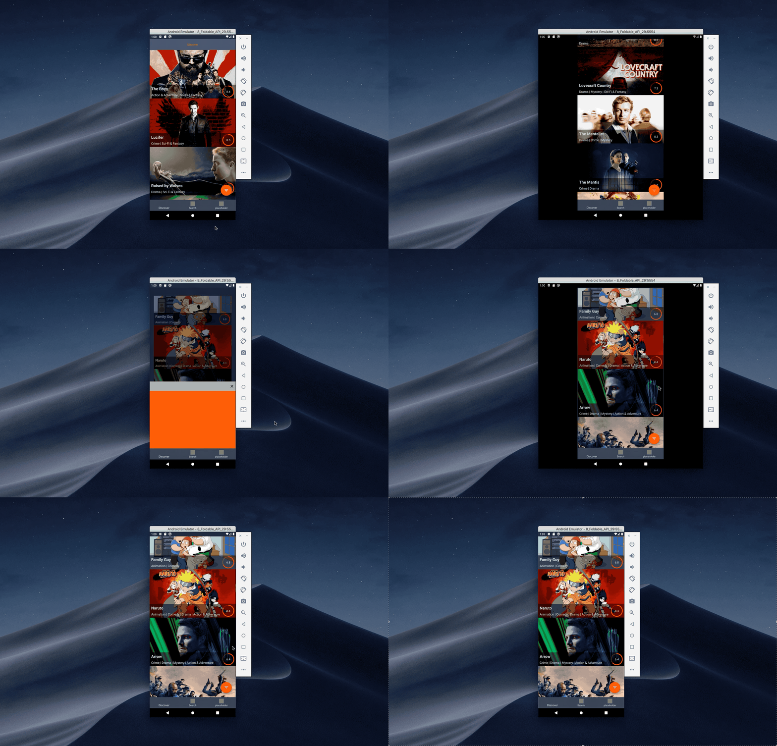
- resizeableActivity = true
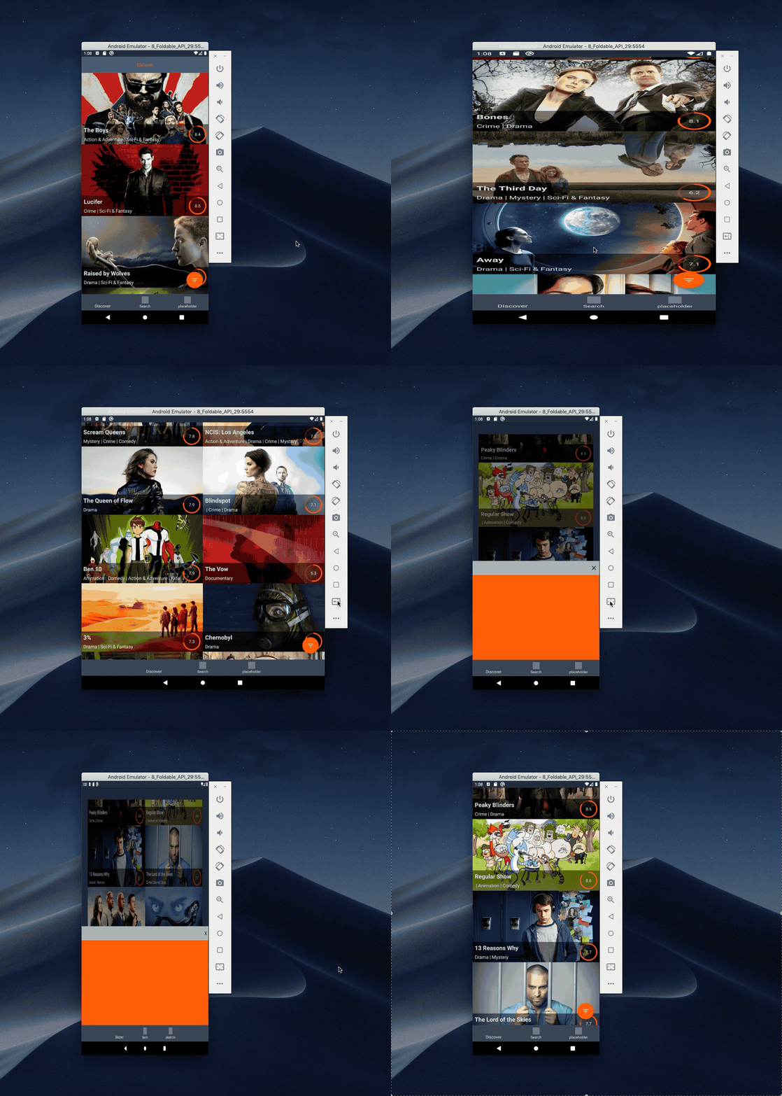
Did you notice any specific differences between those?
This app is partially handling the size change and we can notice some subtle differences between those two cases.
- The app handles the config changes when it comes to the scroll position and number of displayed grids.
- The state of the bottom sheet placeholder isn’t saved
When resizeableActivity is false, the app functions just like before: the screen gets bigger but our app stays the same and no config change happens.
The scroll position is saved between configuration changes, so the user can continue the scroll wherever they left it in both cases.
Saving the state of the bottom sheet is not handled, so when the flag is turned on, the state gets lost during the transition.
So if you don’t handle configuration changes, make sure you turn off this flag in your app in order to avoid some nasty surprises! In the cases shown above, one downside was that the bottom sheet was missing. That said, most apps won’t be so subtle – configuration changes may lead to some strange behaviour and even to crashes in some situations.
Foldable modes
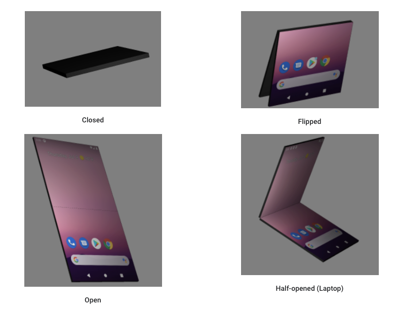
source https://developer.android.com/guide/topics/ui/foldables#postures
Apart from the final states – folded/unfolded – you can also support and react to other states. In order to do so, you’ll need to add a new jetpack window manager library.
If you want more info on the folding event, you can listen for a sensor event that will yield information about the current hinge angle
Testing
Buying a foldable phone to get your app ready for the new features it’s a bit pricey option. But don’t worry. With Android Studio 3.5 and above, you can emulate a foldable phone.
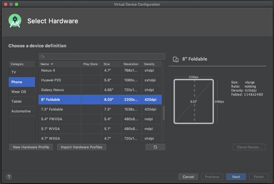
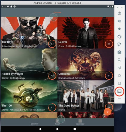
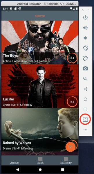
Apart from the normal Android emulator stuff, it has additional fold/unfold buttons.
If this isn’t enough and you want to test out those hinge angle features, you will need to grab the Android Studio Preview build and run the foldable device emulator on Android 11. Then, you will see additional options in the sensors category and additional emulator images.
Here it is in action
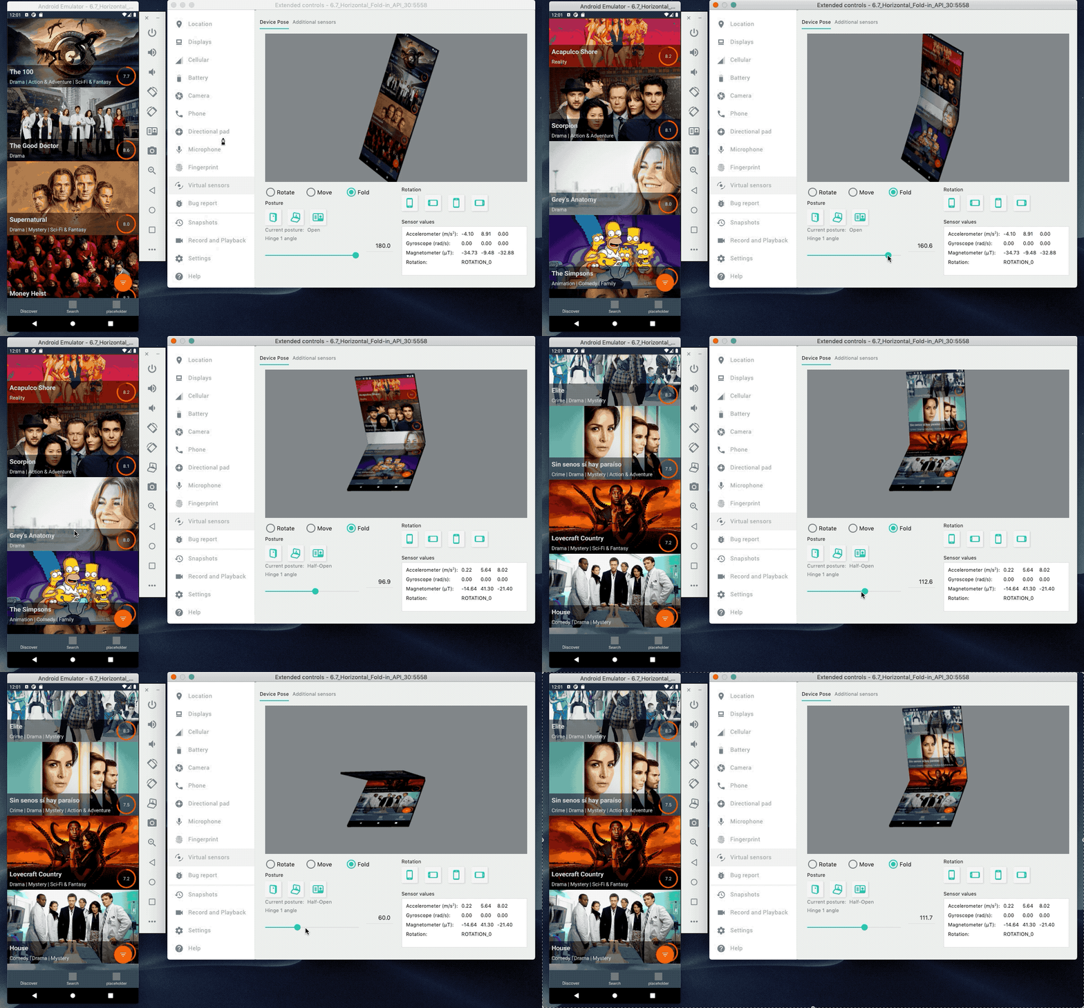
Our app doesn’t quite handle the horizontal fold case ^^
As you can see, the hinge isn’t centered and our view is cut in the wrong place. But don’t worry, the window manager library comes to the rescue!
Window manager library
As I mentioned earlier, the window manager library gives you the ability to check the folded state and also can help us with the cutting hinge problem – we can check the hinge position.
I will be using a window manager sample from Android repository.From the WindowManager, we can get info about DisplayFeatures described as:
A display feature is a distinctive physical attribute located within the display panel of the device. It can intrude into the application window space and create a visual distortion, visual or touch discontinuity, make some area invisible or create a logical divider or separation in the screen space.
#TYPE_FOLD
#TYPE_HINGE
In the sample, we can find an example of how the SplitLayout that will handle splitting the view uses the DisplayFeatures to achieve that. We can assume that Google will provide us with some nice tools in the future to help us out with foldable apps, e.g. something like the SplitLayout shown in this showcase app but, of course, more optimised and advanced.
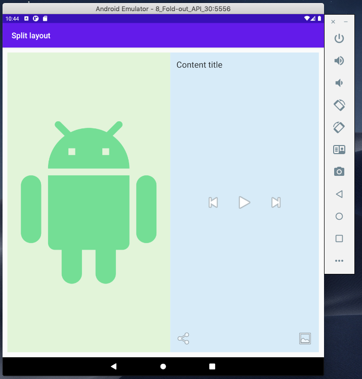
SplitLayout includes two other views you can see above: Content and Controls. It finds the position of the hinge and divides the display in order to properly measure the two new containers and position and measure the Content and Controls layout inside.

This is what it looks like with horizontal fold – quite a nice use case for control/content views.
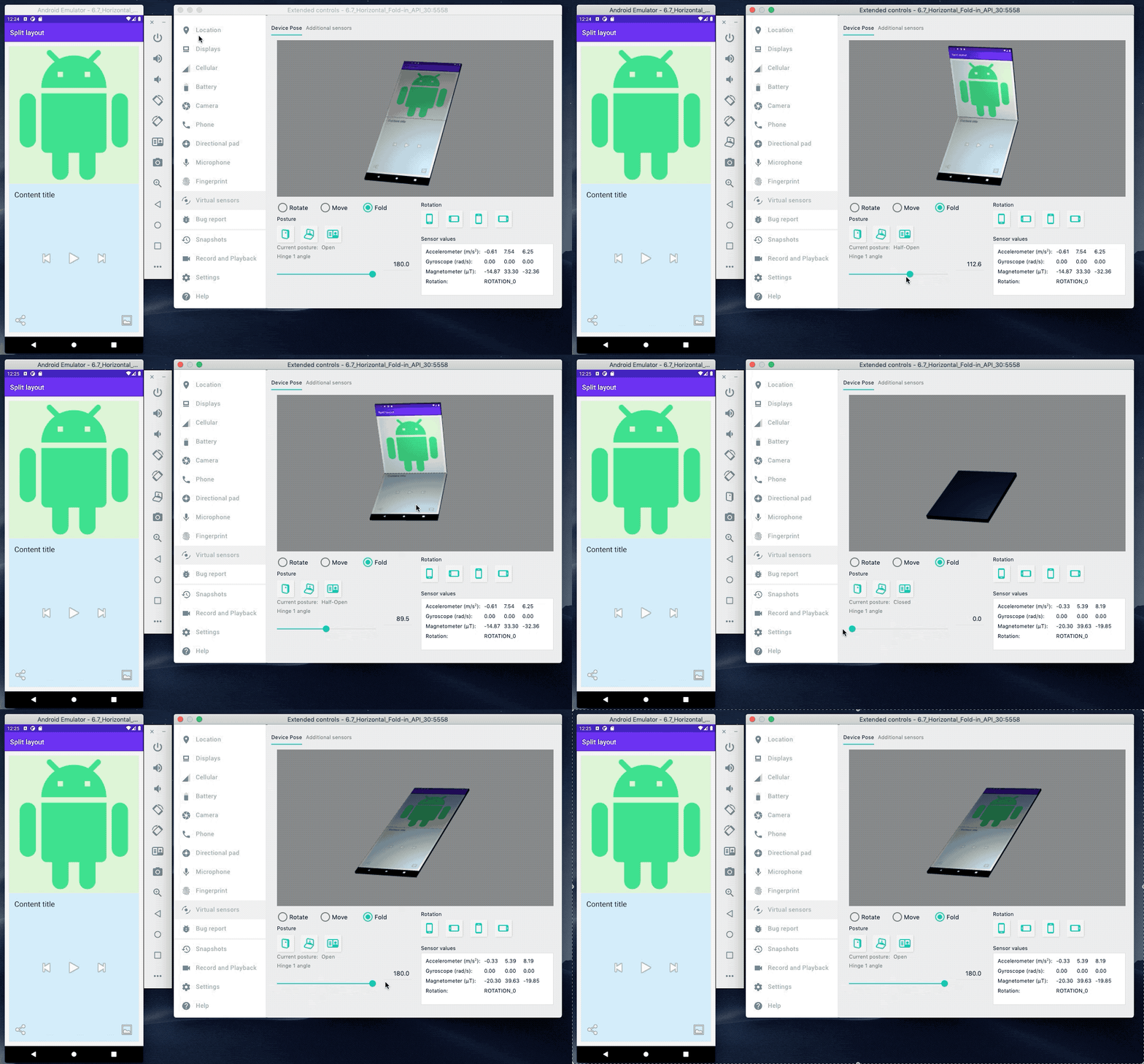
As you can see, there are lots and lots of new possibilities and use cases to be utilised – whole new area for designers and developers to shine in. So get ready and hop on the foldable train! ^^


