Creating a Pixel-Perfect iOS App with Flutter

Exactly since September 19, 2018 when Flutter Release Preview 2: Pixel-Perfect on iOS blog post appeared on Google Developers Blog. Unfortunately, it is really difficult to achieve. Let's see the state of the union now when Flutter 1.0 is available.
I've decided to build a simple app with table view to see compared side by side whether pixel perfect is possible. It is going to show recent articles from Codestories blog.
Native iOS
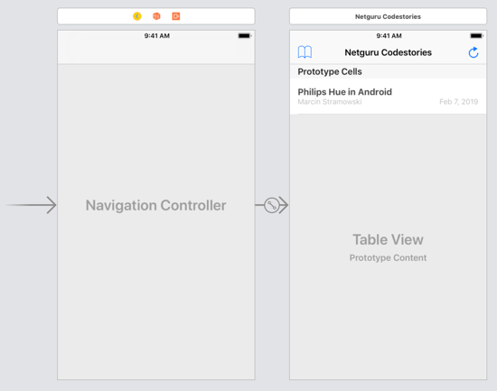
The native implementation uses storyboard/XIB with cell's constraints pinned to margins. Nothing special for iOS developers.

When it comes to the code it looks pretty easy too:
import UIKit

struct Article {
    let title: String
    let author: String
    let date: String
}

let articles = [
    Article(title: "Philips Hue in Android", author: "Marcin Stramowski", date: "Feb 7, 2019"),
    Article(title: "Netguru DevOps Team About Their Work – Why Bother? What Skills Are Useful? Is It a Role for Everybody?", author: "Olga Trąd", date: "Jan 31, 2019"),
    // and more articles
]

class ViewController: UIViewController, UITableViewDataSource {

    @IBOutlet private weak var tableView: UITableView!

    override func viewDidLoad() {
        super.viewDidLoad()

        tableView.dataSource = self
    }

    func tableView(_ tableView: UITableView, numberOfRowsInSection section: Int) -> Int {
        return articles.count
    }

    func tableView(_ tableView: UITableView, cellForRowAt indexPath: IndexPath) -> UITableViewCell {
        let cell = tableView.dequeueReusableCell(withIdentifier: "Cell", for: indexPath) as! ArticleTableViewCell
        let article = articles[indexPath.row]
        cell.titleLabel.text = article.title
        cell.authorLabel.text = article.author
        cell.dateLabel.text = article.date

        return cell
    }
}

class ArticleTableViewCell: UITableViewCell {
    @IBOutlet weak var titleLabel: UILabel!
    @IBOutlet weak var authorLabel: UILabel!
    @IBOutlet weak var dateLabel: UILabel!
}
Flutter
In Flutter it is more complicated at least at first sight. Mostly because it prefers compositions over inheritance. You need to know that all views are widgets.
Cupertino widgets simulate iOS look pretty good, so let's use them.
import 'package:flutter/cupertino.dart';
import 'package:flutter/material.dart';

class Article {
  final String title;
  final String author;
  final String date;

  const Article({this.title, this.author, this.date});
}

var articles = const [
  const Article(
      title: "Philips Hue in Android",
      author: "Marcin Stramowski",
      date: "Feb 7, 2019"),
  const Article(
      title:
          "Netguru DevOps Team About Their Work – Why Bother? What Skills Are Useful? Is It a Role for Everybody?",
      author: "Olga Trąd",
      date: "Jan 31, 2019"),
      // and more articles
];

void main() => runApp(MyApp());

class MyApp extends StatelessWidget {
  @override
  Widget build(BuildContext context) {
    return CupertinoApp(
      debugShowCheckedModeBanner: false,
      home: CodestoriesPage(),
    );
  }
}

class CodestoriesPage extends StatelessWidget {
  @override
  Widget build(BuildContext context) {
    return CupertinoPageScaffold(
      navigationBar: CupertinoNavigationBar(
        leading: Icon(
          CupertinoIcons.book,
          size: 34,
        ),
        trailing: Icon(
          CupertinoIcons.refresh,
          size: 38,
        ),
        middle: Text("Netguru Codestories"),
      ),
      child: SafeArea(
        child: ListView.separated(
          separatorBuilder: (_, index) => SizedBox(
                width: double.infinity,
                height: 1,
                child: Divider(
                  indent: 16,
                  color: Color.fromRGBO(200, 199, 204, 1.0),
                ),
              ),
          itemCount: articles.length,
          itemBuilder: (context, index) {
            return SizedBox(
              height: 67,
              width: double.infinity,
              child: Padding(
                padding: EdgeInsets.fromLTRB(18, 12, 18, 12),
                child: Column(
                  crossAxisAlignment: CrossAxisAlignment.start,
                  children: [
                    Text(
                      articles[index].title,
                      overflow: TextOverflow.ellipsis,
                      maxLines: 1,
                      style: TextStyle(
                        fontWeight: FontWeight.bold,
                        fontSize: 17,
                        color: Color.fromRGBO(59, 59, 59, 1),
                      ),
                    ),
                    Expanded(
                      child: Align(
                        alignment: Alignment.centerLeft,
                        child: Row(
                          children: [
                            Text(
                              articles[index].author,
                              style: TextStyle(
                                fontWeight: FontWeight.normal,
                                fontSize: 14,
                                color: Color.fromRGBO(177, 177, 177, 1),
                              ),
                            ),
                            Expanded(
                              child: Align(
                                alignment: Alignment.centerRight,
                                child: Text(
                                  articles[index].date,
                                  style: TextStyle(
                                    fontWeight: FontWeight.normal,
                                    fontSize: 14,
                                    color: Color.fromRGBO(177, 177, 177, 1),
                                  ),
                                ),
                              ),
                            ),
                          ],
                        ),
                      ),
                    ),
                  ],
                ),
              ),
            );
          },
        ),
      ),
    );
  }
}
It differs strongly from the code written in Swift. In Flutter there are no delegates and data sources for table or collection views. Also instead of table/collection view there is ListView. It owns an array of subviews (in Flutter/Dart nomenclature: a list of widgets) as its children.
The code is longer than the same written with Xcode, but keep in mind that in Flutter world there is no Interface builder and UI needs to be written programmatically.
As you can see there are a few weird values. For example padding such as EdgeInsets.fromLTRB(18, 12, 18, 12) is bigger than spacing set in Interface builder, but it makes Flutter to render views in a similar way to native iOS.
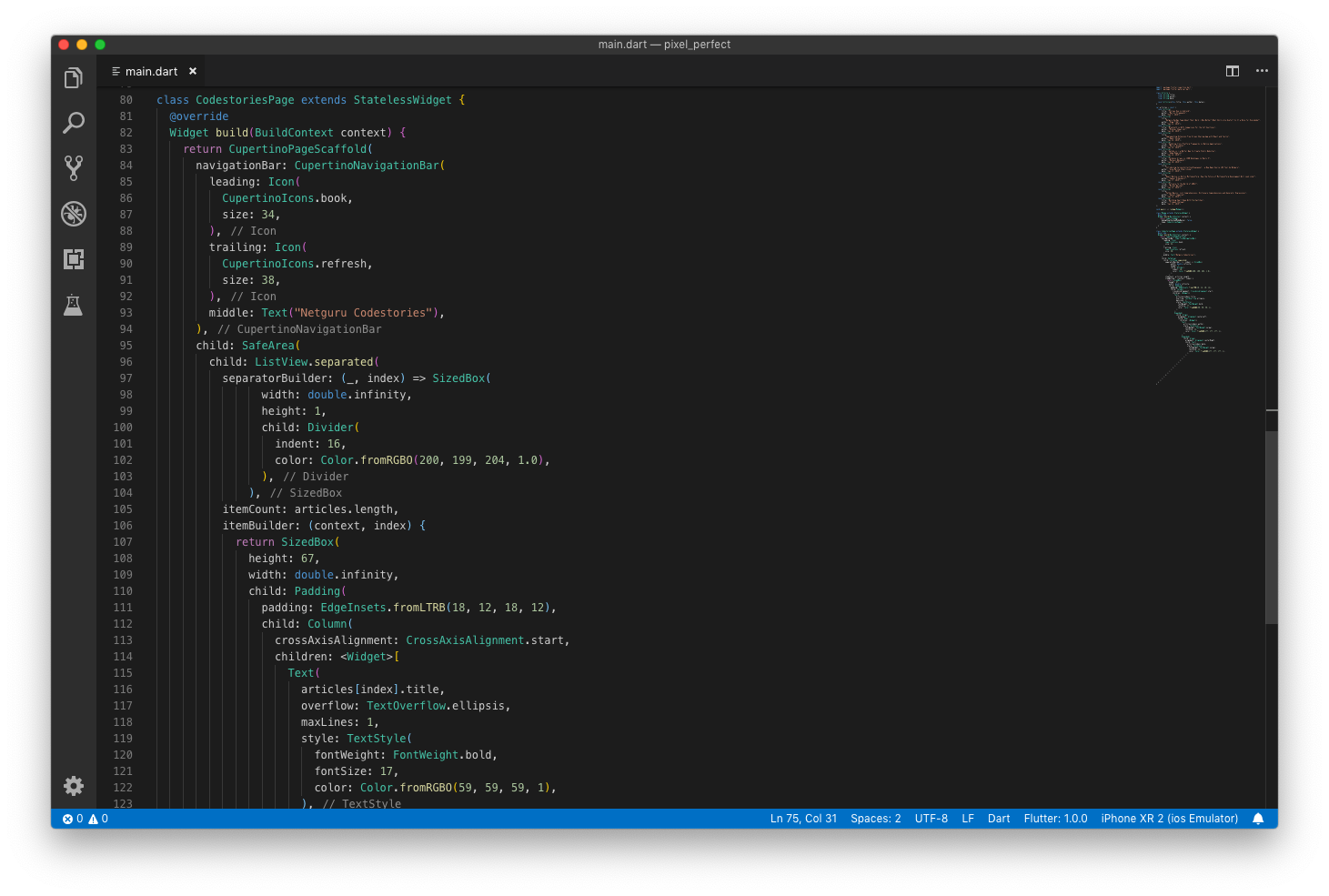
PS In case you are worried that the code above looks terrible and may be really difficult to manage, please keep in mind that it looks much better in a good IDE such as Visual Studio Code. I prefer VS Code than Android Studio/IntelliJ, because it is simpler. I believe that VS Code is perfect for iOS developers accustomed to Xcode, but Android Studio is going to work great for Android developers. All of them offer great features like refactoring, wrapping views, extracting methods or widgets, auto-creating constructors, etc.

That's how it looks like in Visual Studio Code with added Bracket Pair Colorizer 2.
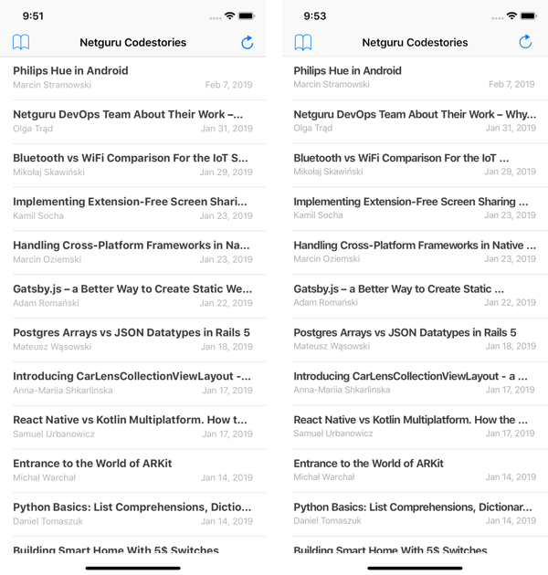
The result

The issue with letter spacing is well known, but not sure about the current status – according to Github it is going to be fixed in Q1 2019. As you can see below typography in Flutter sometimes behaves really odd, especially when font weight is the thinnest.

Verdict
It seems that creating a pixel-perfect iOS app with Flutter is very difficult and almost impossible at the moment. On the other hand, I believe that comparing iOS and Flutter design side by side is worthless. Flutter lets you create an app that looks exactly the same on iOS and Android and this cohesion is more important than these details.


