11 Examples of Good UX Writing

Just a few words on a checkout or subscription page can make a huge difference to your customer’s opinion of your brand. We’ve rounded up some UX writing examples to show you the key do’s and don'ts.
Getting your UX writing, or microcopy, right will help you stand out from the crowd and give your product the best possible platform. Learn from the UX writing examples of others to help craft your own successful microcopy.
UX writing is crucial for crafting clear, user-friendly interfaces, and the examples in this article will show you how to implement best practices in your work. From effective error messages to engaging microcopy, delve into 11 real-world scenarios that illustrate excellence in UX writing.
What is UX writing?
UX stands for User Experience. UX writing is therefore any written content that seeks to improve and clarify the user experience of your audience. UX copy is an essential part of each UX design, and it should increase user confidence and improve your product's overall user experience.
Effective UX writing informs users about actions they can take, are taking, or have just taken, guides them through the user flows, and increases their confidence.
UX writing appears:
- Before users take an action, to clearly explain what will happen when they do.
- During the action, it helps users complete the process and offers suggestions and updates.
- After an action, to confirm what has happened and explain the next steps.
How to make it good
UX writing directs and guides users through your website, encourages user interaction, educates them every step of the way, and helps them easily arrive at their desired destination without confusion. The best UX writing is so in-touch with its audience’s needs and intended journey that the technicalities that sit behind it are invisible.
The following guidelines for UX writers and UX designers will help you to shape your microcopy into highly interactive content that simplifies everyday user experiences. You’ll find some tips on how to make your end user enjoy their time with your digital products and leave with a greater sense of trust. You can find more UX writing tips here.
Examples of good UX writing
The following UX writing examples technically showcase the mindset that should be the credo of every user-centered designer and technical writing team. Let's get on with the Good UX Writing users manual.
Clear actions
The No.1 priority when it comes to understanding UX writing essence is clarity. At every step, your user must be clear on what action they are taking, what it requires of them, and what the outcome will be. Your UX writing should be legally sound, so you will want to run anything that involves payments, sign-ups, and contractual obligations past your legal team.
Make sure your explanations are simple but anticipate any potential concerns. In the example below, taken from bunq, “Try for free!” and “Already a member, click here to login” clearly state that the service can be tried for free, and what will happen after the button is clicked.

The human touch
It's the UX writer's role to make communication as simple and easy to understand as possible. Users are much more likely to respond and connect with a voice that sounds human. Think about how you might talk to your customer if they were standing in front of you.
UX writers will usually opt for a more conversational tone that uses a simple sentence structure. Commands, questions, and explanations are active and concise, with the object of the sentence at its very beginning. Your users will focus on the first 11 characters of a sentence, so make sure your meaning is clear from the outset.
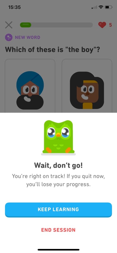
In this example from Duolingo, rather than writing something as blunt and formal as, “All progress will be lost if you close this window. Are you sure?” the UX writer has chosen a much more personal message.

Brand personality
Injecting personality into your microcopy is essential, whether it’s with humor, a distinctive voice, or just a friendly attitude. It’s even more important, however, that your brand voice and personality match your target group’s expectations.
Usually, users of health, finance, and legal products might expect reassurance and professionalism. It’s not always the case though — Kraken is a great example of a finance-related app that has adopted a personality that speaks to its target group.

Humour and entertainment
Who said UX writing has to be serious all the time? Injecting humor into UX writing can significantly shape a brand’s personality, setting it apart in the digital landscape. Kraken, a cryptocurrency exchange app, effectively uses humor in its UX writing to resonate with its audience and distinguish itself in the finance industry.
There are many opportunities for humor within the standard buyer’s journey. One place, in particular, has appealed to many companies: the error page.
This page is innocuous in its seeming lack of importance but it’s also a place that can be used to allow users to recover from frustration, keep them on your website or app for longer, or even convert them to clients.
Even error pages can be spruced up with a bit of humor. TripAdvisor, for instance, uses humor on error pages to engage users while still providing helpful information. This approach enhances the user experience during frustrating moments, turning a potential negative into a positive.

Additional support
No one really likes filling in forms or questionnaires. The only things worse than forms are the errors that appear while you’re filling them in.
To make the potential for error as small as possible, a good UX writer will add short explanations, comments, and hints. These work best if triggered by certain actions, for example, saying the right (or wrong!) thing at the right time.
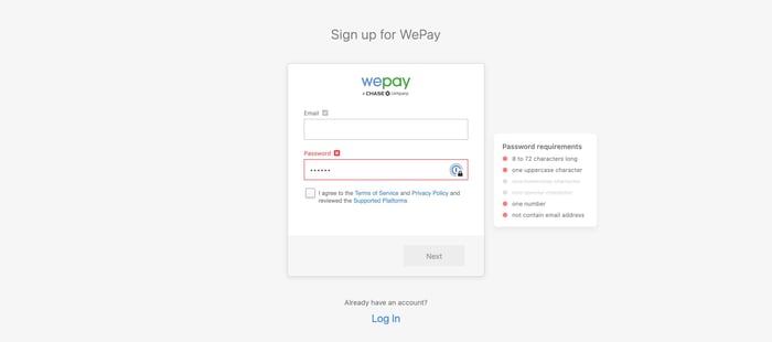
When the user clicks to fill in a certain box (e.g. the password set-up box on the WePay sign-up page), a message might offer a tip. By only offering up information snippets when they’re needed, you can also ensure that your users aren’t overwhelmed or put off by an overly wordy page.

Be aware of timing
Being aware of your customer’s situation makes your copy much more relevant to them. Slack's value proposition of being the digital HQ seems super-accurate in COVID-19 times.
Tapping into the concerns, needs, and expectations of your customers at any given time can help you uncover hidden value in your product and keep it relevant.
Even in UX writing, timing holds a significant role. Tailoring the content to align with the customer’s current situation increases the relevance and perceived value of a product. Slack’s UX writing, for instance, reflects the importance of timely communication, adapting their messaging during events like the transition to remote work due to COVID-19.
Motivation in UX writing is tied to the clear articulation of benefits and rewards that a user receives from taking certain actions within a digital product. Headspace’s encouraging users to share their experience and Pirate Ship’s engaging login microcopy are prime examples of effective motivational UX writing.

Motivate your users
Tune into why carrying out certain micro-actions, such as sharing your product, might appeal to your customers. Will there be benefits they can pass on to their friends? Will it be something to show off? Will they receive a discount code?
Express this motivation clearly, either through short, visual stories or simply with a sentence under the call-to-action (CTA) button. Your reward will be increased product exposure.
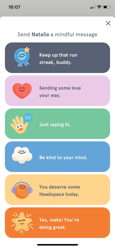
A good example is this Headspace’s message, which allows users to express how they care about their friends while staying on-brand.

Be inclusive
An embedded characteristic of good copy is its inclusiveness. UX writers working with languages that have different female and male forms (like my native language — Polish) will know a lot about it.
English seems more forgiving in this area, but it is still very important that the copy does not exclude any group, whether this is different genders, ages, ethnicities, abilities, backgrounds, or sexual orientations.
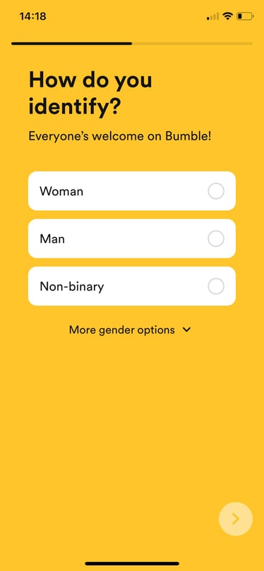
Bumble is doing quite well in this field, and now offers a number of choices within “more gender options,” as well as the option of adding your own suggestion.
In an increasingly digital world, accessibility and inclusivity can no longer be afterthoughts. UX writing needs to consider these aspects to create a genuinely inclusive digital experience. For instance, error messages should leverage icons or other visual cues instead of just color, to accommodate users with color vision deficiencies.
Placing error messages above input fields can also improve accessibility, especially for users who utilize magnification tools or mobile devices. The accessibility of digital content is a necessity as well. Medium, for instance, employs alt text for images, providing context for individuals using screen readers or those with slow internet connections. They also ensure that their videos and texts are accessible by providing captions and maintaining clear text contrast.
Inclusive UX writing encompasses a commitment to not exclude any groups, considering various genders, ages, ethnicities, abilities, and sexual orientations. Contentful’s UX writing guides users on how to enhance accessibility, suggesting certain fields for content to be more inclusive for all.

Avoid Dark Patterns
Although the use of dark patterns to influence user actions might seem appealing, ethical UX writing places a higher value on user-friendly design and transparency for sustained engagement. Dark patterns can lead to legal consequences. For instance, businesses in California may face penalties if they do not correct manipulative website designs within a 30-day window.
Instead of deceptive practices, ethical alternatives can be employed. These include:
-
Providing categorized options
-
Formatting unsubscribe options prominently
-
Transparently using contacts
-
Communicating terms for free trials
-
Maintaining control over shopping basket selections
With a clear focus on transparency in all interface aspects, UX writers should aim to create engaging experiences by designing for the entire user experience, prioritizing long-term engagement over short-term profit. Through UX research and user research, they can better understand the needs and preferences of their target audience.
Error Message Mastery
Ever stumbled upon an error message that made you feel like you’re the one at fault? Effective error messages can turn this around by:
-
Using a conversational tone
-
Using simple language
-
Avoiding blameful language
-
Avoiding ALL CAPS, exclamation marks, and technical jargon
-
Providing specific directives
This approach helps lessen user frustration and clarify needed actions.
Additionally, when it comes to error messages, there are a few things to keep in mind:
-
They need to be easily understandable
-
They should be placed with inline validation to improve user comprehension
-
Making sure that these messages align with the brand’s voice and tone is a key factor in establishing product trust and maintaining a consistent user experience.
Empty State Empowerment

An empty state screen can be disappointing, but with positive language and actionable CTAs, it can be transformed into an engaging user experience. LinkedIn’s messaging empty state uses positive language, provides useful information, and includes an actionable CTA. Slack’s microcopy, on the other hand, is simple, conversational, and contains a flawless CTA that facilitates merging email accounts.
Imgur takes an inventive approach to empty states by deliberately avoiding negative language. This approach maintains a positive user experience even when content is missing, highlighting that every state of an app, even the ‘empty’ ones, can be crafted to enhance user experience.
UX writing traps to avoid
- Don’t use Lorem Ipsum. Though initially convenient, Lorem Ipsum can be a time-consuming setback for UX writers and designers. Using Lorem Ipsum in place of real website text will result in an unrealistic design that doesn’t fit together with the valuable microcopy you need. The shape of the site won’t fit the final text, and you won’t get an accurate response from usability tests.
- Don’t use jargon. As designers, we want users to be able to process information easily. Jargon and complex words might slow users down or alienate them. Consequently, conversions might be negatively impacted.
- Remove unnecessary words. Even an unnecessary “a”, “an”, or “the”, can disrupt the flow of a punchy piece of microcopy.
- Avoid superlatives. Superlatives are rarely accurate, and therefore inspire distrust in your users.
- Don’t prioritize grammar. Sometimes the hard-and-fast rules are made to be broken. Be conversational rather than strictly correct, and use numbers rather than words to make the important information stand out.
- Don’t blame the user. When a user enters information incorrectly, helpfully explain what they can do to correct it without apportioning blame or being opaque.
Don’t manipulate the user. We probably have all seen the “Yes, sign me up” and “No, I don’t want more clients” buttons. Inducing guilt or FOMO in your readers is not okay.
Measuring UX writing
If you are a UX writer designing content for a client, the best way of measuring the success of your microcopy is by carrying out comprehensive usability testing. Offer options with different degrees of personality, humor, and depth, and see which ones allow users to complete their tasks most efficiently and evoke the most positive emotions.
To translate success into workable numbers, use analytics to measure user interaction, click-through rates, and conversion metrics. In addition, assess whether you have had more or less customer service inquiries from users needing help — with good UX writing, these figures should go down.
If your microcopy is done well, you should experience higher conversions and increased customer confidence. Guiding your users through an enjoyable, informative online process will make them more likely to complete it and therefore improve your business performance.
For more information on how you can evaluate and improve your UX writing, get in touch with one of our experts!


-%20copy.jpeg?width=1200&height=630&name=What%20is%20Mobile%20Cloud%20Computing%20(MCC)-%20copy.jpeg)