How to Recognize a Well-Designed Digital Product (Examples)

Nowadays, the lines between "pretty” vs “ugly" have become more blurred and less relevant. Do we now pay more attention to whether a product is useful? In this article I’ve tried to identify the most important traits of well-designed digital products and give you some examples which you might want to bear in mind while designing yours.
Good design is always simple
A good design is always a working solution that is as simple as possible. Research shows that we trust in nice products and we buy services and acquire things that can surprise us in ways that transcend their aesthetic qualities. Besides being useful, they simply allow us to enjoy the fact that we use them.
We can’t measure or determine whether something is well-designed just by considering one factor alone. We need at least a few if not several variables that will allow us to rate a product as hot or not.
A designer knows he has achieved perfection not when there is nothing left to add, but when there is nothing left to take away. Antoine de Saint-Exupery
The coefficients defining the quality of design:
- Functionality is one of the most important features of well-designed products. For sure, every one of us has been in situations when we had to deal with products which, although they looked great, didn't work properly or do what they said on the packet and sometimes they even created problems instead of solving them.
- Aesthetics can be described as the first contact on the user-product line. This is a feature that can "hijack" the consumer with an appearance that dazzles and excites. It speaks in shapes and fascinates. It is on way of evaluating a product.
- Intuition clearly defines the product function while also allowing the purpose of the product to be read and correctly understood without recourse to an instuction manual. A product design that allows the user to use and understand the product is intuitive.
- Simplicity is one of the hardest things to achieve. As John Maeda said: “it’s all about subtracting the obvious and adding the meaningful”. It’s a complex and a thoughtful process but still worth developing. Products that fall within this category, while characteristic and memorable, can also manipulate customers via form over content and persuade them to buy simple products even though they can turn out to be more expensive..
- User-centered design. A project based on this idea can boost user attention and satisfaction. It’s a simple framework which can help you create optimal products dedicated for specific target groups.
Simplicity isn’t just a visual style. It’s not just minimalism or the absence of clutter. It involves digging through the depth of complexity. To be truly simple, you have to go really deep. You have to deeply understand the essence of a product in order to be able to get rid of the parts that are not essential. Jony Ive
Examples of well-designed products:
- Marvel - design

If you are a designer, you have probably heard of this before. Marvel is a web-based app that allows you to create interactive prototypes from scratch as well as by uploading an existing one. Marvel has much to commend it when it comes to keeping everything simple with regards to use and interface. This is our choice.
- Human - mobile app

A beautifully designed fitness app that allows you to track your daily movement and compete with the others. The company calls it the ‘Daily 30’. As it is extremely simple, keeping up with Human is easier than with competitive fitness systems. Omg — have you ever seen their maps? They are from mapbox.
- Slack - communication

Reinventing the way people can talk in groups. Equipped with a beautiful and intuitive interface and delivered as a native, web and mobile app. How awesome is that? Slack is working miracles in remote teams, you can read whole story here.
- Monument valley - game

One of those products that makes your jaw drop. Manipulate architecture and guide a princess through a beautiful world of awe. Sounds like your new plan for the evening? Yeah, you should definitely check this game.
- Tookapic - photography

This is something, I would even say more than just something - if I could just find the right words to describe this. Tookapic is a web app that can help you work on a new habit. The Photo-a-day Project, designed by polish designer Paweł Kadysz is filled with stunning photos and features a well-crafted interface. Grab your camera, soldier!
- Ted - inspiration
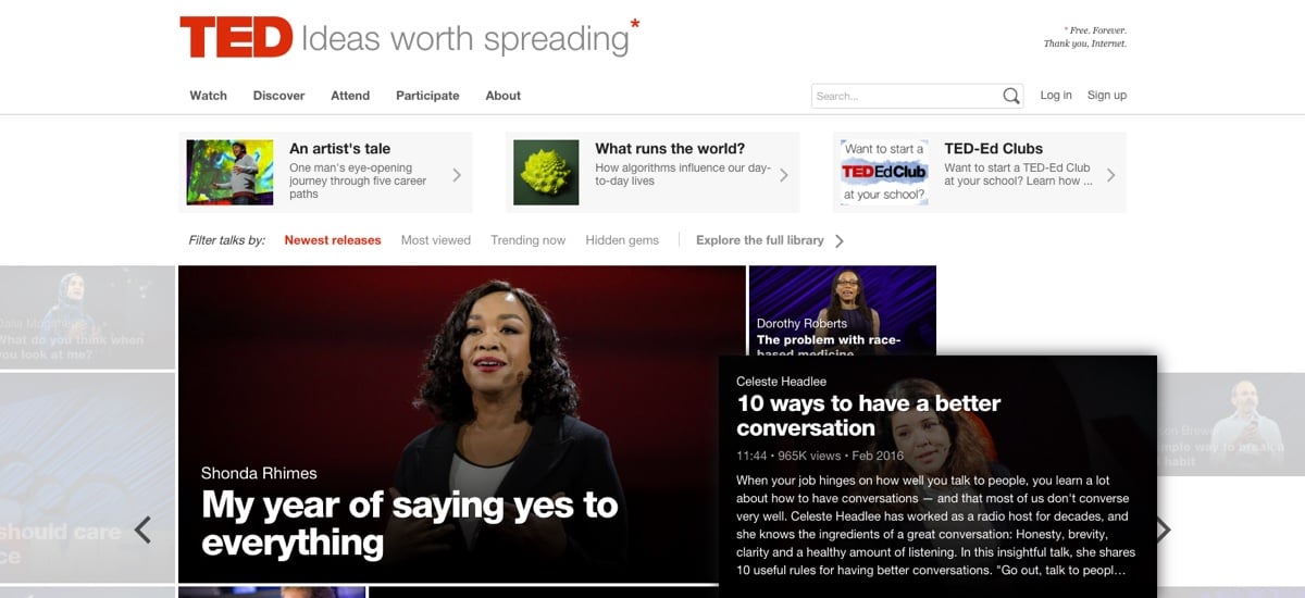
 All of us working in a creative industry need inspiration. Ideas don’t come easy and sometimes we need to make an impact by coming up with something incredible all by ourselves. TED (technology, entertainment, design) is a non profit organization whose mission is to spread ideas throughout the world. It's really worth watching for the ideas on offer there and because it’s built with a really cool design.
- Jsfiddle - app

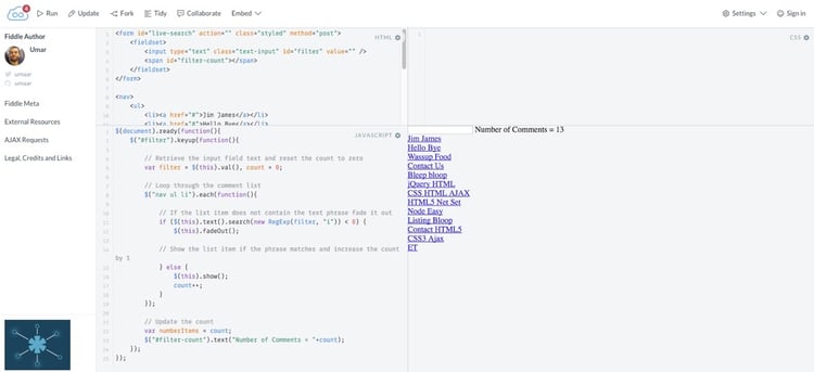
One of my mentors used to say that if you want to understand design, you have to surround yourself with it. JsFiddle is a beautifully designed frontend playground that allows developers to work with their code. A stunning and simple interface.
- Airbnb - services

Put it in this way, Airbnb is a gorgeous room rental web app. It works like any holiday booking site, but there is one major difference – it offers apartments, flats and houses of ordinary people looking to make some extra money. Have you ever considered where you want to sleep today? Definitely worth checking, because of the gorgeous UX patterns and nicely crafted UI.
Others worth checking:
- Trippeo - life organizer
- Bartaile - e-commerce
- Asana - productivity
- Tumblr - micro blog platform
- IFTTT - app
- Stripe - financial app
- Treehouse - e-learning
- Freeletics - fintess
Wrapping up
As I’ve mentioned, it’s not easy to say categorically which design is good and which is not. What is certain is that good design should defend itself without any external or additional help. Yet, to understand a design we can develop a system that would help us understand and correctly interpret its ‘form’ by surrounding ourselves with beautifully crafted products and dealing with them on a daily basis. Do you know any other examples of well-designed products? Drop us a line in the comments below!


