Illustrator's Eye: 12 Principles of Animation

They were introduced by the Disney animators Ollie Johnston and Frank Thomas in book The Illusion of Life: Disney Animation published in 1981. These principles are the outcome of Disney animators’ work from the 1930s onwards. They were created to help reflect real life and the basic laws of physics in animations, but also to resolve abstract issues like character appeal. The 12 principles of animation are perfect for both frame-by-frame animation and motion design.
The 12 principles are:
- Squash and stretch
- Anticipation
- Staging
- Straight Ahead Action and Pose-to-Pose
- Follow Through and Overlapping Action
- Slow in and Slow Out (Ease In, Ease Out)
- Arcs
- Secondary Action
- Timing
- Exaggeration
- Solid Drawing
- Appeal
Squash and Stretch

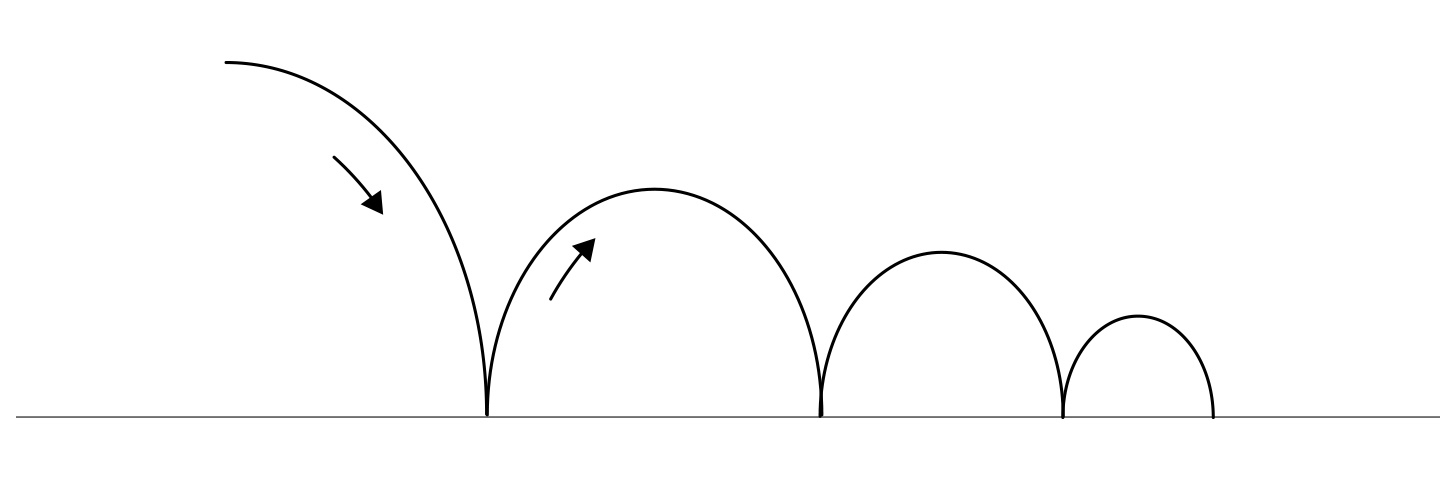
The squash and stretch rule is about giving a sense of weight and flexibility to drawn objects. It works on simple objects, like a bouncing ball, and complex compositions with human bodies. The most important aspect of this principle is an object's volume. It should not change when squashed or stretched. The best advice from the authors of Disney animation is to think about the object as a half-filled flour sack. It will squash out to the fullest shape when it’s dropped on the floor, and stretch out to the longest shape when it’s picked up by the corners. But it will never change its volume. Anything composed of living flesh will be proportionally deformed (squashed or stretched) within its shape in processing through action. This rule could be also applied to still elements, like a ball or chair, to emphasize movement. The animated object should also work together with the other elements in a composition. For instance, a ball should squash when touching the floor during a bouncing animation.
Anticipation

Source: Ollie Johnston and Frank Thomas - The Illusion of Life: Disney Animation
People watching animation need to be prepared for the next movement and expect it before it actually occurs. Otherwise, the impression the scene makes will be less spectacular, or worse, a gag could be missed. To avoid this problem, Disney animators invented the Anticipation principle.
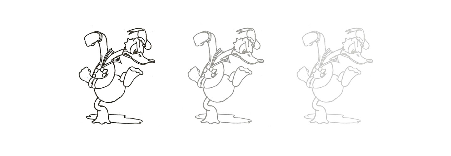
Anticipation is used to prepare the audience for an action and to make the action appear more realistic. It’s about showing a small opposite, contrasting movement, before the actual move. Before a man runs, he bends his body in the opposite direction and crouches low, raising his shoulders and one leg. It’s based on real life actions: a dancer jumping needs to bend their knees first, a golfer making a swing has to swing the club back first. It seems to be a natural way for creatures to move; few movements in real life occur without some kind of contrasting, opposite action.
Staging

Shot by Aga Koniuszek
“It is the presentation of any idea so that's completely and unmistakably clear. An action is staged so that it is understood, a personality so that it is recognizable, an expression so that it can be seen, a mood so that it will affect the audience.”
Staging in animation is similar to staging in theatre and film. Its purpose is to direct the audience's attention and make it clear what is of the greatest importance in a scene. This can be done in various ways, such as the use of light and shadow, or the angle and position of the character, or the weight and colors. The essence of this rule is to keep focus on what is most important to define the mood of a scene/character. It’s also about cameras - you can zoom on a face, or zoom out to stage the scene.
Straight Ahead Action and Pose to Pose

Source: Ollie Johnston and Frank Thomas - The Illusion of Life: Disney Animation
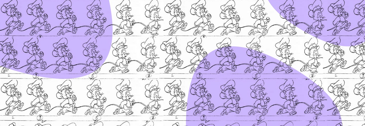
There are two different approaches to the drawing process. The First one, Straight Ahead Action is about animating frame by frame, from beginning to end. The second, Pose to Pose, begins with a plan of the most important poses. The animator starts by drawing a few key frames, and then fills in the intervals later.
Straight Ahead Action creates a more dynamic illusion of movement and is better for creating realistic movements, but it makes it harder to maintain proportions and to create exact, precise poses along the way. Pose to Pose works better for dramatic, emotional, or even exaggerated scenes, where composition and relation to the surroundings are more important. These techniques can be mixed in one animation.
Both methods offer certain advantages for different movements. In the past, animators would use Pose to Pose to get quicker results, but now, with the development of stronger poses, understanding of timing, use a secondary action and other rules, it becomes a brilliant way to compose animations that are textured and full of accents and surprises.
Follow Through and Overlapping Action
When a character reaches the spot for the next action, it should not completely stop. This will look unnatural and stiff. To avoid this effect, Disney animators invented the Follow Through and Overlapping Action principle. It helps to create more realistic movements and gives the impression that characters and objects follow the laws of physics.
- Follow Through means that loosely tied parts of a body should continue moving after the character (skeleton) has stopped. Also, these parts should keep moving beyond the point where the character stopped only to be subsequently "pulled back".
- Overlapping Action is the rule for animation of different body parts. They should move at different rates. In character animation, an arm will move on a different timing than the head.
There are five main categories related to this principle:
- If a character has any appendages, like long ears or a big coat, these elements should continue to move after the character stops. This is easy to notice in real life.
- The whole body doesn’t move at once. As one part arrives at the stopping point, others can still be in movement (arms can still move when legs are still, after an animation showing running).
- The loose parts of a character should move slower than the skeletal parts. It’s sometimes called “drag” and gives figures looseness and vitality.
- The way characters or objects finish an action tells us a lot about their personality. It should be combined with the staging principle.
- Moving Hold is a rule that states that the object or character should be frozen for a few frames (usually 8-16) after it achieves its final pose. This is time for the audience to absorb the attitude.
Slow In and Slow Out (Ease In, Ease Out)

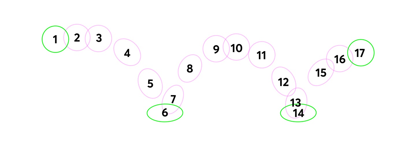
The movement of objects in the real world needs time to accelerate and slow down. For this reason, more pictures should be drawn near the beginning and end of an action, creating a slow in and slow out effect. It helps to achieve more realistic movements. This concept emphasizes the object's extreme poses. Inversely, fewer pictures are drawn within the middle of the animation to show faster action. This principle applies to characters or objects moving between two extreme poses, like sitting down and standing up, or a bouncing ball. Using this principle helps to avoid mechanical movement, and it’s a basic principle for staging and timing.
Arcs

Most natural action tends to follow an arc, and animation should reflect this rule for greater realism. This could have something in common with the weight of objects, but, whatever the reason is, most living organisms moving will follow some kind of arc. For example, when animating a pointing finger, the animator should make sure that in all drawings between the two extreme poses the fingertip follows a simple arc from one extreme to the next. Animations based on drawings with straight inbetweens can completely kill the essence of the movement.
Secondary Action
Adding secondary actions to the main movement gives a scene more life and makes it look more natural. The important thing about secondary actions is that they should emphasize the main action. They should be planned wisely, because it they conflicts with or becomes more interesting or dominating than the main action, the entire animation will suffer. Secondary Action should work with characters’ or objects’ features, so the expression is actually emphasized and the scene looks outstanding. The best solution is to start from animating the main action and then slowly add other movements and secondary actions. Used correctly, Secondary Action will add richness to the scene, naturalness to the movement, and will support staging.
Timing

The number of frames used in any movement determines the amount of time that action will take. Timing is about the speed of the action. On a physical level, correct timing makes objects look like they follow the laws of physics. Timing is critical for establishing a character's mood, emotion, reaction, and staging. It is also a great way to communicate a character's personality. Timing helps to show that character is relaxed, excited, nervous or lethargic.
Exaggeration

Illustration by Aga Koniuszek
This principle is an effect especially useful if you want to make your animation look more like a caricature of realism. The level of exaggeration depends on the effect the animator wants to achieve. The classical definition of exaggeration, employed by Disney, was to remain true to reality, just presenting it in a wilder, more extreme form. If a scene contains several elements, there should be a balance in how those elements are exaggerated in relation to each other. If a character is sad, he should be sadder, if he is bright - make him brighter.
Solid Drawing

Illustration by Katarzyna Dziaduś
The principle of solid drawing is about drawing single scenes in three-dimensional space and giving them volume and weight. The animator needs to be a skilled artist and has to understand how shapes, anatomy, weight, balance, light and shadow work. The book’s authors write a lot about avoiding “twins” - characters with arms or other parts looking the same. No one draws like this on purpose, but sometimes “twins” appear in animations anyway. They look lifeless and boring. The shape should be a plastic, living, ready-to-move form.
Appeal

Illustration by Iryna Korshak
Appeal in a character is a very important part. It helps to define the mood and presence of a person, its quality of charm, good design, simplicity, body language, magnetism. A character who is appealing is not necessarily sympathetic; villains or monsters can also be appealing. It’s about the feeling that a character is real and interesting. There are several solutions for making a character more appealing and they are different for likable characters (symmetrical face, round shapes) and villians (sharp shapes, dark, purple colours).
Couple of pieces of advice from Frank Thomas and Ollie Johnston:
- The parallel lines of the pipe or hose gave no chance for solidity or dimension
- When bent, instead of having weight or strength, it was only a linear design
- Adding flesh increased the volume without giving a fluid, active potential
- In nature we see forms in balance, ready to move in any direction. Few fluid forms are completely symmetrical, and the contrast in form and shape makes an active type of balance. One side can be straight while the other bellies out with the relaxed weight, or the can both bend or stretch or twist or turn - it is always possible, and in balance. We call these forms “plastic” as opposed to “static”.
Summary
The 12 principles of Disney animation changed the way animators create their stories. Because of them there is magic and life in animations. Using these principles will definitely help you to create beautiful, eye catching animations. The Illusion of Life book is a huge source of knowledge, and this article is based only on one chapter from this book. I recommend reading the whole book - apart from knowledge about animation, it contains a lot of interesting stories about Walt Disney and the animation industry.
--
Reference:
The Illusion of Life, Disney Animation - Frank Thomas and Ollie Johnston


