iOS 13 Modals Changes
Another component of iOS 13’s new look is cards. Since the original SDK, the default presentation style in iPhone has covered the full screen. We’re changing that default to, a much more fluid, card presentation. (…) and even better they are dismissible with just a single downwards swipe.
and then in WWDC 2019 Modernising Your UI for iOS 13, around 0:09:42 we can get quite a lot of information about cards:
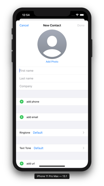
(…) new in iOS 13 we have a standard design for presentations (…). For example, if I'm here in the contacts app and I tap plus to add a new contact, we have a new presentation style that looks like this, rather than the full screen presentation that we had before. You can see that the root view controller's view is not as scaled down and not removed from the view hierarchy.
Surprise
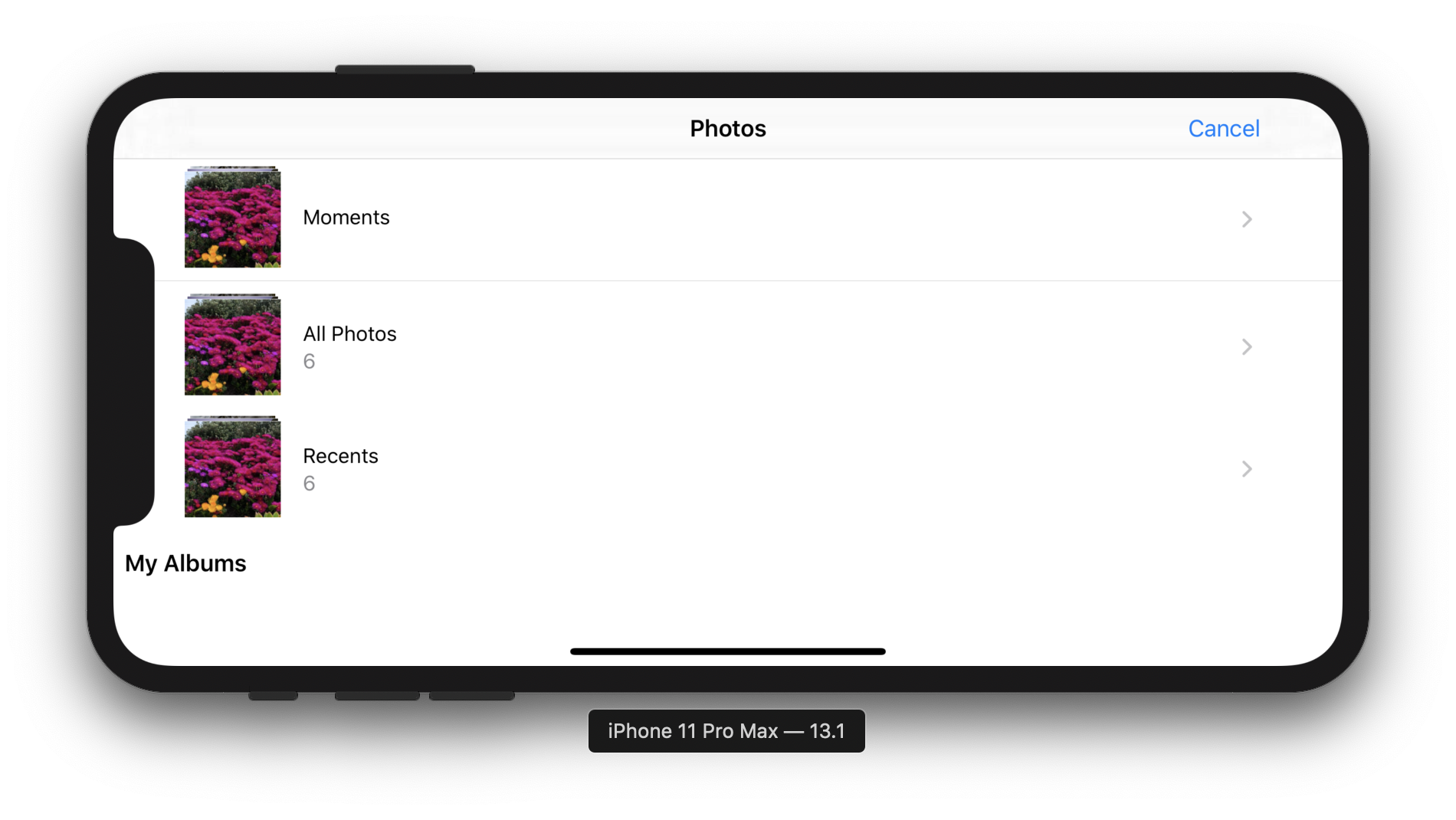
The reason why this post came to live is that in iOS 13 the default value for UIViewController's modalPresentationStyle property is the newly created .automatic. This allows the system to set the correct presentation style automatically for the view controllers provided by the system. For example, depending on whether you configure UIImagePickerController to use the photo library or camera as a source, it will be shown as a page sheet or will take up the entirety of the screen.
.jpg?width=3264&name=chenges%20in%20storyboards%20(1).jpg)
However, if you simply instantiate and present a custom subclass of UIViewController, system will resolve .automatic to .pageSheet by default. This results in the same code having a different effect on iOS 13 compared to any earlier version. Also, modals presented in the new presentation style are dismissible, allowing users to disrupt the designated program flow.
Page sheet presentation style
I thought that it’s a new presentation style, but it’s not. It is just a new design for already existing .pageSheet and very similar .formSheet. So for iPhones in portrait, we get this card layout, however for iPhones in the landscape mode we get a full-screen layout.
It’s quite different on iPads though. The page sheets there float in the middle of the screen. If we keep presenting new ones when some have already been presented, they will be stacked on top of each other. What is great about these on the iPad is that their width follows the readable width (readableContentGuide), which makes them perfect for content worth reading!
.png?width=3264&name=chenges%20in%20storyboards%20(2).png)
Popover presentation style
Here we have another gotcha! If you set modalPresentationStyle of a view controller to .popover you will get a popover, right? Well, that is only true if you are in regular width. If you are in compact width, you will get a sheet. For a device size class reference visit Apple Human Interface Guidelines on Adaptivity.
Pulling down
If you present something as a sheet, the ability to pull it down is built-in. Apple will put a gesture recogniser on the entire presented view, so any non-interactive area will trigger a pull down on a sheet. Also, if a user pulls past the top in any of the scroll views or its subclasses, the sheet will be pulled down. This can become both a blessing and a curse.
Thankfully Apple introduced two new APIs to control pulling down:
- isModalInPresentation property of UIViewController (docs)
- UIAdaptivePresentationControllerDelegate protocol (docs)
If you wish to prevent a sheet from being dismissible, just set its isModalInPresentation to true. After being pulled down, it will spring back in.
It’s out of the scope of this article to go into details of pulling down and how to interactively handle it. I would strongly recommend watching this WWDC talk from 0:14:33 and taking a look at the example code if you’re interested.
Appearance callbacks
Yet another gotcha.
|
Presentation type |
|||
|---|---|---|---|
|
Fullscreen |
Page and Form Sheet |
||
|
presenting VC |
presented VC |
presenting VC |
presented VC |
|
viewWillDisappear |
viewWillAppear |
|
viewWillAppear |
|
viewDidDisappear |
viewDidAppear |
|
viewDidAppear |
|
viewWillAppear |
viewWillDisappear |
|
viewWillDisappear |
|
viewDidAppear |
viewDidDisappear |
|
viewDidDisappear |
When using the Sheet style, the presenting ViewController is not removed from the view hierarchy. Therefore, any appearance callbacks won’t be called. If you have any logic there, it is important to be aware of this and rework it.
When to use which presentation style
Based on Apple’s Human Interface Guidelines on Modality:
Firstly, we should evaluate whether we really need a modal or not.
A modal experience takes people out of their current context and requires that they dismiss an, so it’s essential to use modals only when they provide a clear benefit.
You don’t want to disturb or bother our users. But, when you do decide to use a modal your choice should be based on the engagement level or complexity.
Use a sheet for non-immersive modal content that doesn’t result in a complex task.
Use a full-screen modal view for immersive content – such as videos, photos, or camera views – or a complex task that benefits from a full-screen presentation, such as marking up a document or editing a photo.
Eventually, if you make up your mind, please consider and remember the following:
- Can you clearly tell what the purpose of this modal is? Keep modal tasks simple, short, and narrowly focused.
- Modals always should include a dismiss button. Not only will it allow users that don’t know about the pull gesture to dismiss the modal, but it will also improve accessibility.
- Regardless of whether people use the dismiss gesture or a button to close the view, if the action could result in the loss of user-generated data, present an action sheet that explains the situation and gives people ways to resolve it, like “Delete Draft“ and “Save Draft“ when dismissing a new email.
- Generally, it’s a good idea to add a title to a modal that describes its purpose.
Quick fix
If you came here looking for a way to make popover behave the same way in iOS 13 as they did in earlier versions, here is what you are looking for:
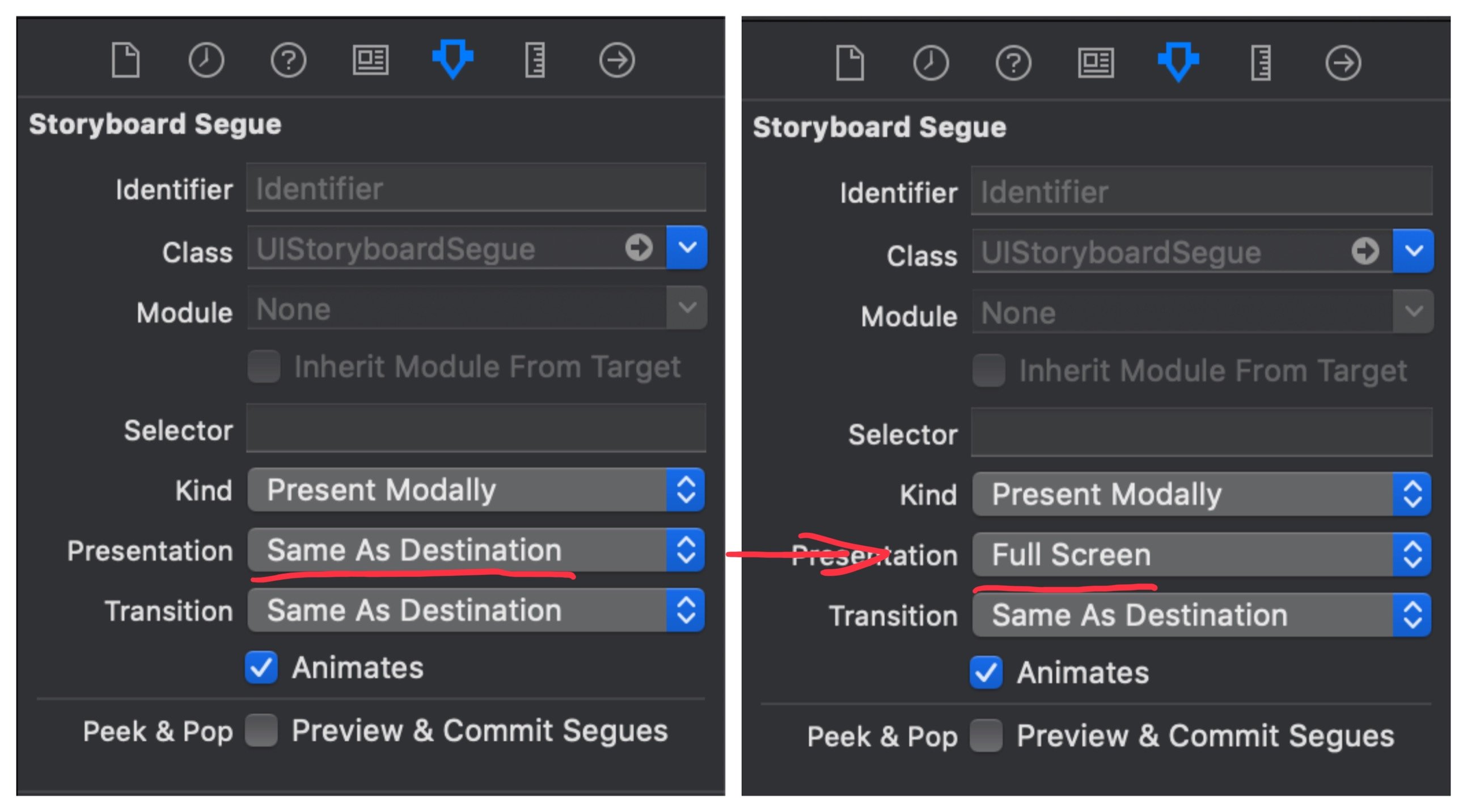
or in code:
let vc = UIViewController()
vc.modalPresentationStyle = .fullScreen
self.present(vc, animated: true, completion: nil)
or you can swizzle a present method. Thanks to Abedalkareem Omreyh's post on StackOverflow I can present you with this neat extension which does exactly that:
extension UIViewController {
  static func swizzlePresent() {
    let orginalSelector = #selector(present(_: animated: completion:))
    let swizzledSelector = #selector(swizzledPresent)

    let orginalMethod = class_getInstanceMethod(self, orginalSelector)
    let swizzledMethod = class_getInstanceMethod(self, swizzledSelector)

    let didAddMethod = class_addMethod(self,
       orginalSelector,
       method_getImplementation(swizzledMethod!),
       method_getTypeEncoding(swizzledMethod!))

    if didAddMethod {
      class_replaceMethod(self, swizzledSelector,
        method_getImplementation(orginalMethod!),
        method_getTypeEncoding(orginalMethod!))
    } else {
      method_exchangeImplementations(orginalMethod!, swizzledMethod!)
    }
  }

  @objc
  private func swizzledPresent(_ viewControllerToPresent: UIViewController, animated flag: Bool, completion: (() -> Void)? = nil) {
    if #available(iOS 13.0, *) {
      if viewControllerToPresent.modalPresentationStyle == .pageSheet
        || viewControllerToPresent.modalPresentationStyle == .automatic {
        viewControllerToPresent.modalPresentationStyle = .fullScreen
      }
    }

    swizzledPresent(viewControllerToPresent, animated: flag, completion: completion)
  }
}
then inside AppDelegate in application(_ application: didFinishLaunchingWithOptions) call:
UIViewController.swizzlePresent()Photo by Arnel Hasanovic on Unsplash


