Design Systems Trends and Best Practices - 2025 edition

A design system is a collection of reusable components that are coded and documented, providing transparent standards that enable designers and developers to collaborate and build coherent digital products.
Over the past few years, the concept has gained significant momentum because it aligns with the general trend of project automation. In the near future design systems will become a must-have for every organization that wants to build consistency across products and unlock the potential of their design teams.
Here are the four key trends and best practices for building design systems.
Industry trend: Design tools that know how to code
Should designers learn how to code? That’s one of those questions for which nobody seems to have an answer.
Recent trends show that we may have been asking the wrong question. Consider the rapid evolution of design tools that help designers focus on design and generate code automatically. For example, Airbnb has developed an internal workflow where designers sketch a UI and get the code for it in a few seconds.
Accessibility
One of the most popular UI prototyping tools, Principle, requires almost no knowledge of coding. New tools like Framer X and Modulz can automatically translate UI patterns into React components, allowing developers to build upon designs instead of replicating them in production.
Tools that unify design and development workflows into a single UI will become more prevalent in the years ahead, helping designers to think in terms of components and design systems. This will be useful for those seeking to develop competency in a UI system and guidelines to build best practice design systems for innovative work.
Note that the bridge between coding and design tools may not come from the more established players, but the newbies whose integrative approach is taking over the scene. The future of design systems will come from innovative thinkers who think in systems and consider design systems UX for an experience that keeps users happy.
Best practice: Building a design team
As more companies get interested in developing design systems, they have to reexamine how design teams are built. Documentation of design systems often includes some code snippets of design components. That's why a design team needs to include at least one designer and one developer.
At Netguru, the more people we involve in the creation of a design system, the better the results. Ideally, your team should consist of at least two people, a designer and developer, but ideally, it should be 5 people: four product designers with different expertise (two with UI and two with UX skills) and a developer.
Industry trend: The rise of DesignOps

Speaking of design teams, we will continue to witness the emergence of DesignOps, which is the practice of optimizing the work of individual team members and entire teams to match standards of excellence.
DesignOps is on its way to becoming essential for mid-sized and large product companies whose design teams consist of more than 20 people. But the horizontal role of the DesignOps officer can bring benefits to every kind of organization. After all, it's about making the business more efficient by managing tools, processes, workflows, collaboration, end-to-end employee experience, and more.
DesignOps may affect design systems positively in specific cases. For example, it may come in handy for teams that need to build ad-hoc processes for a given project. Since each project has very specific requirements, technical limitations, and roadmaps, building ad-hoc flows and using different tools is fundamental.
Design teams stand to benefit a lot from a well-defined infrastructure, repeatable processes, and scalable programs that are part of DesignOps.
New industry standards: Inspiring visual styles
Keeping up with a UI style guide and many visual design systems published by leading design companies is a must. Here are the two that we think are going to inspire designers to rethink their practices in creating design systems for brands.
UI style guide examples can be useful, but also consider how to build an integrated system with an elements library and documentation so you have all the tools to best represent your product and company. A UX design system can bring synthesis to the overall approach to your users.
In addition, a UX style guide can be important as part of a design system by outlining how to best integrate UX components.
The future of design systems
MailChimp’s design system
Mailchimp's new system reflects the brand’s recent design transformation. It focuses on the needs and skills of web designers/developers; it defines the HTML, CSS, and JavaScript code for every element, even the custom iconography. Code reusability, a consistent workflow, and code logic are some of its crucial features. A web designer can get started with Mailchimp's system right away and create consistent websites or web apps very quickly, ensuring high UI standards for web application development.
Mailchimp’s design system was developed with the idea of introducing a framework of core components to foster creativity while maintaining harmony. The system adopted a new approach to such elements as animation and illustration that allow communicating a broad range of emotions, take risks, and showcase the creativity of the company’s designers.
Marvel’s design system
Functional design requires a balance between aesthetics and functionality. When the function is critical, it's best to keep things simple. Marvel's system is simple and straightforward – an excellent starting point for any functional design project. For example, its style guide classifies warning colors, text box variations, and animations.
The main strength of this system is that it explains every element from the viewpoint of a developer, UI designer, and graphic designer. Its accessibility is an example to follow for teams involved in building graphic design systems. By following the guide, designers can create a cohesive design language, build a platform-agnostic system, encourage change and solid reasoning, and boost cross-team communication.
Audi’s design system
Audi’s design system deserves special attention – it is very comprehensive, well-structured, and exceptionally intuitive. All the elements are organized into categories, making it easy to browse and find assets and documentation needed in the design process. It provides instructions with examples in an interactive manner.
Also, check out our Netguru guide to understanding the difference between a style guide and a design system to help build a more well-rounded solution for your organization.
New industry standards: A design system is never finished
Design systems are always under development, which is reflected in documentation and a UI design library available to the public. Just like product design, a design system is never finished. Every iteration of a product and contribution to UX and UI should be reflected in the design system to build strong UI design standards for your team, with a consistent UI design language for a polished product.
With user data design systems can be made to be responsive to user needs while maintaining overall consistency.
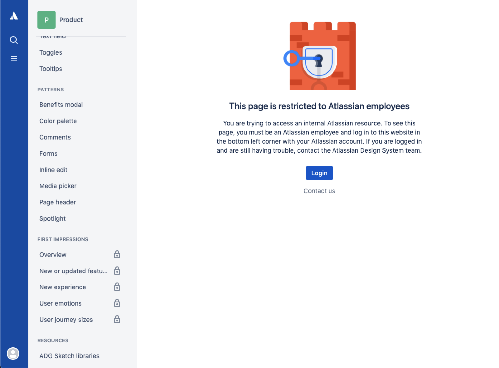
Oftentimes, it’s a living document that can be shared with the world with some limitations, like the example from Atlassian.design shown below:
Corporate-driven design systems
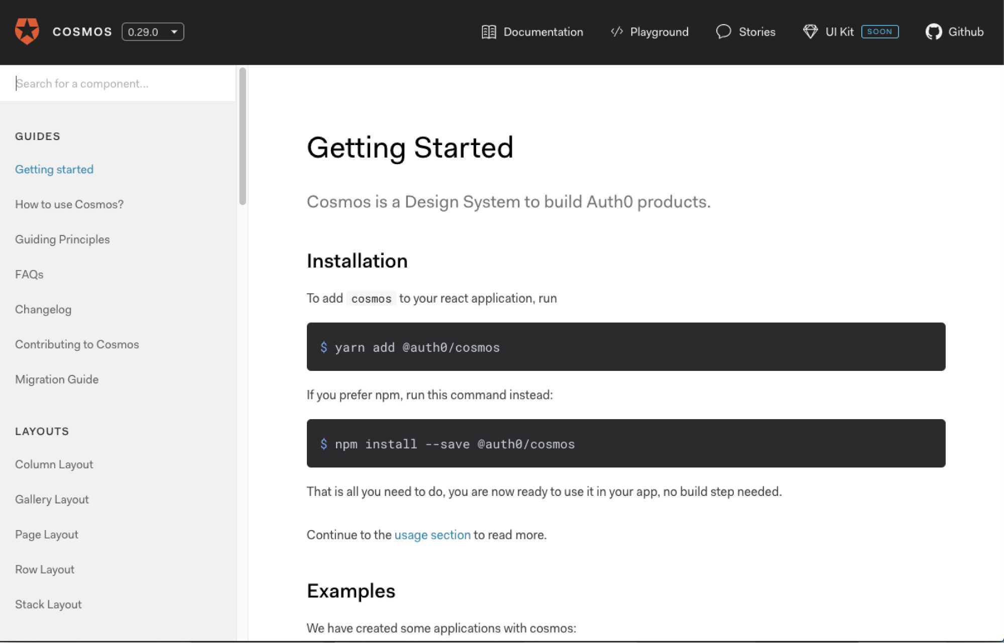
Some companies which publish their design systems online also display the information about the current version and its release history. The examples below illustrate the approach to this matter from Salesforce and Auth0.
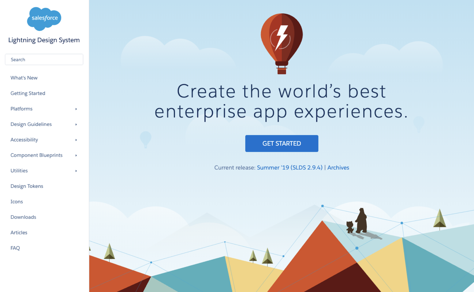
Source: https://www.lightningdesignsystem.co
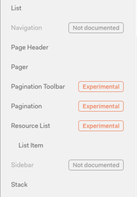
Auth0 also uses labeling for different stages of items in their design system. This helps users and creators distinguish between finished elements and those that are still in progress.
The takeaway
Organizations can't afford to ignore the benefits of having a design system. These industry trends are a component of best practices that will provide UI guidelines for design system creation across different industries. Even if your project is already up and running, it's a good idea to build a design system for it. If you follow best practices, design systems pay off in the long run. Developing strong UX standards and UX design systems are critical in thinking about how to create products that resonate with users.
Product managers and designers can end up spending considerable time coordinating with outside teams in trying to synthesize design consistency across software. This is why there’s a major shift towards a tool-agnostic approach. Services like Specify, for example, can give design system teams increased access to design tools and foster greater consistency.
Are you looking for a team of experts to help you set your foot in the design system territory? Get in touch with us – we create custom design systems for clients from various industries.

