Mobile Web Development: Creating Mobile-Friendly Sites


Surprisingly, many sites are still anchored in designs for desktop users – despite the fact that 55% of online traffic comes from mobile devices.
If your site merely “works” with other devices than desktop, then it’s not a mobile friendly website. Visitors won’t tolerate clunky experiences anymore.
What raises the stakes even higher is that Google has now fully switched to mobile-first indexing. This means that they’ll use the mobile version of your site to score and index it for SEO ranking.
What can you do to ensure a great experience for mobile devices? In this article, I discuss your options with their pros and cons.
Types of mobile friendly website solutions
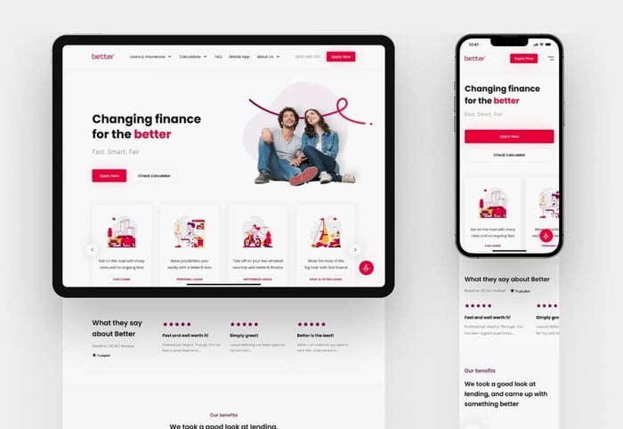
Responsive web design
Building mobile web sites with responsive design ensures that sites look good and work well on any typical device. Features that let you accomplish this include using flexible grids, layouts, and media queries.
Flexible grids use percentages of the screen space (not pixels or characters in length/width) to define their borders.
For example, it would apply a value of 33% to one block, and 66% to another, so that no matter what screen size it appears on, it remains visually consistent.
Meanwhile, media queries are conditional statements in CSS3 that apply different styles based on the screen's characteristics, i.e., width, resolution, or orientation. For example, “@media only screen and (max-width: 1024px) {...}” means that the styles inside the curly braces will apply when the screen width is 1024 pixels or less.
Advantages
- A single URL for desktop and mobile. This makes it much faster for search engine bots to index your pages, as they only need to crawl them once. Your site is also more “shareable” because its URL is not platform-dependent.
- It’s future-proof. Responsive sites should fit all possible screen resolutions, sizes, and orientations. This means that even brand-new devices will display the site the way you intended.
- Page load speed. Responsive web design promotes fast load time. If you work with an experienced mobile app development team, they’ll make sure to use this technical potential to its full advantage.
Disadvantages
- Takes more time. With responsive design, you need to think of all layouts beforehand, which can be time-consuming. Still, once you set up all the conditions, you’ll reduce the number of compatibility issues in the future.
- More upfront investment. This relates to the above. While costly, it pays off in the long run because you don’t need to constantly tweak your website to accommodate each new device/screen.
Dynamic serving
Dynamic servers determine what sort of device they’re dealing with and adjust what they serve to the screen. Each device will get different HTML and CSS packages and visitors will see different content.
Advantages
- Single URL. Like the responsive solution, you don’t need to redirect users to click a new link adjusted to their device.
- The server only sends out the responses and media files that are optimized per device. If your desktop-based site is ‘feature-heavy’, you can adjust the mobile version to be much more simple – and load faster.
Disadvantages
- User detection errors. This mobile website design method could misidentify a device and serve the wrong version of content. You need to manually add and update a list of potential screen types on the server. If it’s outdated, it can falsely recognize a device.
- Potential SEO ranking issues. Search bots need to index multiple pages of the same content. In the worst-case scenario, it can even put you in competition with yourself.
Separate mobile site
In this option, there is a completely different page and URL for the mobile site – “www.website.com” and “m.website.com”. This option is now the least popular.
Advantages
- Optimized specifically for mobile users. Before responsive design came into the picture, this mobile website design option provided the best user experience possible.
- Potentially easier to design and deploy, since it's independent of the desktop site.
Disadvantages
- Long-term complexity. You need to maintain two versions, m.website.com and website.com, which will increase maintenance costs.
- m.website.com offers less information value. That’s the reason why most of these mobile websites have a “Switch to Desktop Site” option (and also why companies are moving away from separate mobile pages). If you slim down your m.website.com site off certain features, it could prevent users from achieving their goals. This isn’t an experience people expect in the mid-2020s.
Key technical considerations for mobile optimization
Regardless of which mobile friendly website solution you choose, pay attention to the following:
Max-width and min-width properties
We’ve all been faced with websites on our smartphones where the text is too tiny to read. We zoom in until it’s readable, but then have to drag the image back and forth to read lines that are off each edge of the screen. That’s something appropriate width properties will prevent. ‘max-width’ keeps content from exceeding screen boundaries, while ‘min-width’ ensures it remains readable on smaller screens.
Hiding/delaying bulky elements
This is possible with a technique called “lazy loading”. It will only load images as the user scrolls down. It’s especially helpful for pages with lots of media content or long-scrolling pages, as it allows the browser to focus on what's currently visible.
You can also hide elements not suitable for mobile. Removing non-crucial assets and code segments from mobile view will speed up everything. But it’s up to you to determine which functions are ‘crucial’ and which aren’t. For example, a movie review site probably needs video capability, but an Etsy store doesn’t.
SEO and mobile optimization
Make sure you don’t exclude spiders (web-crawling bots from search engines) with the robot.txt file on your site. Your mobile pages need to be crawled, too, particularly since Google now prioritizes this aspect for its ranking.
Web development tools for mobile sites
There are two options to choose from — which is best depends on your website complexity and goals.
Option 1: DIY with tools and plugins
WordPress and other Content Management Systems provide plugins such as NitroPack or WP Touch. These tools automatically make your site friendlier for mobile devices, with very little guidance. They speed everything up by caching images, compressing them losslessly, using lazy-loading, etc.
Pros
- If you’re small and plan to stay that way, this solution can work well for you. They’re quick and easy-to-use, and keep the whole site simple, easing maintenance.
Cons
- In my opinion, websites targeting a wider audience, which treat their site as more than ‘just’ a portfolio, will find plugins insufficient. They’ll eventually need to go with a professional development service to make some custom mobile optimization adjustments.
Option 2: Professional development
Professional mobile app development is the way to go when building more complex sites.
Pros
- You get solutions tailored to your needs. Your mobile web app will work well with your other tools and integrate with your company systems. The team will make sure the site functions perfectly on each device type.
Cons
-
It requires significant development expertise and resources. That said, aside from maintenance, building a mobile friendly website is a one-time cost, with a good payback.
Examples of mobile friendly sites
Slack
Slack puts its best foot forward when it comes to user experience on every device. They don’t let the server auto-resize visual materials and animations. Those are core to their branding—so, they meticulously refashion these items.
They’re crafted to be virtually identical, but have the right size for each screen size.
[embed gif]
Slack also centralized their font sources and style-switching parameters. Altogether, this makes the site responsive, with admirable load times.
Swiss Air
This is a shining example that other travel services could look up to. The website has the ‘usual’ materials for travelers but when it switches to the mobile version, only essential elements remain at the top.

Users want ease-of-booking on mobile, equivalent to the desktop experience. Swiss Air has created a superior mobile UX that they can be proud of, retaining that essential functionality. The top-of-page material on desktop, like “Discover Swiss”, is moved further down the page, leaving just the most important options at the top.
Prioritizing the mobile view of website – the way to go
Today, having a mobile friendly website is no longer optional. Remember that Google now uses your mobile website to rank the entire site in search. So, whether you choose responsive design, dynamic serving, or another method, make sure that users have a satisfactory experience.
Investing in mobile optimization will result in higher engagement and long-term success for your website – and that means better ROI, too.