Flawless User Experience in Your M-Commerce App

How to keep them coming back for more? See how to leverage the potential of smartphones and achieve the ultimate user experience in your m-commerce app.
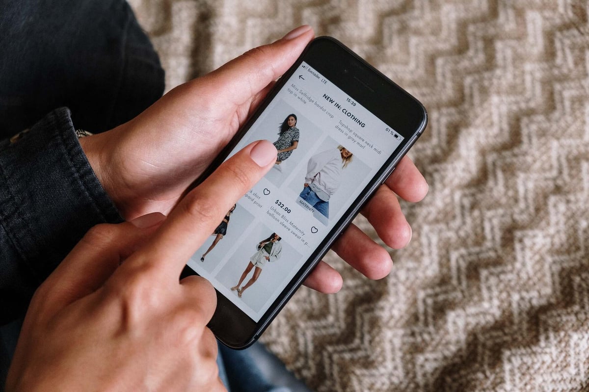
Ecommerce has taken a bold move toward the mobile ecosystem. Shopping mobile apps have become a common element of our lives, and enable us to buy things whenever and wherever we need them with just a few taps. But it’s not all unicorns and rainbows for the creators of such apps: designing an m-commerce experience that makes users feel safe and well-served requires exploring specific UX areas. In this post, you’ll learn about key elements that make or break the user experience in any m-commerce app.
Why m-commerce needs a flawless user experience
If you associate online shopping with e-commerce in general, it’s time to acknowledge the expanding sector of m-commerce (mobile commerce), which takes shopping to mobile apps and mobile-optimized websites. Big numbers leave no doubt: Statista’s research on e-commerce sales shows that the share of mobile-based consumers in commerce keeps growing each year.
During 2021’s Black Friday and Cyber Monday, global mobile traffic increased by over 90% compared to 2020. M-commerce has gained unprecedented traction and you definitely don’t want to ignore mobile visitors in your customer journey.
As many of our daily activities have moved from offline to online, Gen Z has led the next step of this change with their attachment to smartphones. This group of consumers self-describes as always connected and eager to do everything and anything using their mobile devices. Knowing this, you may think: if so many people love shopping with their mobile phones, where’s the problem? What’s so tricky about user experience in m-commerce apps?
Actually, there are quite a few issues, and they’re far from minor. For many customers, m-commerce has several drawbacks that prevent them from switching to mobile shopping. Forrester Research mentions the following:
- 51% of survey participants claim it's easier to make a purchase on a computer than on a mobile phone, which clearly indicated there’s still a lot to do in the field of user experience in m-commerce apps.
- 46% of participants simply stick to their habits – they’re more used to making purchases from a desktop computer than a mobile device.
- Customers are still wary of transaction security when it comes to shopping via mobile phone. 30% of them don’t feel safe using mobile payment services.
- 16% of participants make an insightful statement: mobile websites have different content, features, and functionality from their desktop counterparts, which results in confusion and complicates the shopping experience.
- Many customers mention various physical constraints that make them avoid shopping on mobile, such as slow internet connection, small screens, difficulty in printing a receipt, or data transfer limits.
This survey clearly shows there’s still a lot to be done in the field of mobile commerce to broaden the group of shoppers and create higher revenue opportunities for more businesses.
Benefits of following the m-commerce UX design tips
The presented data comes with an undeniable conclusion: m-commerce has become a business essential for online stores of any kind: single or multibrand. Embracing this trend will translate into tangible benefits both for companies and their consumers.
From a user’s perspective, a flawless user experience in an m-commerce app ensures they get what they need, quickly and efficiently, right at their fingertips. A thoroughly designed checkout process encourages their trust and diminishes the obstacles and stress connected with mobile shopping, as mentioned in the Forrester research.
Customer happiness connected with a flawlessly designed user experience will be visibly reflected in business performance. High usability will minimize the churn and attract more incoming customers looking for a convenient way to shop. Finally, an enjoyable and engaging mobile shopping app can boost the conversion rate and increase sales in this channel, adding up to total revenue.
How to make sure users feel comfortable with m-commerce
There are several crucial ways to make users feel comfortable with using mobile apps for shopping, including designing easy navigation and search experience, providing high security standards, and personalized shopping experience.
Provide easy navigation and search experiences
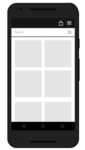
A properly designed mobile commerce product is one that feels familiar to the customer, even though they might be new to the experience. It’s critical to ensure that the user interface is consistent with its desktop counterpart.
In terms of navigation and search experience, consider this an omnichannel design challenge: the customer journey must feel seamless between desktop and mobile devices.
Another tricky part of designing a mobile commerce app is to adjust the interface to the physical differences consumers find discouraging when shopping on mobile. Make all adaptations with mobile usability in mind and consider different tools to achieve desired results: navigation, layouts, and UX writing.
 Source: UX Planet
Focus on security
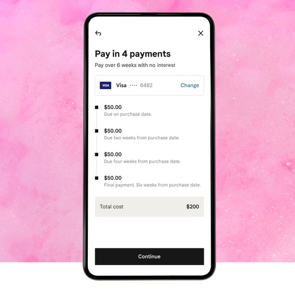
Customers can be wary of different security issues related to shopping with their smartphones, especially those involving sensitive data and payments. Paradoxically, cutting the checkout flow too short may feel “too easy” for users and result in churn. Always inform users of the level of security and ask for sensitive data gradually during the account registration process.
Explain why you need information such as a birthday (if you really need it) or other requested information that customers might find unexpected. Include a number of trusted payment options suitable for different locations and customer groups, which include both payment gateways (Stripe, PayPal) and installments (Klarna, AfterPay).

Source: Klarna
Personalize
Shopping on a mobile involves another significant factor that is harder to capture on desktop computers: the user’s personal attachment to their device. Smartphones are something more than just a tool to perform specific tasks, they act as daily companions in users’ life challenges, personal connections, and entertainment. The number of customization options makes each device unique from user to user.

Personalized user experience by Countr
Such an approach requires you to extend this one-of-a-kind experience across your m-commerce app as users will expect it. The impact of personalization translates straight into sales results – Epsilon research shows that as many as 80% of consumers are more likely to make a purchase when brands offer personalized experiences.
Your key challenge will be to accommodate personalized elements on a much smaller screen space than a desktop. For example, a user may see eight products at once in a web browser while only two products in a mobile app, which makes it even more important to show items relevant to that particular customer. It will give them a better impression of the store’s offer and indicate that they don’t have to spend more time and energy to get to what they are looking for.
 Product displaye on desktop versus mobile screen
Test! You shape their experience
With so many user experience factors to take into account, you don’t want to leave anything to your gut feeling. Without a proper check, you can never surely know what users will think or how they will react to any changes and novelties in your app. You can test your ideas in a number of ways:
- Conduct user interviews at different stages of the design process, both before and after the implementation. It will help you calibrate and prioritize the changes you can implement so that users – and the business, by proxy – will benefit most in the shortest period.
- Once you select and develop updates for your app, invite a selected group of users as beta testers to try things out and ask for feedback in return. It’s a quick and reliable way to learn about any bugs or gotchas and fixes before the big reveal.
- Releasing an update doesn’t mean that testing is over! Conduct continuous A/B tests to validate the updates and measure how they affect the churn, KPIs, and eventually, the revenue.
Optimize the UX design of your m-commerce app
People tend to be scared of changes and cautious of new technologies – that includes the growing market of mobile commerce. Customers are used to certain interactions and ways of receiving information, which they have been learning and using for years. As designers, we must take these habits under consideration and help users in accommodating the brand new world opening in front of them on a daily basis.
At the same time, we need to know where to draw the line or slow down with shaping the new ecosystem. With the right tools, personalization, and attention to your customers, you may find a key to both the change in the perception of these experiences and to the financial benefit of the product itself.


