Experts’ Take on the Most Common UX Mistakes: 9 Pitfalls You Should Avoid At All Cost

They may result in failed products, unhappy users, inefficient processes, or frustrated team members. We’ve asked four product design experts and leaders to talk about the most common and dangerous mistakes made in the process of UX design.
Here’s what they came up with.
- Designing experiences based on assumptions rather than real insights into the usage context, behavioral patterns, mental models or level of digital literacy in your user base.
- Underestimating the power of simple, minimalistic design and copy. Less can be more.
- Not being purposeful enough in making design decisions.
- Jumping straight to design screens - and skipping important steps of the design process.
- Neglecting good communication and failing to involve the team and stakeholders in designing solutions.
- Failing to define the problem and thus solving the wrong one.
- Remaining too passive - waiting for requirements instead of asking questions and not asking for feedback.
- Neglecting your education and growth.
- Forgetting about the key aspect of design excellence: end user convenience.
As you can see, there’s no shortage of mistakes UX designers often make - even the experienced ones. To understand why these issues are so important and to learn how best to avoid them, let’s take a closer look at the advice of experts from Zeitgold, TransferWise, Nubank and Deutsche Bank.
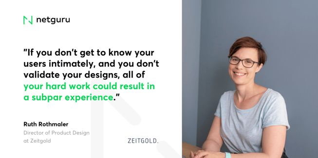
Ruth Rothmaler, Director of Product Design at Zeitgold
So much in UX starts going sideways when you design an experience based on assumptions rather than real insights into the usage context, behavioral patterns, mental models or level of digital literacy in your user base.
If you don’t get to know your users intimately, and you don’t validate your designs, all of your hard work could result in a subpar experience. If you start looking, there are countless examples of this. You’ll find products designed in a vacuum rather than with a real usage context in mind, like those security doors in an office building where everyone carries around a laptop and a coffee cup - but the door knobs are so slippery that you need to use two hands to open the door.

Or you’ll see users having to uncomfortably bend sideways when using a portrait-only app because their tablet sits in landscape mode on their countertop stand to accommodate its main purpose, running a POS system.
You might encounter a search experience that ignores basic search behavior reliant on alphabetical order and instead sorts 50+ filter options by usage frequency to optimize for conversion - which results in a very painful experience for anyone who looks for something beyond the top 5.
Maybe you yourself have spent countless hours working on a powerful new filter that your users simply don’t use, only to find out months later that they just don’t understand the filter label, which had made perfect sense to everyone on the team.
Or you might have built a beautiful minimal interface that’s a pleasure to use for digital natives and techies like yourself, only to realize that a significant subset of your customers needs way more guidance to complete simple tasks.
Much of this can be avoided by getting out of that comfortable office chair, venturing into the world of our users, and getting to know them - one cringeworthy, eye-opening, assumption-crushing session at a time.
Patrick Rawat, Product Owner at TransferWise
The most common UX design mistake is underestimating the power of simple design and copywriting principles. Although we are often tempted to give or show users everything, the saying 'less is more' is often true in UX design.

We can influence customer behaviour with design decisions. The following three questions help my team not overdesign (or wrongly design) a solution:
- What's the real problem we're trying to solve? And what are the nice-to-haves? This question is a cliche in the product world, but it is so important. It's easy to lose track of what we're trying to achieve and get sidetracked.
- What's the worst outcome our design could have? Map out all the potential unhappy paths before testing. This could be both an unhappy experience for the end user or an unwanted behaviour from the business perspective (e.g., less traffic to a specific page or product).
- What are our pass/fail metrics? Ensure you have a strong understanding around what the before/after results are and that they are statistically significant. Tracking potentially negative changes is fundamental, too.
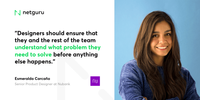
Esmeralda Carcaño, Senior Product Designer at Nubank
In my opinion, the most common mistake is jumping straight to design screens. Many designers, especially the more junior ones, tend to receive a requirement and almost immediately start sketching screens. Sketching ideas is perfectly fine, but not as the first step of a design process. Designers should ensure that they and the rest of the team understand what problem they need to solve before anything else happens.

Failing to collaborate with other teams is another big one. This is something that I’ve seen even with experienced designers.
Many designers start gathering information at the beginning of their process, but it soon becomes a black box that other teams don’t understand. This gives the impression that designers just need to wait for a magical moment when inspiration arrives to deliver a solution. To avoid it, we should be humble enough to admit we don’t know all the answers, and that we need help.
We need the entire team to arrive at a solution. Talk to your colleagues, ask them for their opinion, and co-create with them. People love to feel heard and you’ll learn a lot from other disciplines. It’s a win-win situation!
Then there’s the lack of communication. Some designers struggle to show the importance of a good design framework, which leads to constant conflicts with other teams due to the lack of understanding of what a designer does. While this depends on the company’s UX maturity level, designers should participate in every project from the very beginning - and others should understand why.
In companies that don’t have a high maturity level, this could be challenging, but not impossible to achieve. The key is to give visibility to your process, invite other teams to user interviews, and practice your public speaking so you’ll be able to present the results of a project to the entire company.
This can also help you win allies and new user advocates!
Another big mistake is failing to define the problem or not digging deep enough into it. Some designers receive requirements and then deliver a solution without taking the time to really think about it. Remember, “there is nothing worse than solving the wrong problem”. To avoid doing so, question everything. The idea is not to know all the answers, but rather to build team alignment and make decisions together along the way.
Some basic questions to get you started are:
- What is the problem?
- How do we know this is a problem?
- What does success look like?
- How are we going to measure success?
Designers should be the right hands of decision-makers. If they are, it’s only a matter of time before they start proactively contributing to the company roadmap instead of passively waiting for defined requirements.
It’s also too easy to neglect to ask for feedback. If you are not sure about your proposals or the way you are solving a problem, ask others for their opinions. Remember that it is better to get feedback in the early stages of a project than after you’ve developed a whole proposal. You are not supposed to know everything, so don’t be afraid of asking for feedback and providing it.
Last but not least, keeping up to date and studying the basics are mandatory. I’ve seen many experienced designers that forget basic usability principles or basic visual design stuff. I’m not saying that designers should aim to be unicorns, but they should keep up a continuous learning attitude that makes them aware of their strengths and allows them to spot opportunity areas.
Sha Nawaz, Client Experience Product Owner | Wealth Management (VP) at Deutsche Bank
Design is a subset of creativity. All creations - movies, apps, buildings, cars, nature - have one aspect in common that makes their design excellent: simplicity and convenience for the end users. UX design is no different. In our zeal to come up with a superior design, we often forget who our target audience is.

I often find UX design mistakes that fall in the bracket of what I call 'The Unwanted 3 Cs’ - Complex, Cryptic, and (un)Cool.
- Complex - the design has too many distractions or calls to action, multiple journeys or workflows that achieve the same thing, and ends up confusing the end user.
- Cryptic - designers often end up designing a system for themselves and not for the end users, resulting in obscurity and too much jargon.
- (un)Cool - designers want to keep end users up to date with the latest trends and technologies, so they offer “cool” features which are unwanted or simply uncool.
Whether you’re a UX designer at the beginning of your career or a professional with many projects under your belt, the mistakes mentioned above are sometimes easy to make. To avoid them, you need to remember the lessons shared by Ruth, Patrick, Esmeralda and Sha: design for your end users, be proactive, and depend on your team when you need to. If you think of any other common UX design mistakes you’ve seen, let us know in the comments!


