App Development and VR Technology to Experience Real Estate on Mars

Scientists claim that in about 50 years we’ll have colonized the Red Planet. Sounds impossible? It’s not just a vision.
We still believe the best is yet to come.
Project genesis
One day we started thinking – what if there was an app that allowed users to book or buy real estate in space? What if there was an opportunity to rent a space house and experience the interiors of the next generations using VR technology?
Last but not least – how can we prepare the interface and all the interactions to look visually futuristic while keeping them implementable at the same time?
First steps of the design process
To lay the foundation for a successful project, we first uncovered the project’s boundaries, the measures of success, and the feasible solutions to address user needs.
The project scope included desk research, moderate branding, 3D modeling and rendering, user interactions, interaction design, and technical documentation.
Once we had defined the problem, we spent time researching and choosing tools, specifying the list of features, planning remote work, and managing responsibilities.

Bringing our ideas to life
Based on the project’s scope, we then focused our efforts on the activities that would create the most impact on the MVP: branding, 3D modeling, copywriting, and UI design.
Branding
When working on branding, we strived to find the most suitable features and values that would fit the product prospective target personas. Based on our research on potential competitors in the real estate market, we ideated naming which we wanted to be personally attached to.
Having defined our main objectives and a name, we developed a moderate yet meaningful brand design suited for our unique experience.
User flow maps
Among the many possible screens and states of the product, we decided to pick those allowing us to experiment with the newest technologies. The MVP version of our concept was mainly focused around features allowing users to immerse themselves in the 3D experience.
Wireframes
Surprisingly, the biggest difficulty we encountered while working on the wireframes was lack of content. Products that aim to represent futuristic visions should be approached holistically, which means that the whole interactive environment should be enriched with the right copy written in an on-brand voice. To fulfill those requirements, we created wireframes based on our research and imagination.
User interface
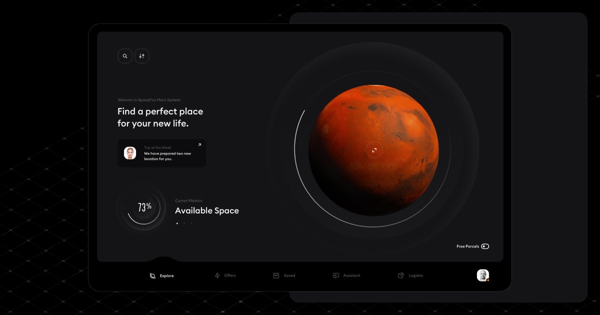
Due to the nature of the universe and its natural color palette, we decided to lay out the app in a dark theme. Moreover, there is a reason why Mars is called the red planet, so a dark palette seemed to be a better choice than a light one, which would have made too strong a contrast with red hues, possibly resulting in eye strain.
Mysterious darkness builds the right atmosphere, allows the users to focus on the high-quality 3D models, as well as enables us to design impressive, light-inspired animations and microinteractions.

Lessons learned
Thanks to this internal project, our team was able to step back and see their work with new eyes. We improved our remote work process which was more challenging than expected as each of us took care of different parts of the project while treating the whole concept as a side initiative.
We learned a lot about 3D environments, tools, interactions, and tech integrations.
More importantly, straddling the border between creativity and product design allowed us to look at our craft from a new, unknown perspective. This only strengthened our belief that the best is yet to come.
