UX/UI Design and Prototyping for a Green Energy Sharing Platform

Contents
Storing energy poses challenges. It often requires batteries which are expensive and can have negative environmental impacts throughout their lifecycle – from production to use and disposal.
Salzburg, an Austrian greentech company, company came up with an idea for a platform that enables sharing the excess of energy within the community, instead of storing it.
The platform users – consumers who drive demand by purchasing and using energy from a variety of sources would be able to buy green energy from Prosumers, who produce their own energy, typically through the use of renewable sources such as solar PV.
Salzburg AG decided to bring this idea to life with our help.
How we approached this project
The project began with branding workshops to define the brand identity, archetype, brand and communication guidelines, and tone of voice. To make sure that the brand identification and final product would be in line with the target audience, our team conducted field and UX research. That helped us understand how users use and interact with the energy-sharing platform.
Based on the workshop and results from the research, we mapped out high-fidelity wireframes with necessary components and layout requirements. Only then did the UI designers focus on the visual side of the platform to create one cohesive prototype.
We focused on precision, from the aesthetically pleasing design to the pixel-perfect interface and thoughtful use of motion. Finally, we tested the design with real users to validate that the final product is intuitive and meets user needs.

Design phases included:
- Branding workshops
- Field and UX Research
- Wireframing
- IxD design and prototyping
- Creating illustrations
- User testing
Final result: a clean energy digital center
Visual excellence
The key to our visual language was to convey the energetic excitement and combine it with the calming notions of a dark interface. Overall, it has a formal and minimal look and feel, supported by “diodic” accents. It uses physical imaginary elements to add the notion of the hardware within the user experience. One of the key ingredients to achieving this was the illustration set, which neatly fitted into the layout.
Essential features and good UX
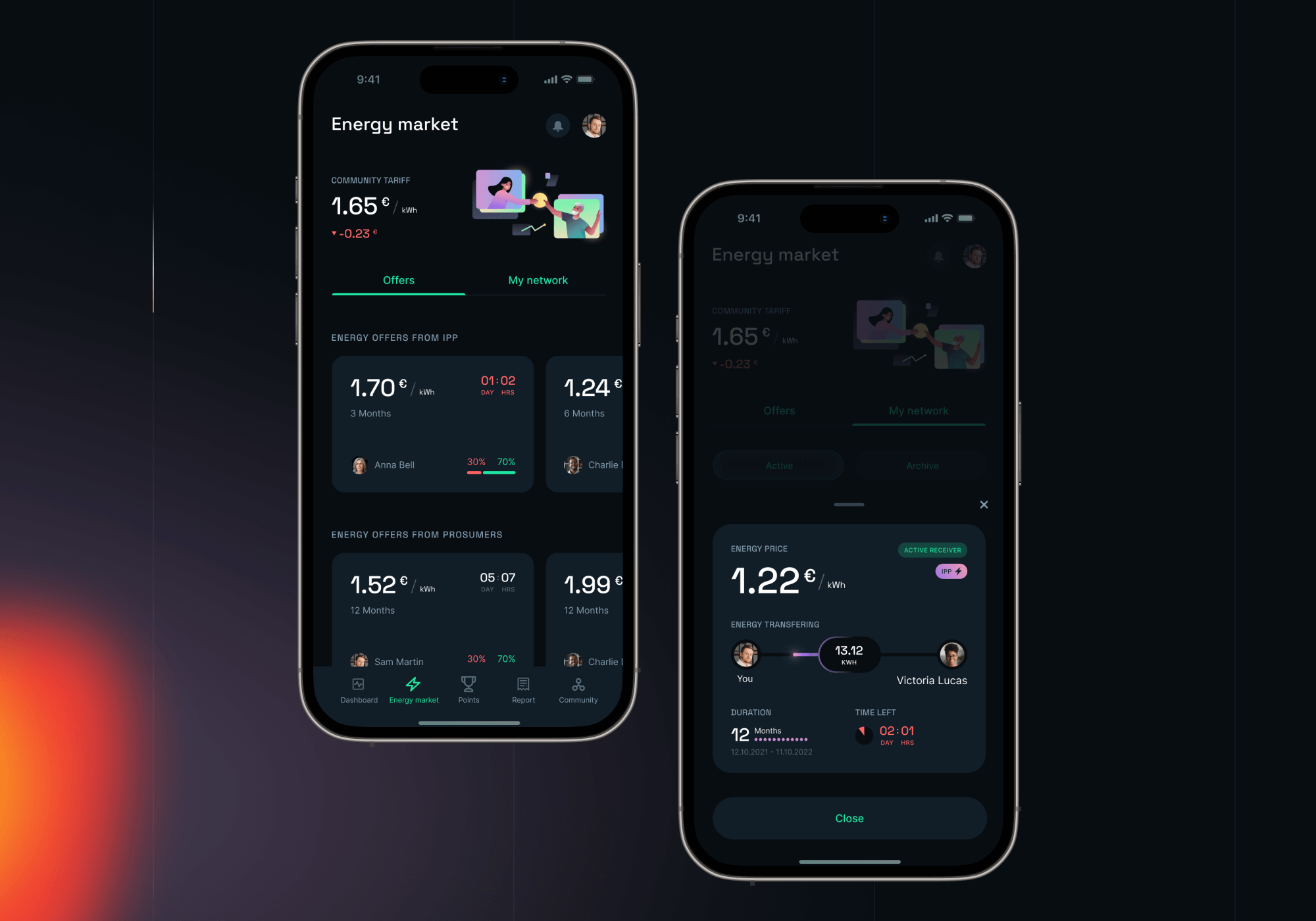
Energy market and energy offers
The main app feature is intuitive and adjusted to user needs. It allows contractors to participate in the energy market by sharing, trading, or giving away surplus energy. It also plays a crucial role in raising their awareness of how energy is consumed by individuals and how important the transition to renewable energy is.
Prosumers can create and manage “Energy Offers” to sell excess energy generated from their solar PV systems to consumers. They can set prices, specify the amount of energy for sale, and manage the offer's terms.
To participate in the community, prosumers must first install a special device. After a simple digital setup, prosumers can start sharing or trading their surplus energy.
Advanced energy usage reports
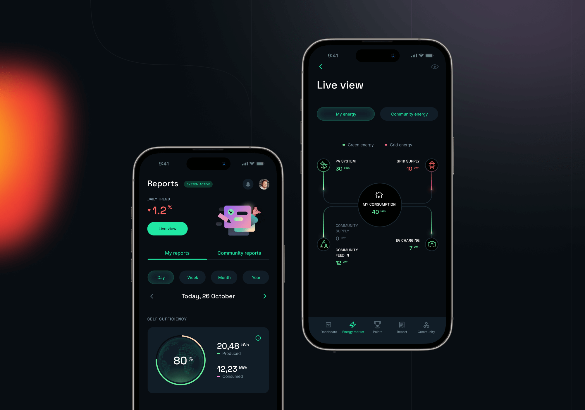
The Energy and Finance reports are key components of the platform and provide real-time insights for individual prosumers and consumers on their energy usage. They also enable members to see how energy flows within their household and also how it’s distributed across the whole community.
CO2 savings achieved by prosumers are also highlighted, helping members to understand the positive impact they are making on the environment.
The reports also offer a clear picture of self-sufficiency, giving prosumers insights into how much of their energy needs are being met by their own solar PV systems.

Additional features
Personal data and household management
User profiles are designed to make it easy for the members of the energy-sharing community to manage their personal data, household information, and financial transactions.
While designing user profiles, we put a strong emphasis on privacy to give users peace of mind that their personal information is kept safe and secure. The app setup process was also designed with maximum focus on the user experience – we optimized it to reduce hassle with minimal steps. This allows contractors to finish the setup quicker and discover basic features before the lengthy verification process.
The billing section within the household management feature provides an option to seamlessly manage financial transactions on the platform with features like payment processing, billing history, and multiple payment options.
Cross-platform compatibility
We tailored our designs to work seamlessly across all devices, ensuring effortless transitions from desktop to mobile. Users can start a process on one device and pick up exactly where they left off on another.