Improving UX Through Designing Automations in the Careem Super App
Careem was looking to improve the user experience of their Captains (what the company calls their drivers and delivery fleets). Netguru provided expertise in product design, offering solutions to reduce the time and manual effort spent by users and Careem’s teams while handling profile update requests. To achieve our goal, we focused on automating several stages of the update process.

Established in 2012, Careem began as a ride-hailing company based in Dubai. Its business gradually evolved into a super app providing vertical services like transportation, deliveries, and payment methods.
Careem became the leader in the region and, in 2020, was acquired by Uber. Currently, Careem operates in over 100 cities across 14 countries and has 48 million users.Implementing app-wide automation
Careem observed that its operations team was preoccupied with managing update requests and wanted to implement more efficient methods of handling them.
Careem’s drivers (their “Captains”) sent requests to the operations team when they wanted to change personal data like their profile picture, phone number, or the city they operate in. In the existing workflow, employees manually handled matters that could have been completed automatically.
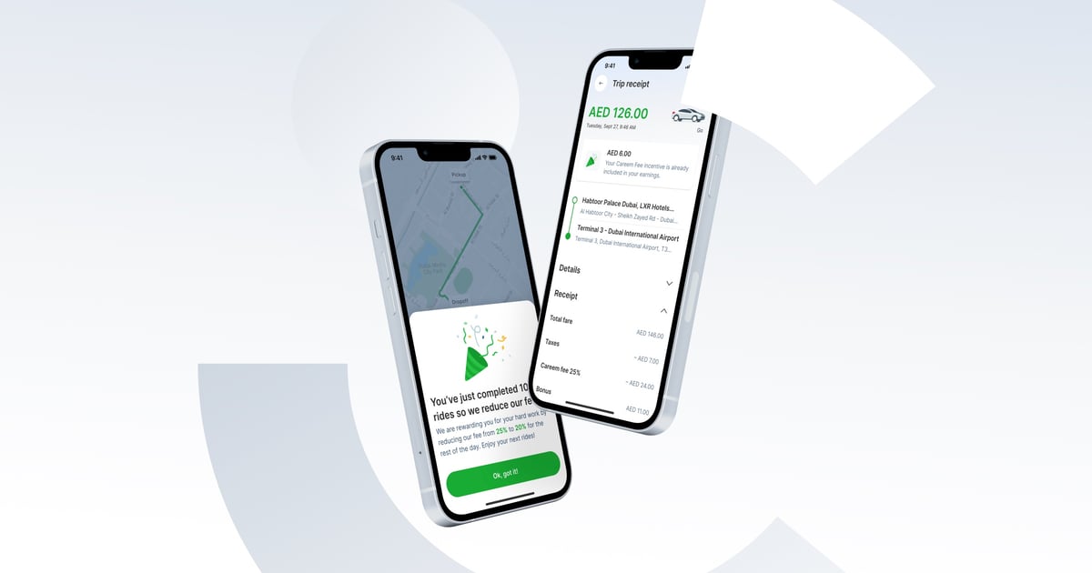
The client was also looking for an improvement in its ride receipt design as Captains misunderstood commissions and fees deducted from their earnings.
Netguru analyzed the existing processes, identified pain points, and provided expertise in product design. We then introduced improvements in several features of the app.
By implementing them, Careem can free up the financial and human resources absorbed by the existing workflow.
Identifying the client’s needs
The project's primary goal was to reduce the operations team's involvement in profile update processes to zero. This would also result in reducing the care costs related to those requests.
The secondary success metric was decreasing the number of hours Captains spend on the app update process, thus, increasing their time spent driving and serving customers.
Three key challenges
We located several areas for improvement within the app.
- The negative impact of manually operated requests. These cause a loss of time, negatively influencing the company's budget. We estimated that account unblocking alone caused a loss of around 100 hours per month per market, and the update requests cost around 300 to 700 hours per month per market. Changes to personal data were approximately 33% of all requests made by Captains in the Saudi Arabian market only.
- Complex, time-consuming update procedures. Captains had to visit a Careem branch or send emails to update their profile data or upload documents. Data updates required the operations team to confirm new information and manually update it within the Captain’s profile.
Unclear receipt design. At the end of each trip, Captains received a ride receipt with details of the trip along with the fees and their final earnings. Most of the Captains misunderstood the deductions
Our approach and solutions
Netguru divided the automation plan into two main stages:
- Identifying pain points in the user journeys of Captains and the operations team.
- Creating new user flows that align with the automated processes and evaluating this with user testing.
In the first stage, we conducted user research, including interviews with Captains and key team members at Careem.
In the next stage of the process, we created new UI designs for the profile page. We also prepared a new flow for managing the user's phone number and updating their profile picture with the implementation of a facial recognition feature.
Simultaneously, Netguru worked on improving the ride receipt design. Careem is gradually introducing the new receipt to the Captains. We evaluated our work with usability testing, conducting three sessions with 6-8 users each. Thanks to this, we collected important user feedback that enabled us to improve the app's user experience.

Results and key takeaways
- The client received an in-depth study of their manual model and its key business and design challenges.
- Implementation of the new user flows that automate profile changes and facilitate the operations team’s work, allowing them to save time. This, in turn, improves the team’s productivity and profitability.
- Captains can now change their city of operation without sending manual requests.
- The client is still implementing other recommendations step by step.


.png?width=1200&height=630&name=Polpharma%20CS%20hero%20image%20(1).png)


