A Website for a German Crypto Startup
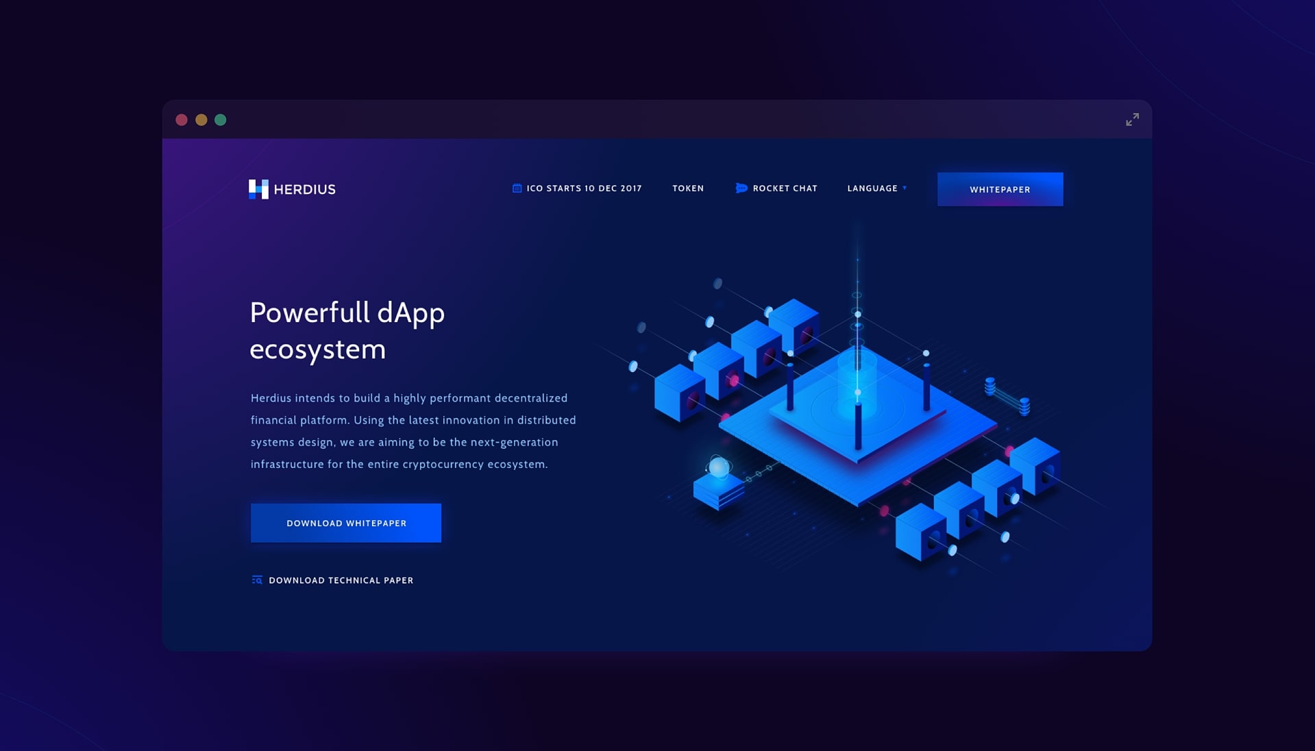
Herdius goal was to build a highly performant decentralised financial platform. They strived to be the next-generation infrastructure for the cryptocurrency and blockchain ecosystem. The client to Netguru to build a landing page for the upcoming project . The main goal was to transform a lengthy white paper into a convincing and to-the-point narrative. We launched the website in 3 weeks.

More companies are deciding to fund their business ideas using ICO tokens, and Herdius is one of them.
The Berlin-based startup has chosen to raise capital through an ICO as a promising alternative to traditional venture capital funding. They needed to find a way to attract and convince investors to their idea.
Herdius aims at building a highly performant decentralised financial platform. Using the latest innovations in distributed systems design, they strive to be the next-generation infrastructure for the cryptocurrency and blockchain ecosystem. Herdius will sit between the users and the root blockchains of all relevant cryptocurrencies (or tokens). In blockchain terminology, it is essentially envisioned as a sidechain.

Balzas Deme, the founder of Herdius, turned to Netguru for help in building a landing page for the upcoming project . The main goal was to transform a lengthy and unwelcoming white paper into a convincing and to-the-point narrative. The Product Design Team leveraged many design elements to evoke emotions and the right feel of the project.

User segmentation
We segmented users into two target groups of potential investors: emotional and rational.
Emotional users have most likely just started their exciting journey with digital currencies. They accept the fact that it’s nearly impossible for them to get all the necessary knowledge to invest fully consciously. Instead, they tend to rely on their gut, or rather the visceral part of the brain. These guys are buying a vision, mostly with their eyes and not data alone.
The other group are experienced players. They dig deeper – most of them have already made their investment. Rational users tend to invest their money based on numbers and facts. They feel comfortable with graphs, timelines, and white papers. These guys are picky, checking the investment very precisely.

Design that evokes emotions
How to provide all this content and stay out of the common basket? Appeal to the logic? We should, eventually, but who‘s going to read your 20-page-long white paper without any guarantee you’re not just fraud? Since information architecture wasn’t exactly an area for creativity to burst, we needed to use other assets to spark the right mood.
Design has many super powers. One of them is the ability to evoke feelings in people. We thought that if people are going to believe in Herdius, we must instil trust and curiosity them. We spent hours discussing the Herdius idea with its founder , Balazs Deme. Their core values like decentralised application ecosystem and multi-level blockchain platform didn’t strike me as particularly exciting. Instead of trying to force words onto users, we decided to translate these into visuals.

Illustrations
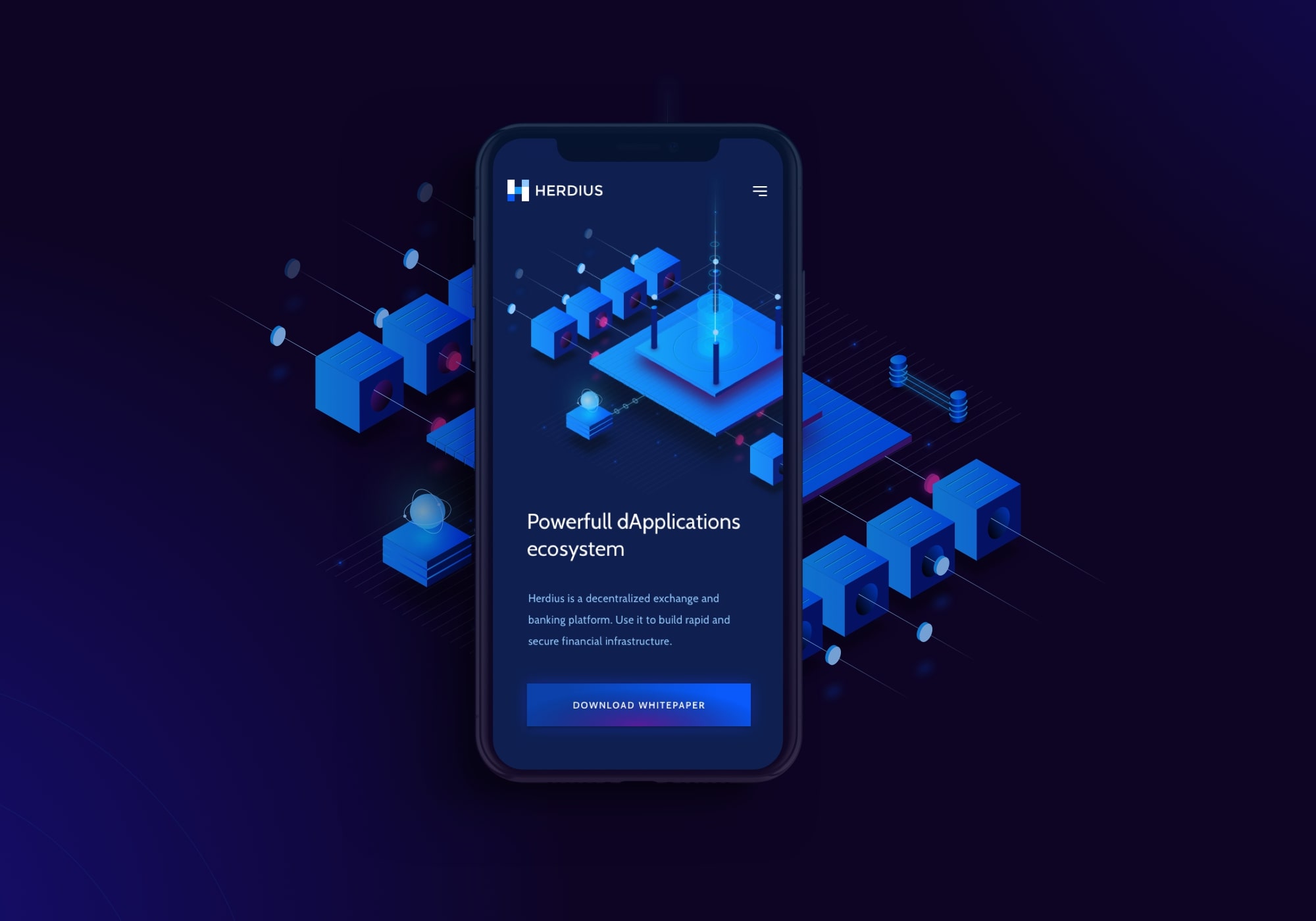
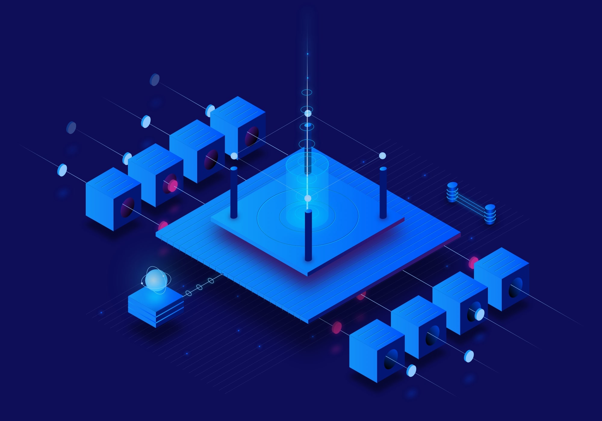
We needed to showcase nodes, connections, energy flow, and some hardware. Isometry is the direction we chose, because it’s precise and looks techy. Sketching core concepts such as platforms and transactions resulted with some basic shapes.
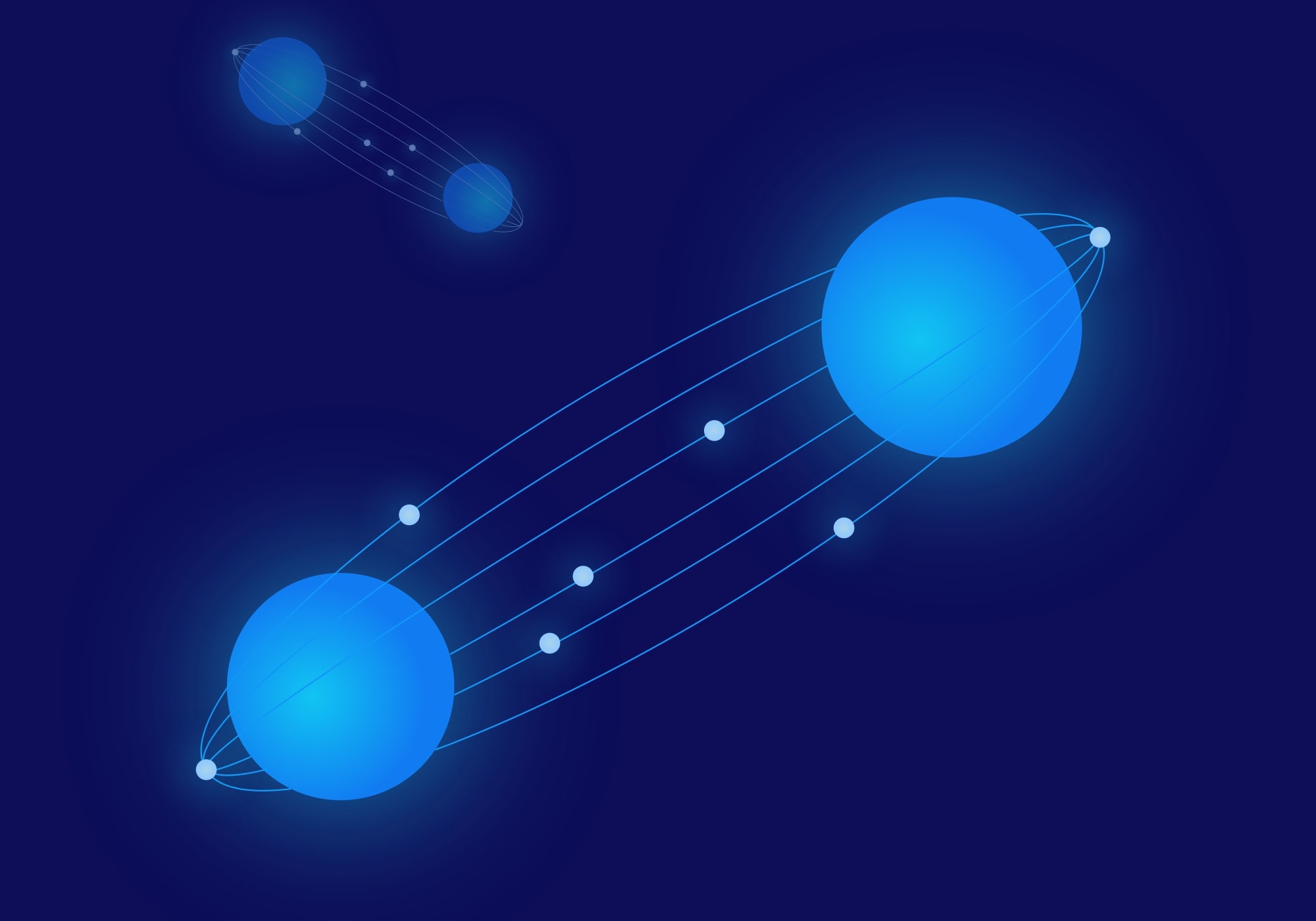
Adding values one by one – cryptocurrency, decentralisation, scalability – brought complex illustrations to life. It was possible only by understanding the complexity of the system and its constituent parts. Placed next to headings, illustrations make the message and the verbal descriptions clearer.
We agreed that illustrations can only picture the ideas. It’s nearly impossible to illustrate a scalable backend infrastructure. What we could do instead was to showcase something the user would know and understand – a multilayer object combined with some analytic-looking charts. Easy. It doesn’t exactly cover the field, but it evokes a mood, and this is what we wanted.

Results?
Thanks to the cooperation between two designers and one front-end developer, we managed to launch the website in 3 intense weeks. ICO is now live, and you can check it out at Herdius.com.
If you want to see more design by us, visit our Behance profile or find us on Dribbble.

%202018-12-11%2015-49-06.png?width=65&height=65&name=Sucheta%20Aleksander%201.jpg%20(760%C3%971140)%202018-12-11%2015-49-06.png)
