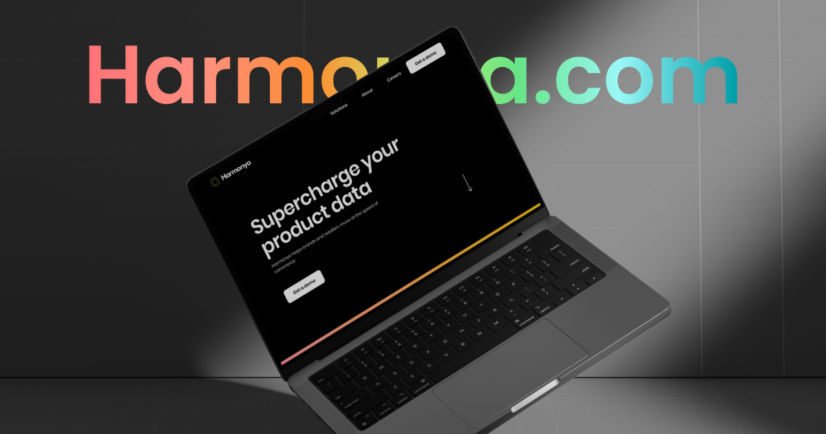
Custom Design and Implementation of Scalable Webflow Site for Harmonya
Harmonya is a startup that’s revolutionizing the way product data is used in the consumer retail industry. To showcase their vision and brand, they needed a custom-designed website to be implemented in a scalable and editable environment.

A US-Israeli startup from Team 8 Venture Capital, Harmonya, provides a suite of applications for manufacturers and retailers, leveraging product data, machine learning, and AI to generate insights into consumer behaviors and product trends that are not represented in other tools.
Kick-off
Harmonya offers an innovative product in an industry with plenty of competitors, so it was critical to make their web presence stand out with cutting-edge design and blazingly fast performance.
After gaining a deep understanding of the product, brand, and users, we could move on to tackle the technical and aesthetic challenges of this project:
- Defining user personas for the project
- Preparing a clean, modern design in line with the brand and product vision
- Implementing and deploying a fluid and responsive website in a Webflow environment
- Leveraging the native Webflow CMS for editability and easy addition of new job listings

A website that represents Harmonya’s mission
The goal was to make Harmonya’s new site fast, aesthetic, and representative of their innovative, future-ready character.
To achieve this, we prepared the whole design and site architecture from the ground up.
Web architecture and design
Defining the sitemap and preparing content architecture was one of the priorities to get an idea of the structure of the pages. Wireframing helped us determine the length of the copy and confirm that the site will be user-friendly. We utilize a monochromatic color palette and interactive gradient for the micro animations.
Bespoke graphics
The final style and illustrations were shaped by the client’s feedback and the illustrator’s expertise. They reflect the elegant, minimalistic look of the brand and explain the complex concepts in an easy way. Adding unique icons helped us create a more holistic user experience. We designed them with maximum readability for fast and easy scanning.
Design solution
To emphasize harmony, we’ve based the design on a grid layout and used typography as the main message vehicle.

Webflow implementation
We implemented a fluid and responsive website with a CMS, multiple third-party integrations, as well as micro-interactions and custom animations. We added advanced filtering to simplify the process of browsing job listings on the “Careers” page.
Thanks to using Webflow, we were able to greatly reduce the time usually spent on development and deliver the full functionality quickly and efficiently.
CMS implementation
The careers page and job listing are based on the Content Management System, so adding or updating new items takes no longer than a few minutes.
Style guide
We’ve collected all of the most important elements – HTML tags, global classes, colors, etc. – in the style guide. This way, the client can easily change them in the future.
3rd party integrations
There are two integrations on the site. A Hubspot form gathers sales leads, and a Comeet form on the job listing pages helps candidates apply with ease.
Results
- Unique web design that fits Harmonya’s brand
- Complete style guide, bespoke graphics, custom web architecture
- Fully functional, scalable, easily editable website implemented in the Webflow environment