Seamless User Interface for the PAYBACK Customer Loyalty Apps

With integration into many popular payment methods, users can accumulate points through online and brick-and-mortar purchases. These are then turned into discounts and other rewards from among hundreds of participating partners.
For its millions of active users, PAYBACK offers value in giving wide choices in where to redeem rewards. Partners can take advantage of a sophisticated multichannel marketing system to create offers that build loyalty with new and existing customers.
The main conduit for customers are the PAYBACK mobile and web applications. These serve as the main hub for reward redemption and are where partners can showcase offers that may be the beginning of a new customer relationship.
Synthesizing a complex system
PAYBACK has created a powerful platform with considerable complexity in the application architecture and presentation layer.
While that is a great strength for partners, the Polish branch of the company wanted to synthesize the interface so the diverse features and resources were offered in a simpler, full-stack solution so customers would experience less friction when navigating the mobile and web applications.
There were specific challenges that PAYBACK sought to resolve in its cooperation with Netguru:
- Bring clarity to the interconnection of the loyalty program scheme and application architecture.
- Redesign the mobile and web applications for simpler navigation.
- Update the PAYBACK visual content to best align with the company’s corporate identity guidelines.
- Build geolocation solutions into the mobile platform to provide additional value for partners.
.jpg?width=2000&name=Case%20study%20image%20Payback%201%20(1).jpg)
The challenges
Netguru and PAYBACK conducted a joint design sprint to identify the technical challenges and discover where we could make the most impact on solutions within the allotted budget. Through our cooperative work, we recommended how PAYBACK could synthesize the customer experience through improved design and features.
Our wireframes identified the vision we had for their apps and what improvements could result in a more pleasant customer experience. After spending time with the PAYBACK team and evaluating the results from our shared design sprint, we developed a concrete plan to execute on redesigning the web and mobile applications.
Our work touched on many key attributes of the solution:
- Addressing the inconsistencies and weak spots that we uncovered through a comprehensive dive into the platform by proposing clearer design and UI.
- Redesigning the PAYBACK applications’ architecture.
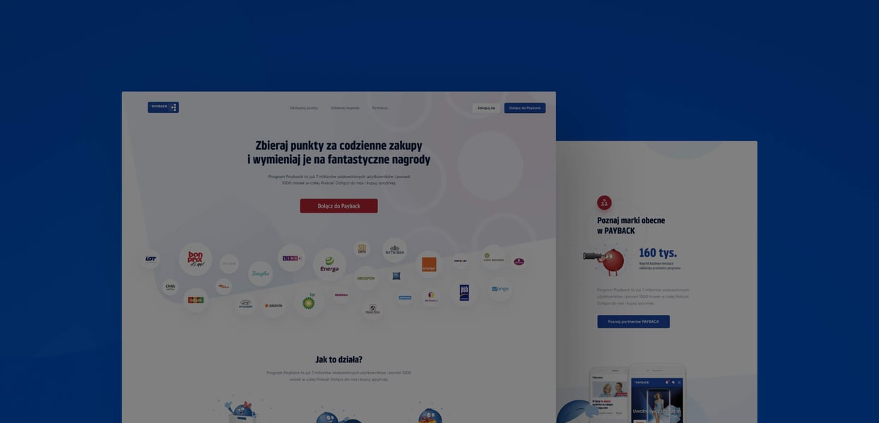
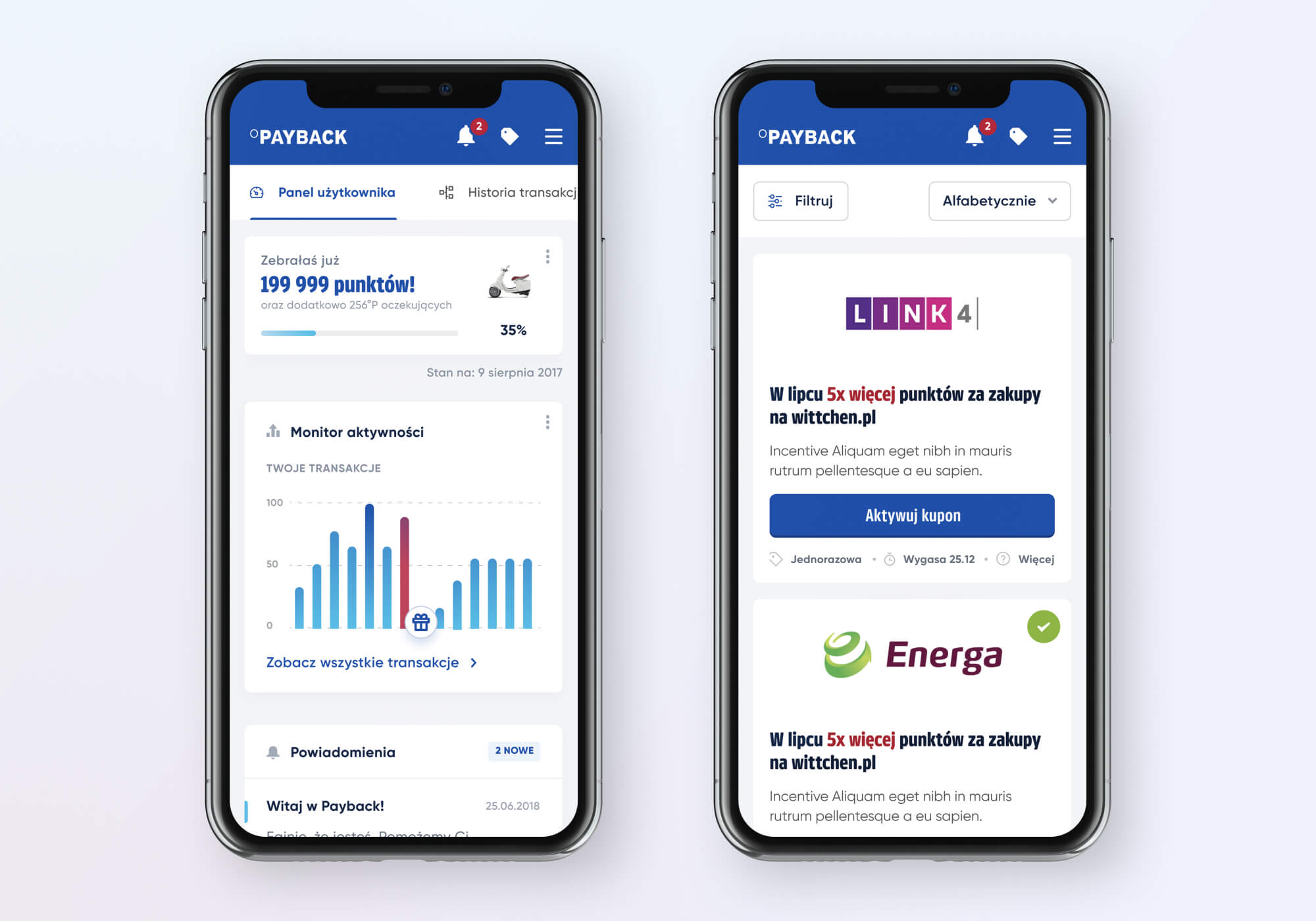
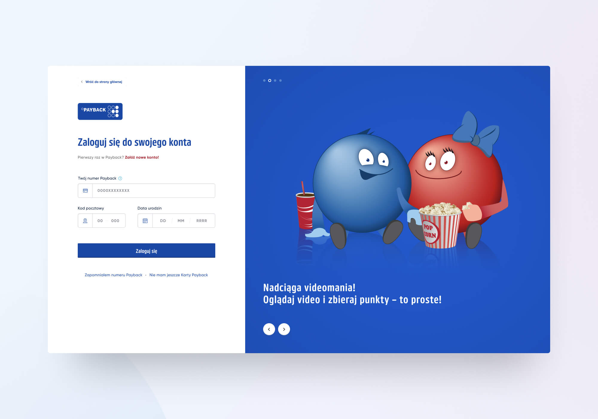
- By modernizing and unifying more than 120 applications’ visual screens, the PAYBACK apps are now simpler to use for customers with clearer access to essential features.
- We built in new geolocation features at key touch points throughout the system.
- We created new educational content to help users take advantage of the options within the platform.

Cooperation between PAYBACK and Netguru
Netguru worked with PAYBACK over a six-month period, collaborating on these features and ensuring we delivered a product that would meet their needs. We identified a number of challenges at the beginning to best formulate bespoke solutions for the betterment of their services.
The PAYBACK website gets nearly 700,000 visits per year, so any design changes had to be made carefully so as not to negatively impact the user experience.
In unifying the many visual screens, it was imperative that we build a consistent system that would help users find the information they need without getting overwhelmed or taken in the wrong direction during navigation.
All work was done in consultation with the company’s branding guidelines, so the final applications were consistent and created a sense of harmony throughout the mobile and web versions.

Delivering a consistent digital product
Crafting beautiful and usable digital solutions is always the end goal when we work with a client. With this project with PAYBACK, Netguru delivered a comprehensive redesign for the company’s web and mobile applications within the approved budget.
The PAYBACK team has provided positive feedback as the new design has been a major enhancement for customers and improved usability.
After our initial cooperation with PAYBACK, we worked on two additional projects to take the next steps with other goals for the service. As the platform continues to grow, the enhanced user experience can serve as a catalyst for customer satisfaction and drive further value for PAYBACK partners.


-2.jpg?width=415&height=415)