Transforming the UX Design of a Rising Fintech Star in Mexico
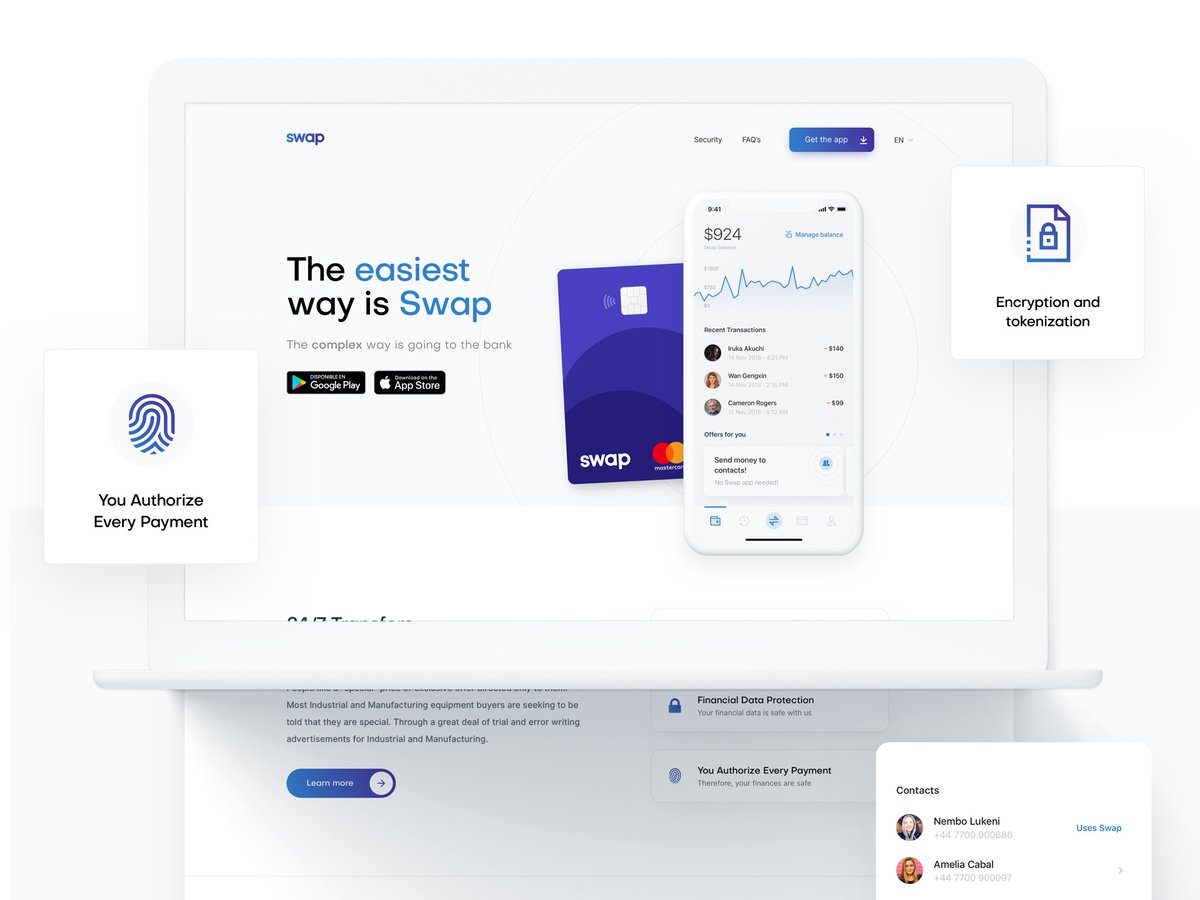
Swap is a P2P mobile payment app that allows users to send money to anyone. The client wanted to do a major UX redesign, as well as rebuilding the app, and introducing a new UI and UX. Within just a few months, the Netguru design team came up with the final version.

Swap is a P2P mobile payment app that allows users to send money to anyone on their contact list, any bank account, and any debit card number. The idea behind the product was to create a convenient mobile wallet that would facilitate transfering money in Mexico.
The banking market there is underdeveloped and complicated. Still, most payments are handled with cash, and bank transfers might take even two hours to process.

Challenges
The first version of the product, built mostly internally three years ago, was a very simple solution with only the core features. Soon, the founders realised that further development created some friction inside the app. Adding more features hampered the user experience in the product, as the old interface version couldn't cope with them.
It was high time for a major UX redesign for the company to be able to move forward, rebuild the app, and introduce a brand new UI and UX. Swap’s founders decided to look for an external partner who would help them prepare the interface for new services and make customer onboarding effortless.
We did our research and approached some agencies. The banking apps made by Netguru really stood out. It was what we were looking for as we wanted to implement the best, world-class, design.
Bruno Ramos Berho
CEO, Swap

Transforming the application for future growth
The design team started with a thorough analysis of the existing product, the market, and the target. It was crucial to analyse how current users interact with the application to understand better which features should be more prominent and where to put them.
After the UX research, the designers started building wireflows and user stories. Then, the UI design team took over to deliver the final look of the new app. They didn’t want to move too far away from the previous version, so that it didn’t feel like a big change for the existing users.
Instead, they updated the color palette and fonts slightly to give the interface a fresh look. Custom illustrations were additionally used to explain abstract terms better and to add a human touch to the application.

Results
Within just a few months, the Netguru design team came up with the final version, using the Swap team’s feedback, and delivered all the results. With the complete documentation and recommendations, Swap's development team could easily implement the resources and apply any changes suggested by the users.
The personal finance management was radically improved, and new features were introduced, including social media money transfers, media payments, and Swap credit. On top of that, Swap launched their own card, which can be plugged into the app in addition to other cards including Revolut or Monzo.
The company is now processing 60 million dollars per month for over 85k users in Mexico and has managed to close a pre-series A of 1 million dollars. They are currently preparing for the A series.


.png?width=1200&height=630&name=Polpharma%20CS%20hero%20image%20(1).png)


