What Is UX Design? Complex Guide for 2023
Introduction
Contents
If a brand wants to succeed, it needs to go up and beyond what the competitors offer, show real concern for our goals and challenges, and prove that it genuinely puts the user on a pedestal.
In fact, according to PWC research, 82% of top-performing companies report that they pay close attention to the experiences they provide users with across digital touchpoints and in their tech. How do you ensure that users are at the heart of your designs? By acknowledging and prioritizing UX design in your product development.
In the following guide, we provide a comprehensive overview of User Experience Design. Starting with a definition and brief history, through UX design principles, all the way to examples of UX technology and trends, we’ll tell you all you need to know to get started with creating flawless experiences for your audience.
What is User Experience Design (and Why Does it Matter)?
Before we dive deeper into exploring the world of UX design, let’s start with explaining what user experience design is.
Simply put, it’s a process that UX designers follow to create products and services, which help users achieve their goals, all the while making sure their experience is meaningful and smooth. It goes beyond product design, and includes such aspects as user acquisition paths, branding, usability, engagement and functionality.
The elements of User Experience
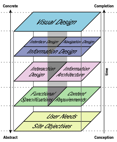
A successful UX design process should be based around the following five user experience elements.
1. Strategy – understanding the reason for creating the product or service, what problems it solves, who the target audience is, and why you think they’ll be willing to use it. The primary goal here is to understand and define user needs as well as agree on business objectives.
2. Scope – scope is another element of user experience; it revolves around defining the content and functional requirements of your product or service.
While the functional requirements focus on feature definition and how they help users achieve their goals, the content requirements are about the type of information required to provide value to users, e.g. text, images, or videos. Think about it this way: if a media player is our feature, then the media files are our content.
3. Structure – the structure illustrates the product-user interaction, how the system responds to it, and how it’s organized. It incorporates two components:
- interaction design – based on the given functionalities, it determines how users will interact with each feature, and how the system will respond to it;
- information architecture – it relates to the content requirements and how they should be structured in order to bring the most value to the user and to facilitate human understanding.
5. Surface – it’s the result of all the decisions you have made along the way. It determines what your product will look like visually, e.g. selecting the right layout, typography, or colours.
All of the above elements of user experience are interlinked with each other, and each element will depend on the layer above. If there are flaws in your strategy, it will negatively impact your decision making in further stages.
Source: UX Design
Why you should care about the UX design process
In most cases, well-structured processes allow for more efficient business operations and the UX design process is no exception. Not only does it let you learn more about your users and how to reach them, but it also helps with continuous product improvement.
The UX design process is about hypothesizing, experimenting, and testing – it’s scientific in nature, which means that you’ll get access to credible data which will support you in making better business decisions. Eliminating guesswork from your decision-making process will increase your chances of success.
UX design enables you to take a deep dive into your users’ needs and desires, which not only helps you create meaningful experiences, but also allows users to achieve their goals easier and faster. This, in turn, builds a stronger relationship between the customer and the brand, which drives loyalty.
Below are a few benefits of leveraging UX design in your projects.
-
Increase in sales thanks to simplified navigation and purchase flow.
-
More engaged customers, which will translate to repeat purchases and more interactions with your content.
-
Improved brand loyalty, credibility, and recognition as people are more likely to come back if their first experience was stellar.
-
Reduced training and customer service costs because great UX is intuitive and needs no excessive documentation.
-
Building better products by understanding what your customers need, designing for their needs, test, and improving with user involvement.
We will now let numbers speak.
-
A one-second delay in page load yields a 16-percent drop in customer satisfaction.
-
UX design unification resulted in a 100-percent productivity gain in development teams and helped save General Electric an estimated $30 million.
-
Virgin America saw a 14-percent increase in conversion rate and 20% fewer support calls after the significant website and UI/UX redesign in 2014.
-
The top 20% of CX leaders outperformed the S&P 500, says a study by Forrester. Design-driven companies outperform the S&P 500 by 219%
-
Every dollar invested in UX can generate 100 dollars in return.
Source: dmi.org
A short history of UX Design
If you want to fully master UX design, you might want to take a quick look at its roots. The concept originated from the science of ergonomics, which focused on developing guidelines that would make work more efficient and convenient.
This trend survived the ancient times and was continued by Winslow Taylor, who became the pioneer of modern work optimization. His research revolved around the interaction between workers and their tools, which can be considered the first example of systematic UX research in human history.
In the 1940s, Toyota embarked on a journey to improve workplace efficiency by developing their world famous human-centered production system.
It focused on creating optimal working conditions for their workers, which Toyota managed to achieve through inviting their employees to participate in their workplace improvement project. This constitutes a key milestone in UX history, as it really brought the user to the center of attention.
While talking about the history of UX, we must not forget about Henry Dryfuss. An American industrial engineer known for designing and improving some of the most iconic consumer products like the Hoover vacuum cleaner and the tabletop telephone. In 1955, he published a book “Designing for People”, where he shared his knowledge about UX design.
However, it wasn’t until 1995 that Donald Norman, a cognitive scientist, put an official label on this concept, calling it “user experience”. He said:
“I invented the term because I thought human interface and usability were too narrow. I wanted to cover all aspects of the person’s experience with a system, including industrial design, graphics, the interface, the physical interaction, and the manual.”.
He became the first individual to have “UX” in his job title.
Today, user experience is a term that everyone in the tech space is talking about. It’s a field which is continuously evolving, and it’s not expected to stop any time soon.
Methods of the UX Design process
Now that we’ve analyzed the elements of user experience, you might be wondering – are there any UX design steps to follow? Let’s take a look at the methods employed by UX specialists in the design process.
UX research
Good UX starts with a thorough understanding of whom you’re designing the product for; namely, establishing who the target users are and what they want to achieve by using a given service or product.
User research techniques abound, but they can be broadly divided into two groups – qualitative and quantitative. As explained by Usability.gov, whether a given user research method is effective for your product or service will entirely depend on the type of app, website, or system you’re developing, as well as your goals, timeline, and environment.
Qualitative vs quantitative research
Qualitative research is the process of collecting non-numerical data that cannot be quantified and analyzed in bulk. Examples of qualitative data in user research include surveys with open-ended questions, focus groups, and 1:1 interviews.
Respectively, quantitative research revolves around collecting data that can be quantified. Some methods user experience researchers use include asking closed-ended questions, A/B design testing, analyzing website/app data, or clustering user comments.
Product Design Sprint
UX designers will often start their work on a project by running a Product Design Sprint (PDS). In simple terms, it’s a short workshop (usually taking five days), during which the idea for the product is discussed and tested with its stakeholders.
A PDS will cover project ideation, design concepts, rapid prototyping, and testing. The ultimate goal is not just to verify the product’s design, but also to evaluate its business assumptions. The most important benefits include:
- Uncovering potential risks
- Avoiding common design- and business-related mistakes
- Treading the path towards an effective collaboration
- Testing product concepts with potential users
- Providing simple solutions to complex processes
In order for the workshop to be successful, it must be attended by a team of specialists from different departments. Usually, 5-8 participants (owners of the project) will suffice.
A Product Design Sprint has five phases (each usually takes a day). These are: Understand, Diverge, Converge, Prototype, and Test.
![]()
User personas
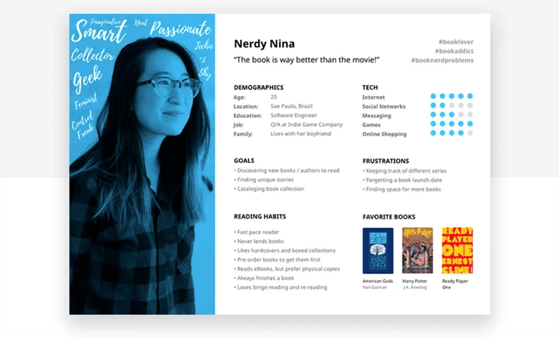
User personas are realistic representations of your key audience segments, based on qualitative and quantitative user data.
A well-defined user persona should include the following information:
- Fictional name & photo
- Motto (a sentence that summarizes the persona’s mindset)
- Demographics
- Job title & responsibilities
- Level of technical expertise
- The software environment they’re accustomed to
- Goals & fears (those related to company KPIs and what’s expected of them by the organization, as well as those driven by personal ambition)
- Frustrations they experience by using similar solutions
Source: Justinmind
There are several benefits behind creating personas – we present them below.
- Personifying data from user research, which facilitates discussions in the design team and with stakeholders.
- Providing inspiration for wireframes and interface architecture.
- Allowing other departments to align their communication style.
User stories
With user personas in place, UX designers proceed to uncover the design’s narrative through creating user stories. This method is used to look at a given feature from the perspective of the end user. As explained on Wikipedia, user stories: “facilitate sensemaking and communication; that is, they help software teams organize their understanding of the system and its context”.
User stories usually follow a template, similar to the one below:
As a [user role], I want to [capability], so that I [benefit coming from performing the action].
Here’s an example of a user story for an HR specialist using professional recruitment software:
“As an HR specialist, I want to review my candidates’ skills assignments, so that I can filter the best prospective hires and proceed with recruitment”.
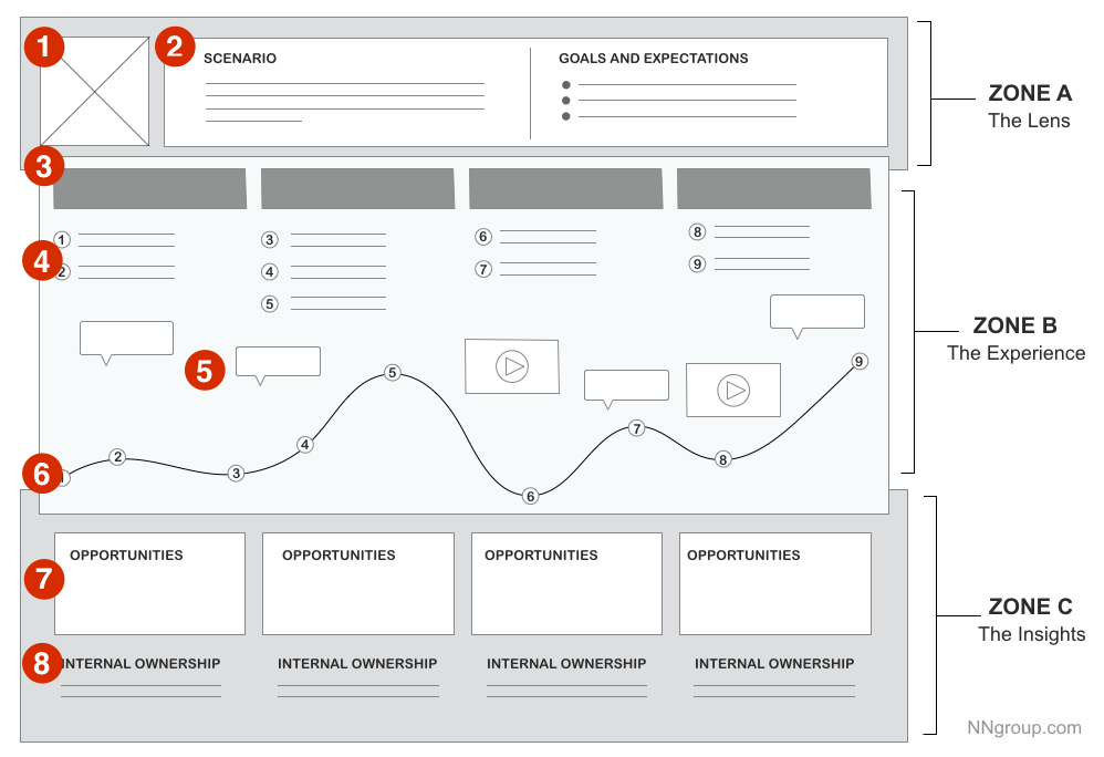
User stories are often grouped into similar categories and used as inspiration for user journey maps. Such depictions help designers look at the main features of the intended service, and scrutinize each step a user takes on their way to completing a desired task.
This allows the design team to pinpoint areas for improvement or any features that distract the user from completing the process, and understand both positive and negative user impressions.
To give you a glimpse of how a user story is structured, below is an example of a user journey map template from the Nielsen Norman Group:
Source: Nielsen Norman Group
Wireframes & Prototypes
Once user goals and the key features of a product/service have been established, UX specialists proceed to wireframe and prototype design. How do they differ, and what are the roles for each in the UX design process?
Wireframes
Wireframes are a basic, low-fidelity depiction of a product or service and also its first visual representation. They serve as the blueprint for the product’s future functionalities, layout, and informational structure.
Wireframing can be roughly divided into two stages: creating user flow diagrams, which is then followed by single-page wireframing.
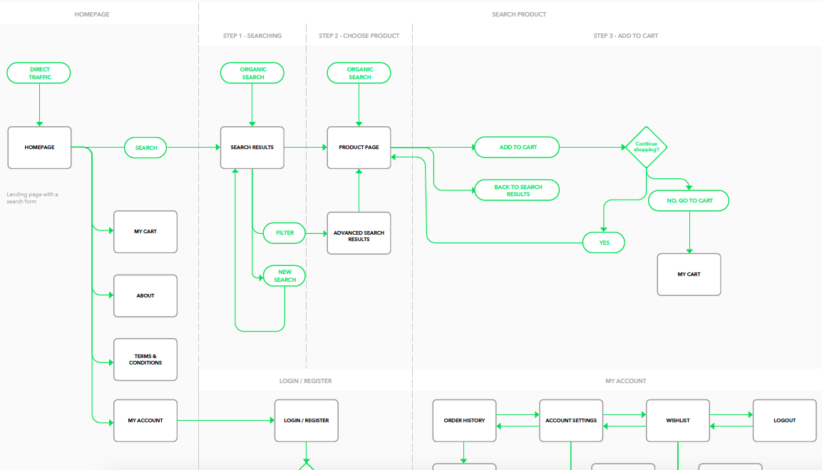
User flows illustrate the most frequent paths, decisions, and steps users take within a product or service. Creating them allows designers and project stakeholders to understand which interactions are critical to user conversions and how any obstacles can be removed.
Here’s a sneak peek of what user flow diagrams look like at Netguru:
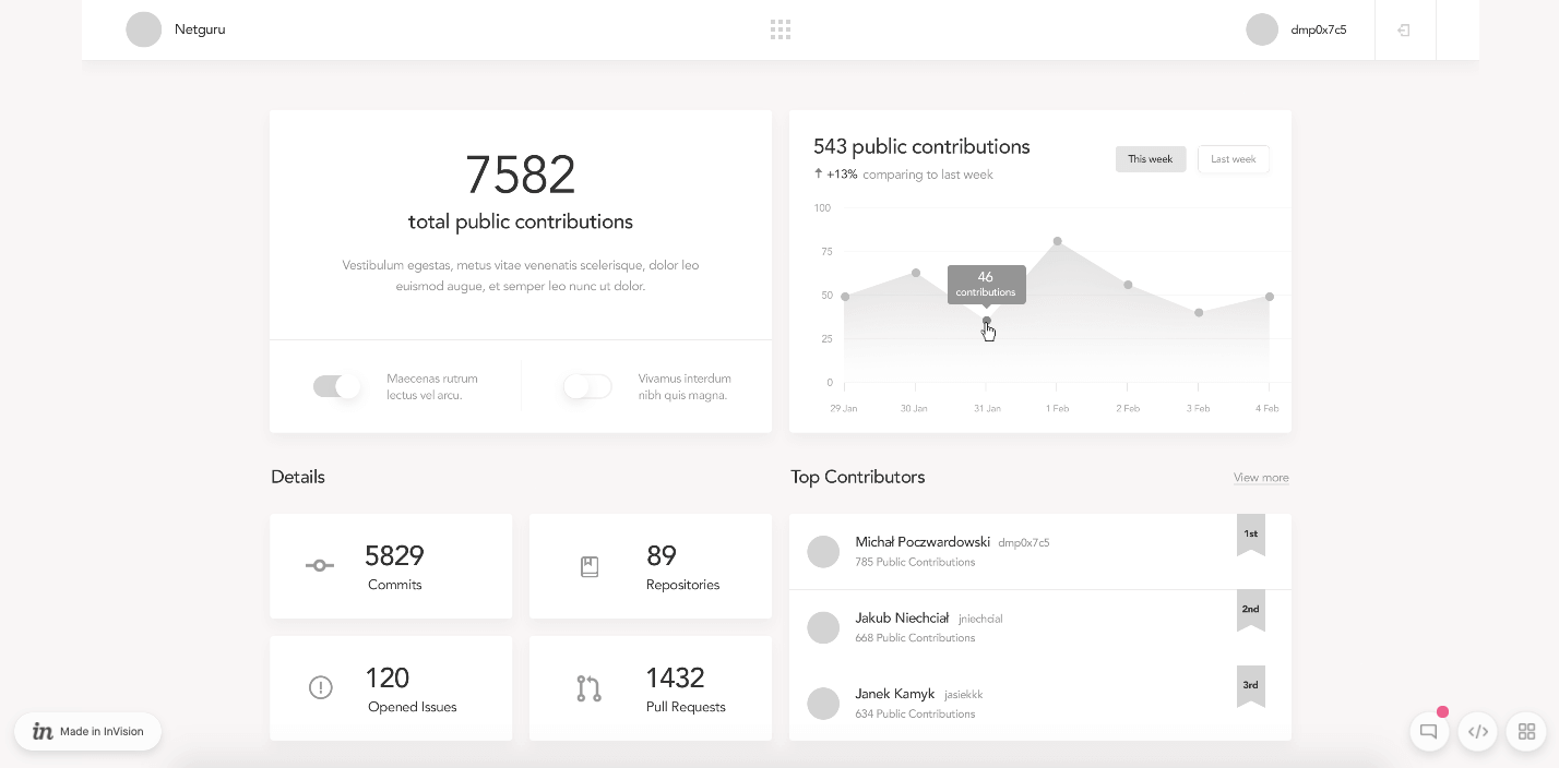
Single-page wireframing are visuals that depict a concept for a site’s composition, page structure and information hierarchy. Their aim is to arrange the elements in a structured, intuitive, user-friendly way that also aligns with the business goals.
As mentioned above, wireframes are stripped of visual details such as colors, photos, or interactive effects. Here’s an example of a single-page wireframe that ideally depicts these concepts:
As we explain in our “Design Process for Pros” guide, designers should never skip the wireframing stage. It functions as “the bridge between researching and designing visuals”, and it lets designers:
- test-drive the concepts and iterate quickly (a process called ‘usability testing’, which we discuss further below),
- eliminate errors and problems early-on in the design process,
- uncover users’ behavioral patterns,
- collect feedback before time and resources are spent on design development.
Prototypes
Prototypes are mid- or high-fidelity mockups of the solution you’re planning to create. As they are much more sophisticated visually compared to wireframes, they are usually created later in the UX design process, after the key features of the product and its branding had already been established.
Metaphorically speaking, prototypes serve as your product’s ‘facade’ – you can create a view for each screen that closely imitates an operational website, app, or service. In fact, with high-fidelity prototypes one could easily be fooled and think they were using a genuine interface!
The benefits of prototype design include:
- testing a tangible imitation of a product with stakeholders and potential users,
- creating a resource for developers (used as reference when they work on the interface),
- serving as part of your project’s documentation.
Most importantly, the feedback you collect on a high-fidelity prototype will be much more relevant than that on a wireframe – with everything laid out, nothing will be left to testers’ imagination.
Design validation
Once the product or service goes live, designers turn their attention to continuously improving the design so that it serves the users best. To make educated design decisions, UX specialists need to collect behavioral and attitudinal data on its users. For this purpose, they commonly turn to usability testing and tracking UX-related metrics.
Usability testing
Usability testing is the process of examining how a representative group of users interact with a product. It is performed on wireframes and prototypes before the design is coded by developers.
In the words of the Interaction Design Foundation, usability testing:
usually involves observing users as they attempt to complete tasks and can be done for different types of designs, from user interfaces to physical products.
There is a wide variety of usability testing methods, which can be categorized into the following types:
- In-person testing. Examples include: tests conducted in a lab setting, guerilla tests (performed with random participants), eye tracking, and observational (i.e. unmoderated) tests.
- Remote testing. For instance, phone interviews, online card sorting, and screen recordings.
- Assessment testing. General assessment tests (users evaluate the overall usability of a product/service rather than separate processes or screens).
- Comparative testing. Users are asked to compare the product to a similar solution.
- Exploratory testing. Users are allowed to freely use a product and are asked to either make remarks (in in-lab tests) or notes (in remote tests) as they explore the interface.
All the usability testing methods mentioned above are a true goldmine for behavioral insights, as they help uncover the ‘what’ and ‘how’ behind user interactions.
UX metrics
While usability tests and in-app/web analytics data (such as website traffic and bounce rates) provide behavioral input, certain metrics can provide context and reveal user motivation.
Userzoom mentions four areas tracked by UX specialists. These are:
- Loyalty levels. User loyalty can be tracked by asking users to rate numerically their willingness to recommend a product to friends or asking users about their general satisfaction levels with a service.
- Credibility. Users are asked about their trust for a brand and whether the product/service has delivered what it had promised.
- Appearance. Inquiring about the visual hierarchy of elements, colors, and/or overall impressions on a product’s branding.
- Usability levels. Users are asked to evaluate whether a given process was easy or difficult to complete. This can be done by asking, for instance, to rate on a 1 to 5 scale, whether a process they’ve just performed was easy or difficult to complete.
These attitudinal insights, combined with behavioral input from usability tests and analytics software can provide UX specialists with enough data to validate and improve the overall UX of the product.
Now that we’ve covered the steps of the design process, let’s take a look at how UX is different from UI and product design.
UX Design vs. UI Design
The terms UX and UI design are often used interchangeably. While these two concepts are related, they’re not synonymous.
User interface can be defined as a series of screens, pages, and visual elements including buttons and icons that facilitate user interaction with a product or service.
In contrast, user experience refers to the emotions and feelings that an interaction with your brand evokes in the user – it’s not limited to the product itself.
The UI is an extremely important aspect of the UX, as it directly impacts how customers/users perceive the product or service. According to Don Norman and Jakob Nielsen:
“It’s important to distinguish the total user experience from the user interface (UI), even though the UI is obviously an extremely important part of the design. As an example, consider a website with movie reviews. Even if the UI for finding a film is perfect, the UX will be poor for a user who wants information about a small independent release if the underlying database only contains movies from the major studios”.
What is the difference between UI and UX
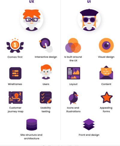
To make it a little easier for you to distinguish between UX and UI, let’s have a look at their key characteristics.
- UX is focused on problem solving while UI focuses on the product’s functionality and looks. Think about it this way: if you were in a restaurant, the UI would be the table, chair, glasses, etc., while the UX would be everything from the food, to service, music and lightning.
- UX design work is more conceptual, while UI design focuses more on tangible aspects – to put it simply, UI designers translate concepts into final visual layers.
- UI is primarily concerned with the product, while the UX revolves around the user. The former focuses on the screens, functionalities and visual styles, while the latter is more focused on the user flows, users’ goals, and the feelings that the product interaction generates.
- UX design usually comes first in product development and the UI follows. A UX designer maps out the journey that a user will go through to reach their goals, while the UI designer translates it into visual and interactive elements.
- UX is more universal. It’s important to note that UX can be applied to all kinds of products and services, as opposed to UI which is limited to digital products only.
Source: RubyGarage
Now that the differences between UI and UX are clear, it’s time to discuss how UX and Product Design vary.
The Difference Between UX and Product Design
Very much like in the case of UI, you will often see the terms ‘Product Design’ and ‘UX’ used interchangeably.
On the one hand, there are several similarities. For instance, both UX and Product Designers need a strong understanding of the Design Thinking Process (an area we discuss further in this guide).
Both groups also need to possess analytical skills and to be focused on delivering the absolute best end product. However, despite this overlap, there is one key difference between these two disciplines.
One of the most prominent distinguishing characteristics of a Product Designer is that their primary focus is optimizing the product so that it serves the business process, while the UX designer takes these business goals and translates them into user journeys.
For instance, while the Product Designer might ask “how will implementing a given process impact our goal of boosting sales by X% in the next quarter?”, the UX designer will focus the bulk of their efforts on creating a smooth user journey so that these business goals can be achieved.
Now that we’ve covered the differences between various design-related disciplines, let’s provide an answer to a question you might have been asking yourself reading this guide.
Why does your product need UX Design?
UX design is much more than ‘simply’ making your users feel comfortable using your product; it’s about securing its future and strong market presence for years to come. Below, we share the top reasons why you should invest in UX for your product.
1. Shorten and improve your conversion path
Baymard has conducted research, during which they tracked the global average cart abandonment rate for 11 years.
Although the e-commerce business have invested significant resources in creating homepages including beautiful imagery, well-crafted category taxonomies and faceted search login, still, over 69% of shoppers abandoned their purchase. The design and the checkout flow were the main reasons why the transaction wasn’t finalized.
One of the primary aims of good UX design is ensuring that users can achieve their goals quickly and easily. If you provide your prospects with a smooth experience they’re much more likely to convert into customers.
2. Reduce development costs
Research is an important part of every UX design process. It’s during this stage that you collect crucial information about your target audience and conduct risk assessment.
You need to do it if you want to realize your product’s full potential and avoid potential obstacles.
We all know that it’s cheaper to prevent a problem than to fix it after the release. In fact, according to the software engineer Roger Pressman, it costs $1 to fix an issue during the design process, while this costs rises to $10 during the development stage, and to $100 post-release.
If you carefully conduct your UX research, and take your findings into account when designing your product or service, not only will you be able to avoid costly product development mistakes, but you’ll also save money on referrals, sales, and marketing.
Happy customers are more likely to recommend the product to their friends and family and less likely to leave.
3. Boost customer loyalty
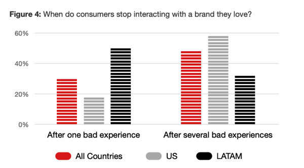
Customers these days are merciless – 32% of customers interviewed by PwC said that they would stop doing business with a brand they loved after just one bad experience.
 Source: PwC
One way of ensuring that the experience with the product is a pleasant one is through an effective UX design process.
Part of which is creating a user journey map (mentioned earlier in this guide), which represents user interactions with the product, starting from the very first point of contact.
Customer journey mapping (CJM) can help you improve customer loyalty through a number of factors. Let’s see what they are.
- Building empathy – you understand your users’ needs better, and you can put yourself in their shoes.
- Spotting bottlenecks – it prevents users from performing specific actions, such as clicking on a CTA that’s not working (which would stop them from completing a purchase). This would effectively turn customers away. A CJM can help you identify roadblocks and eliminate them before your customers get frustrated.
- Increasing retention rate – CJM helps UX designers track customers’ interactions with content, check satisfaction ratings, collect usability scores, and other relevant data, which helps optimize the user experience. All for the purpose of boosting customer engagement and increasing retention.
4. Improve (and prove) Return on Investment (ROI)
Prioritizing good UX means more than ‘just’ making the user satisfied; if done right, its ROI can be tangible and positively influence the KPIs of other departments within the organization.
For instance, in a piece for Clutch.co, the Marketing Manager Harsha Vardhan discusses how implementing UX improvements helped extend the average user session in the Farmrise Impact app by 11% within 3 months.
To give another example, the department & grocery store giant Walmart stated in their 2019 annual report that their e-commerce sales skyrocketed by 43% after they did a full redesign of their online store in Q4 2018.
These are just two examples of how UX’s ROI can be proven. In fact, there are many ways of calculating the return on UX investments, and the particular formula depends on your business type (which is nicely explained in a dedicated article by the Nielsen Norman Group).
What does a UX designer do?
It’s time to ask a very important question: what does a ux designer do? In the most general terms, UX designers are there to advocate for the end user of a product or service and design solutions that put them at the center.
As UX is a broad discipline, the responsibilities of a UX designer will vary from company to company. However, there are several key responsibilities that most UX designers share – let’s have a look at them.
Research
As we explained in the section on the UX design process, research is an essential element for any UX professional’s work. Depending on the size of the UX team, the designer can be responsible for conducting research themselves, or they may be provided with actionable data by a UX researcher.
Research helps UX specialists validate their hypotheses and make informed decisions, based on the understanding of user goals, fears, and priorities.
Developing User Personas & Journey Mapping
UX designers create personas that are representative of the main groups of the user base. This helps the designer see the ‘bigger picture’, that is what drives customers to use a service, and how their expectations can be met and exceeded. Persona development is never finished, because – as time goes by – the characteristics, priorities, and fears of the user base can change.
With the personas at hand, UX designers develop user maps to establish the flow of a product or service. It helps them ensure that users enjoy using the product and they can easily complete the tasks they come for.
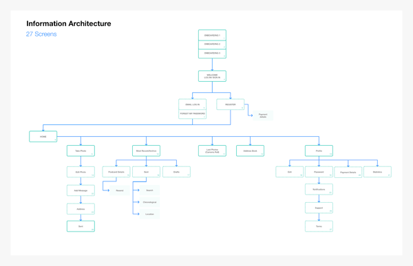
Designing the Information Architecture (IA)
As explained by explained by Adobe:
“information architecture is the creation of a structure for a website, app, or other product, that allows users to understand where they are, and where the information they want is in relation to their current position”.
User experience designers are responsible for creating the IA: the navigation (menu), site/app hierarchy, and the categories.
Here’s an example of a sitemap that depicts the information structure of a website:
Source: Adobe
Wireframing & prototyping solutions
UX designers are responsible for drafting wireframes (low-fidelity depictions of the planned app/website), as well as more sophisticated mockups (high-fidelity prototypes that emulate the look of an operational site).
The wireframes and prototypes are created so that the idea for the product or its specific features can be validated with potential users and/or stakeholders. Designers use the collected feedback to refine the intended product and fix any reported issues.
Continuous user testing
Last, but not least, UX designers continuously analyze user data to improve the solution. As explained earlier in this article, user insights can be collected in many ways, for instance by conducting usability tests, running surveys, or collecting data from website/in-app analytics software.
Depending on the team’s composition, UX designers could be responsible for collecting user data themselves, or could work on the basis of reports provided to them by UX researchers.
What skills does a UX designer need?
Since we’ve answered the question “what does a UX designer do?”, it’s time to look into their skills. There are a plethora of skills that UX designers need to perform their jobs effectively. We will focus on the most important ones here.
UX research
As mentioned earlier, the UX design process starts with research, which makes it one of the must-have skills for all UX designers – no exceptions.
A lot of decision-making goes into building a product, and in order to make the right decisions, they must be backed up by data, which requires detailed research and analysis.
UX designers must get a deep understanding of what their audiences want and how they perceive the world. To find this out they must be able to use a variety of research methods.
2. Collaboration
Unless your UX designer is the “know-it-all” type, they’ll need to collaborate with a variety of stakeholders including developers, UI designers, graphic designers, users, etc. All of them will have an impact on what the end product will look like, which makes good collaboration skills necessary to turn the product into a success.
3. Wireframing
The work of UX designers doesn’t stop at creating hypotheses. To fully show their business acumen, they need to master wireframing. Clickable prototyping is the best method for understanding the functionality of your design before pushing it into development.
It’s often necessary to get other stakeholders on board – it also helps prevent expensive development mistakes. Depending on the project, UX designers might need to demonstrate the ability of creating both digital and physical prototypes.
4. User empathy
Good UX design is about fully understanding the users and being able to put yourself in their shoes. You need to discover their pain points, frustrations, and their goals.
You can only get this information by interacting with the users, but to get a full grasp of what their emotions are, you need to be able to empathize with them.
5. Good communication skills
UX designers must be able to communicate their ideas, not only to get buy-in from other stakeholders, but also to have their ideas translated into actions. Ross Wilson, CXO at Fidelity Investment says that:
You don’t have to be a world-class speaker, but if you can’t communicate your ideas, both in writing and verbally, you will find it very difficult to be effective. I find user experience to be a very communication-intensive craft. We are always working with developers, product managers, users, and various other stakeholders. We have to demonstrate our designs, collect feedback, and collaborate each and every day.
Most popular UX Design Tools
There is a wide range of UX design software that makes the work of UX designers easier and more efficient. Below, we highlight eight popular UX design, prototyping, and UX research tools worth looking at for your project.
1. Google Analytics
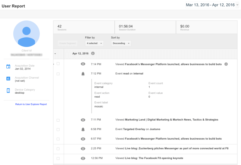
While Google Analytics is perceived as a tool primarily for marketers, it is also a true goldmine for UX professionals.
It allows you to access multiple insights and statistics related to your users’ interactions with your website or product. Among others, the G-Suite solution lets you:
- spot where users land when they first visit your page;
- see how users behave during their user journeys (for instance, what steps they take before completing a process);
- notice any unnecessary steps in users’ journeys (for example, what’s stopping them from finalizing orders on items in their baskets);
- discover which parts of the website users bounce from;
- measure how long the user sessions last;
- and many more.
You can generate reports with ease – they can be as granular or as basic as you want. You can save them as PDFs and share them with the rest of your team, to keep everyone on the same page on the performance of your website or app.
Last, but not least, Google Analytics allows for much more than just ‘observing’ statistics on user behaviors. You can also set goals on specific pages or processes to verify your hypotheses and ensure that nothing hinders your users’ actions on-site.
Source: Marketing Land
2. Miro
Miro is a collaborative whiteboard platform that lets teams collaborate on concepts together. While the tool isn’t a solution for UX teams only, it boasts many advantages for designers.
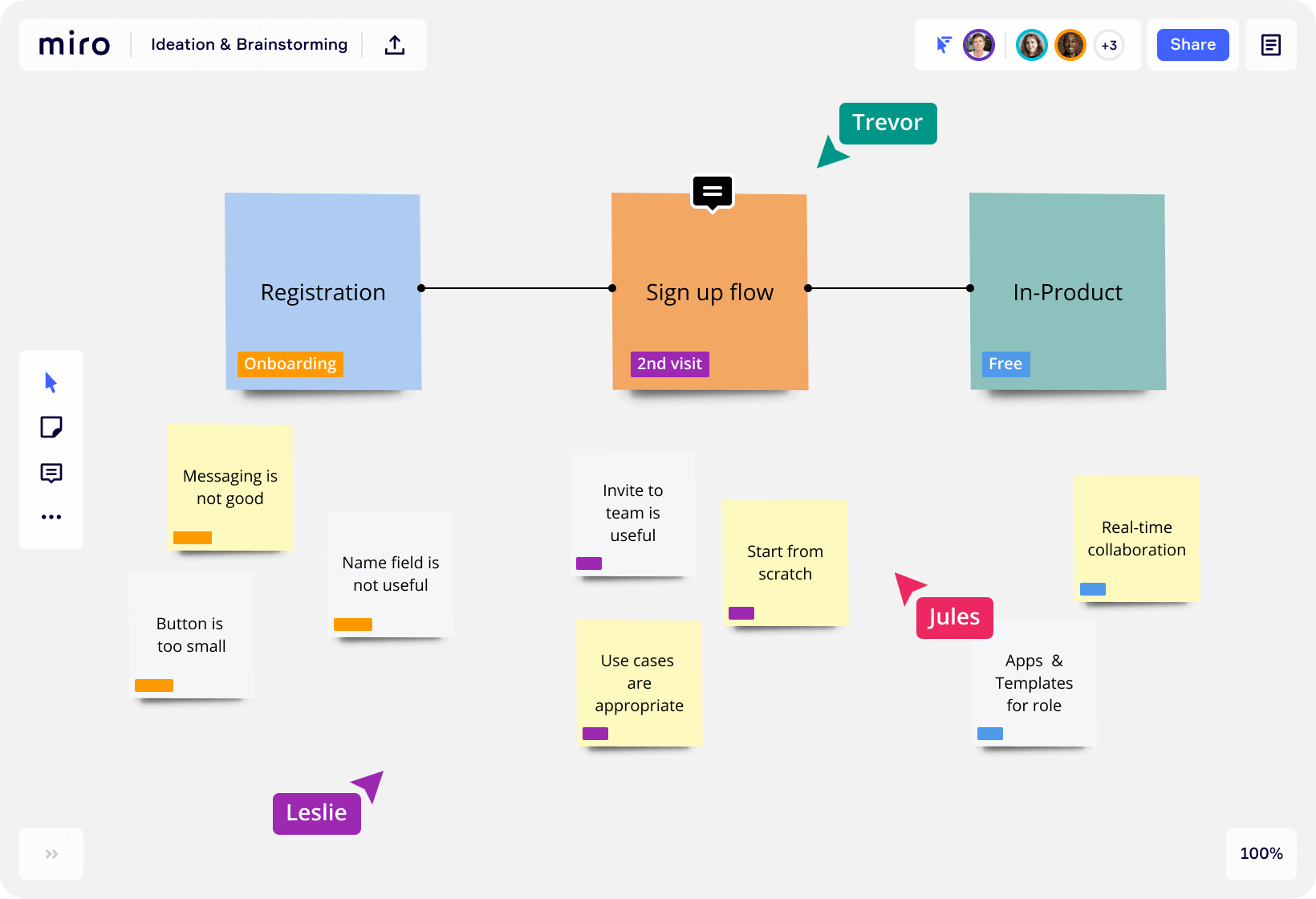
Firstly, it allows you to plan out your work in the research and ideation phases. For starters, you can use the whiteboard to build out visual representations of your user personas, or to conduct live brainstorming sessions on your product’s early concepts, such as its information architecture.
Secondly, you can use the Miro canvas to create diagrams. One immensely powerful use case is the ability to create user journey maps, e.g. creating concepts for the sign up flow.
Source: Miro
Last, but not least, you can use Miro not just as a whiteboard solution, but also a collaboration tool. You can create a timeline of your UX team’s work, assign processes to specific team members, and conduct sprint planning to keep things on schedule.
Miro integrates with a whole range of tools, such as Google Suite, JIRA, Sketch, and Slack. It also offers a free plan for smaller teams.
3. Mixpanel
Mixpanel’s creators call it “the most powerful self-serve product analytics to help you convert, engage, and retain more users”. In fact, the truth isn’t that far off this claim, as Mixpanel boasts many advantages for UX specialists.
The platform allows you to dive deep into user data – you can analyze them in bulk to spot behavioral patterns, or evaluate use cases at an individual, per-user level. Such insights can be used to supplement your user personas, notice any underperforming areas, and inspire you to optimize your user flows.
Mixpanel can be set up for both websites and apps, and can be integrated with more than 30 other tools, including Optimizely, AppCues, FullStory, and Wootric.
4. Dscout
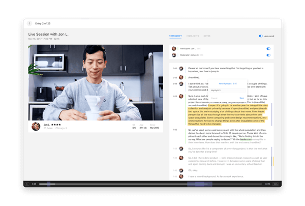
Another UX design tool worth looking into is Dscout. It is a UX research tool that captures thoughts, reactions, and behaviors at the moment they happen. Dscout uses a mobile app and over 100k participants to capture in-the-moment videos, making insights easy to arrange and share.
Thanks to the ‘Live’ feature you can interview people remotely – their video tool is designed specifically for researchers. Dscout also lets you nicely organize large data sets through visual data filtering and sorting capabilities. You can also take advantage of their automatic video transcriptions and the ability to create highlight reels.
The Head of UX Research at Lyft, a ride-sharing company, praises the tool saying that:
We got lots of rich input through screenshots and videos, short answers and surveys, both during the day and night. Overall, this rich set of moment-by-moment data with drivers in various locations was something that we could not have collected so quickly and easily — and possibly not at all — without having made a much larger investment of time and resources.
 Source: Dscout
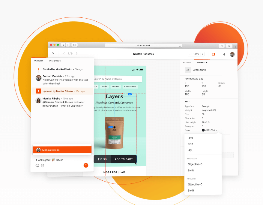
5. Sketch
Sketch is one of the most widely used UX software design tools, it’s a design toolkit that helps you create your best work – from ideation to the final artwork.
It’s intuitive to use and offers infinite canvas, which means you don’t need to know the dimensions of your canvas when you start working on your project. This allows more room for creativity. It’s 100-percent vector based, which means that whatever the size of your file, be it a 5-pixel or 500-pixel square, your work will retain the high quality.
You can export your designs in various resolutions, and you only draw it once. Sharing files is also easy. In Sketch, you can work in any size, and then export it into multiple sizes – this comes in handy when you want to email your work to your clients.
 Source: Sketch
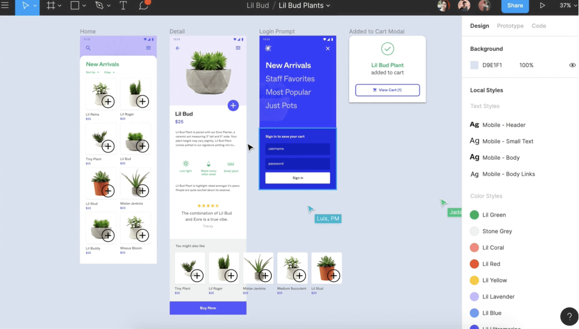
6. Figma
Figma is a design tool for creating all kinds of designs including websites, applications, even CRM systems. It’s cloud-based, and offers rich design and prototyping features. It’s similar to Sketch, however, it provides greater collaboration opportunities, which help UX and UI designers work together on the same project.
Figma runs on any operating system, which makes it very unique – you can open, edit, and share Figma files irrespective of the system you use. This comes handy in situations where designers use a Mac while developers use Windows PCs, which happens in most businesses.
Teams can collaborate in real time – Figma works similar to Google Docs, which minimizes design drifting. Additionally, the tool allows for in-app commenting in both design and prototyping modes – you can view the comments on Slack or have them sent via email. Figma’s APIs provide third-party tool integration, which allows integrations with any browser-based apps.
Source: Figma
7. UXPin
Another UX design software that frequently tops the list of the most popular UX tools is UXPin. The premiere UX design platform for interactive prototyping, design systems, and documentation. UXPin makes prototyping quick and easy thanks to its rich ready-made library of elements. You can build complex interactions based on different states of elements or groups of elements.
The tool offers strong collaboration features, which make working with your teammates on the same prototype convenient. However, what really makes UXPin stand out from the crowd is their interactive states, logic, and code components – all of which provide a better feel for what the end product will look like.
8. Optimizely
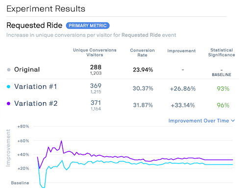
Optimizely can be found on many UX tool roundups, mainly due to its A/B testing module popularity. However, saying that it’s an A/B testing tool would be a grave understatement, as it brings much more to the table.
The platform not only lets you track and analyze just rollouts within a working product, but you can also test prototypes or experimental features with a small group of users before they become widely available.
Source: Optimizely
You can collect input on a single element or entire user journeys – anything from a new pricing or blog layout, to entire flows for critical processes, e.g. payment.
You can integrate Optimizely with other UX-related tools, such as HotJar, FullStory, Mixpanel, Segment, and SessionCam.
9. Smartlook
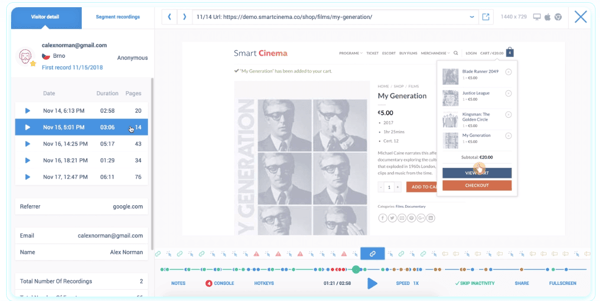
Smartlook is a session recording tool that lets you analyze how users interact with your website or app. With advanced filtering options, it allows you to observe how people behave on specific screens and analyze this data to test the effectiveness of the design. For any usability issues, you can set up events and share the recordings with other members of the team.
Smartlook allows you to track entire user journeys. If you want to learn more about the person whose recording you’re watching, you can easily replay their entire session in all other parts of your website or app for further context.
Source: Smartlook
What’s more, if the Smartlook API is integrated, you can identify users and refine your user personas with real-life customer profiles.
Smartlook offers an advanced analytics panel that helps derive information on users easily; you can also export your data to use for further reference in the UX design process.
10. Maze
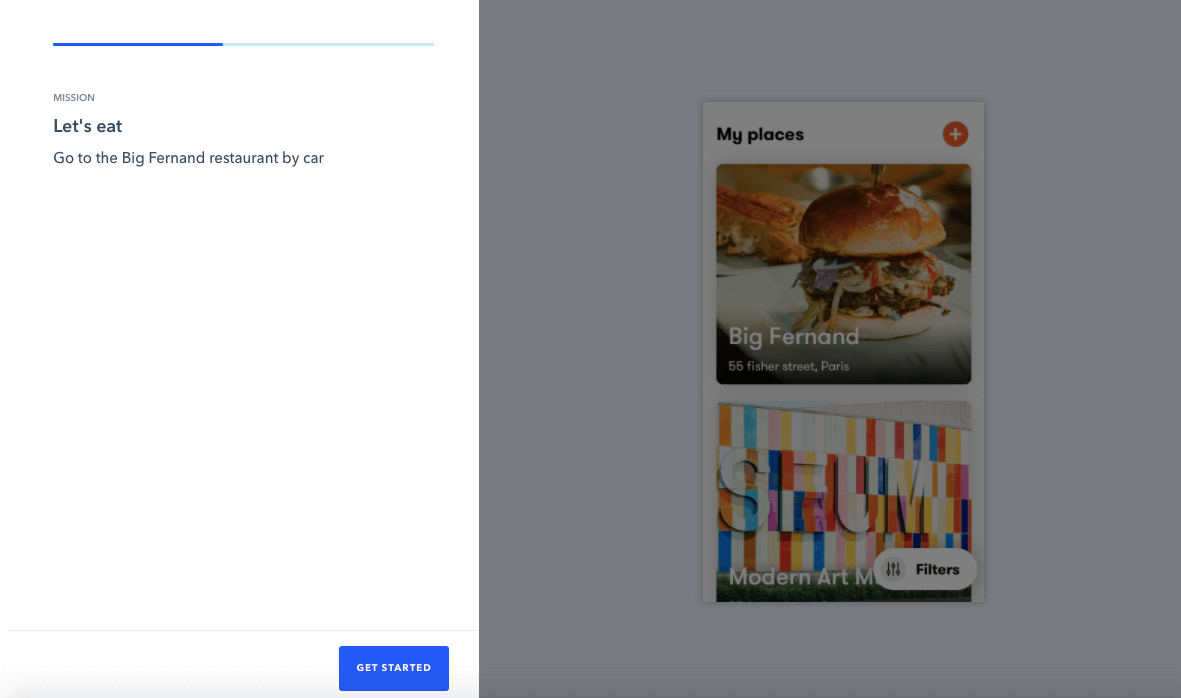
Maze is a platform that lets you seamlessly create usability tests for wireframes and prototypes created in tools like Sketch, Figma, Marvel, and InVision. The platform allows you to conduct unmoderated, remote usability testing and to collect quantitative feedback from the users.
The platform allows you to carefully design and customize each click-through path so that it’s easy to follow for your testers. What’s more, Maze features a comprehensive analytics panel, where you can generate an automatic, detailed report for all your usability tests.
Source: Maze
A huge advantage of Maze is that the platform can also help you recruit testers, with over 70k people registered in their system.
Examples of UX Design implementation
We’ve gone through a lot of UX theory, and now it’s time to have a look at some practical examples of UX design implementation.
1. Swap
Swap is a P2P mobile payment app enabling users to send money to anyone from their contact list, including any bank account and debit card number.
The main motivation behind creating the product was to build a convenient mobile wallet that would make money transfers in Mexico easier. The initial version of the app was very simple, and only included 3 core features. In order to allow further product development, a UX redesign was necessary to maintain good user experience.
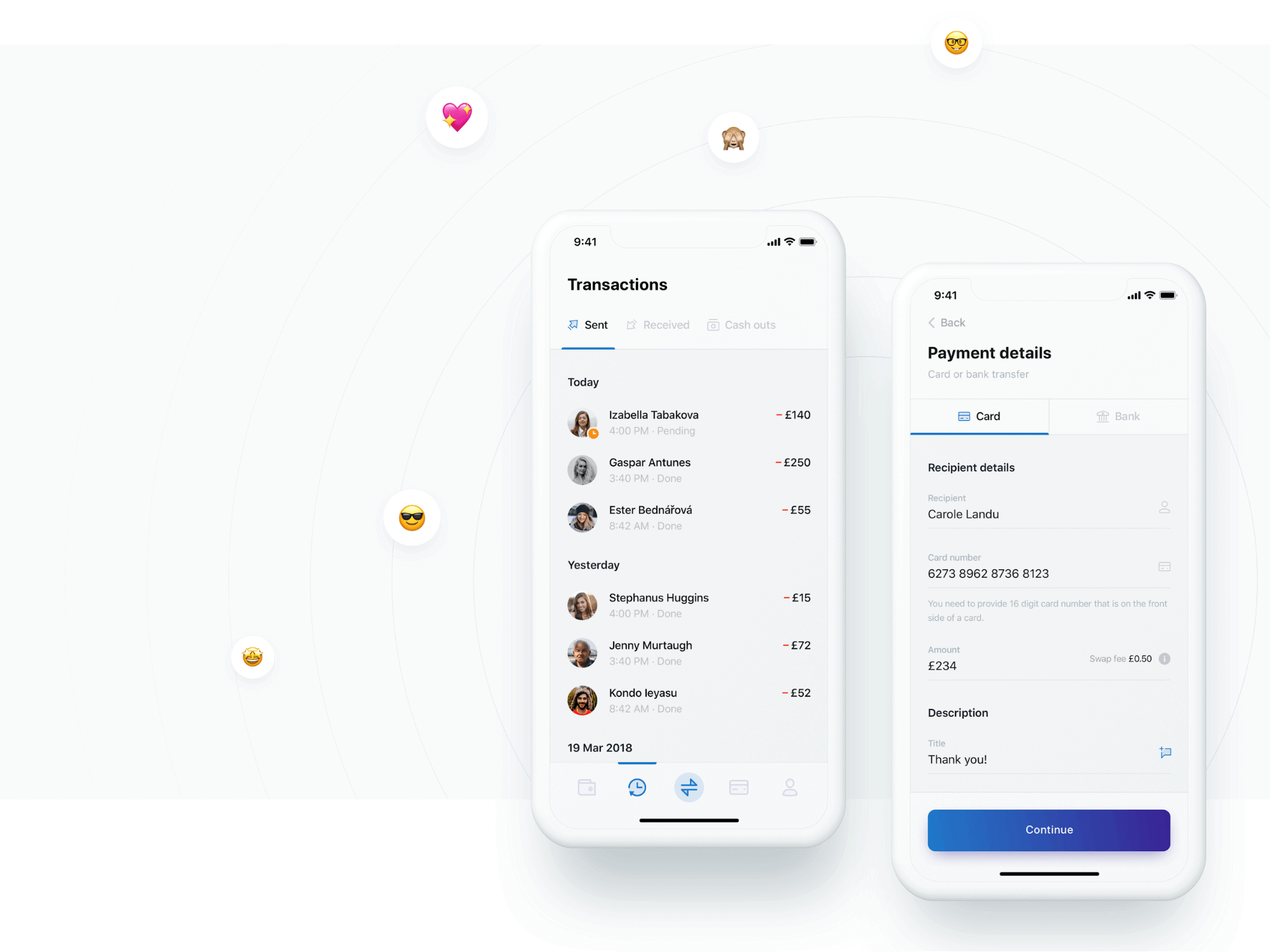
The design team at Netguru started with a detailed analysis of how the current product was used, to learn which features were key.
Next, the team built wireflows and user stories – the aim of the redesign was to avoid any drastic changes to the way the app looked, so as to retain familiarity.
As a result, the personal finance management improved significantly – a few new features were implemented, including social media money transfers, media payments, and Swap credit. Additionally, the brand launched their own card, which can be integrated with the app in addition to other cards like Revolut or Monzo.
The redesign has proven very successful; Swap processes $60 million per month for over 85k users in Mexico, and has closed a pre-series A of $1 million.
2. Artemest
Artemest is an Italian e-commerce site, which features a curated collection of home decor, jewellery, and lifestyle art created by top Italian artists. Their mission is to retain the heritage of great Italian artists, who would have gone out of business if not for Artemest.
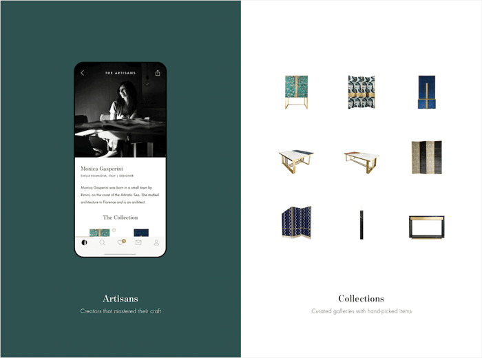
The platform currently has over 350 vendors and thousands of products, with the number continuously growing. They not only required a reliable product that the artisans could securely use, but they also needed an infrastructure that would support product growth. For this reason, the Artemest founders turned to Netguru.
The team at Netguru started with an extensive DevOps code review. UIs were designed in a way to emphasise the unique craft of the vendors. To enable artisans to focus on their work, the design team made sure that the UX was intuitive and user friendly.
Currently, Artemest is flourishing – they’ve launched a brand new, B2B trade channel, while the web and mobile applications have received praise from both clients and the community.
3. Babbel
Babbel is a language learning platform available as a web and mobile app for iOS and Android. It’s one of the most esteemed language learning platforms, with 73% of users declaring they’d be comfortable holding a conversation in a foreign language after just 15 hours of learning.
When Netguru’s and Babbel’s roads had first crossed, the language platform already boasted a user base of over 1 million. The success of their B2C solution encouraged the Berlin-based company to take the next step and develop a B2B solution.
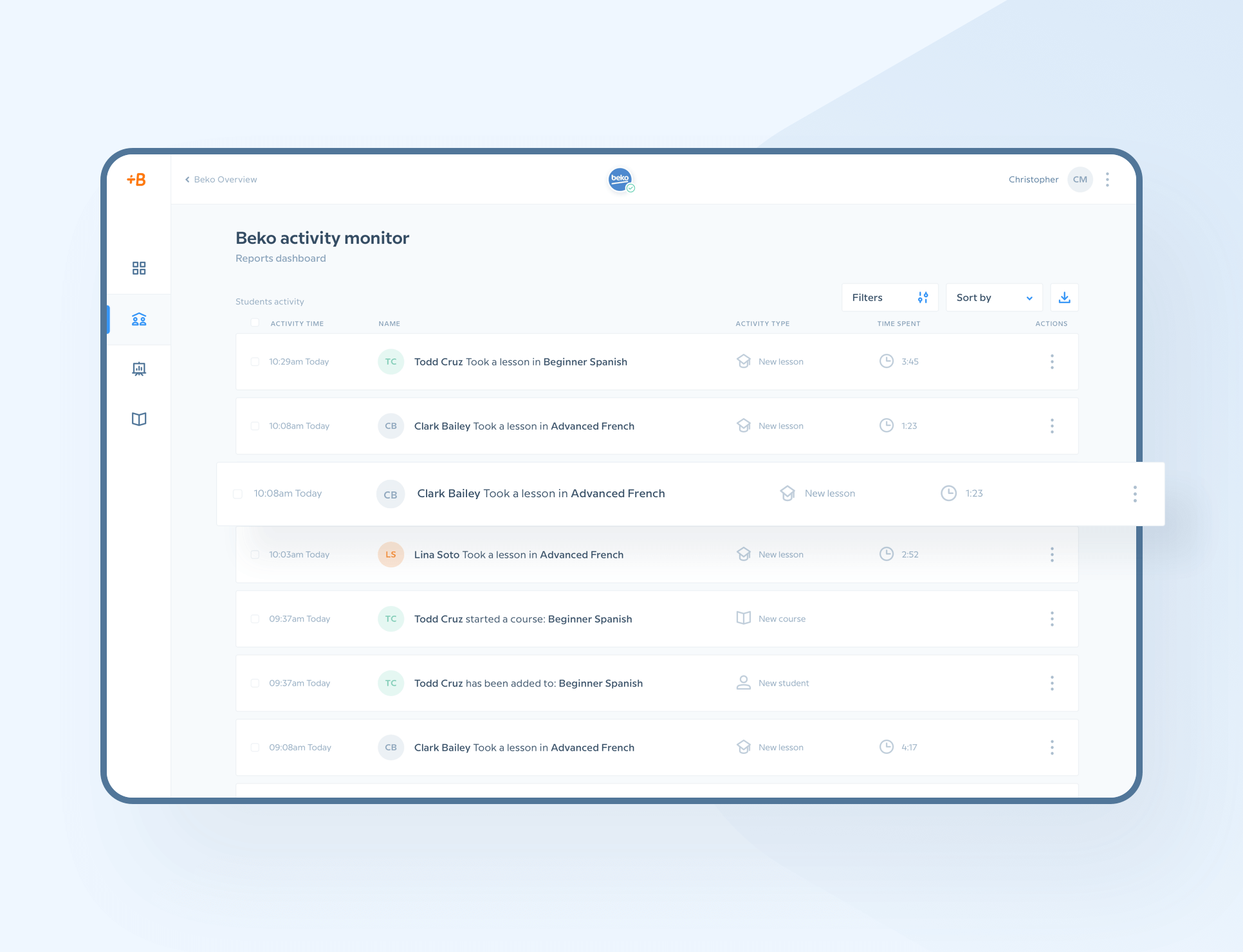
The core of the app – the learning modules – was to remain unchanged; however, the B2B solution needed to feature an app administration panel, access to app usage data for each team member, and provide a higher level of customization.
All the while, the Netguru UX design team needed to ensure that the new modules were cohesive with Babbel’s brand image and its high usability standards.
Source: Netguru
The UX design team gathered the client’s requirements and any available previous user flows.
On their basis, they created all the necessary views for the admin platform, which makes it easy for account managers to analyze how often team members use the app, how much time they spend on particular courses, and whether they’re making progress.
The Netguru team also ensured that the payment flow was simple, and designed it in a way so that an organization can pay only one bulk invoice for all registered users.
The UI team added components, grid, and layout to the accepted wireframes of the B2B module, and ensured that the final product reflected the Babbel branding and core application standards.
4. DAMAC
DAMAC is one of the Middle East’s leading real estate developers, with over 25,000 residential units delivered, and hundreds of commercial and leisure properties developed across the region. It’s most widely recognized for its prestigious projects, such as DAMAC Towers by Paramount Hotels and Resorts and DAMAC Hills – both based in the UAE.
Established in 2002, the company are strong advocates for long-term business strategizing and digitization, which they have found instrumental to maintaining operational stability during economic crises and market fluctuation.
As firm believers in their ethos of supporting DAMAC agents worldwide, the company decided to develop an app that would instantly provide them with all project information. The UX design team at Netguru ensured that the app offers a comprehensive, easy-to-navigate view of DAMAC investments.
.jpg?width=1257&name=ilu01%20DAMAC%20(1).jpg)
The app allows agents to effortlessly browse through the latest offers and filter relevant properties based on data such as size, location, or budget.
To further boost the user experience, the app also includes an in-built calculator that lets agents effortlessly estimate a mortgage for their clients. If a prospect is interested in a property, the agents can generate a PDF sales offer with just a few clicks.
The app is developed for both iOS and Android to ensure that the app is accessible to all DAMAC partners worldwide.
UX Design Trends
Now that we’ve taken you through the steps of the UX design process, shed light on the responsibilities of a UX designer, and provided a few examples of market solutions, it’s time to review the top UX design trends to keep an eye on.
1. Augmented reality
World-leading tech companies invest heavily in AR development – Apple even came up with their own ARToolkit (Arkit 3), to enable designers and developers to build AR products. User interface design for AR is predicted to be one of the major trends in the upcoming years, so it’s crucial to develop the skills necessary for its implementation.
2. UX writing
Copywriting plays an important role in creating a great user experience, however, until recently it was frequently undervalued.
With the rise of the UX writer position, more attention is being paid to making sure that products receive microcopy that is easy to follow – making them visually appealing is no longer enough. UX writers create all the text that is included in a user interface – from CTA buttons, and error messages to form fields and menu titles.
All the major tech players – e.g. Google, Facebook, and Amazon – have UX writers in their teams, and it’s predicted that other companies will follow in their footsteps.
3. Inclusive design
Inclusive design indicates building products which go beyond your perfect target user – it requires you to understand and include all kinds of users. Inclusive design demands taking a more empathetic look at product development to enable accessibility.
It can be as easy as simplifying your microcopy so it’s more understandable, to making more complex changes to your product to allow visually impaired users to effectively use it.
Overall, as aptly put by Furquan Ahmad, Product Designer at Ford Motor Company:
What’s essential for some is useful for all. By making your design more inclusive you’ll be able target more users.
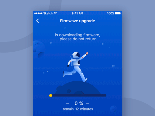
4. Microinteractions
Microinteractions are events created to delight the users – the Facebook ‘like’ button is a good example of a microinteraction.
They perfectly blend into the user interface, which is why sometimes they’re barely noticeable, however, if you eliminated them from your product, something would be missing. Microinteractions add a lot of personality to products, and greatly improve the UX making it easier and more fun to interact with your app or website.
Source: UX Collective
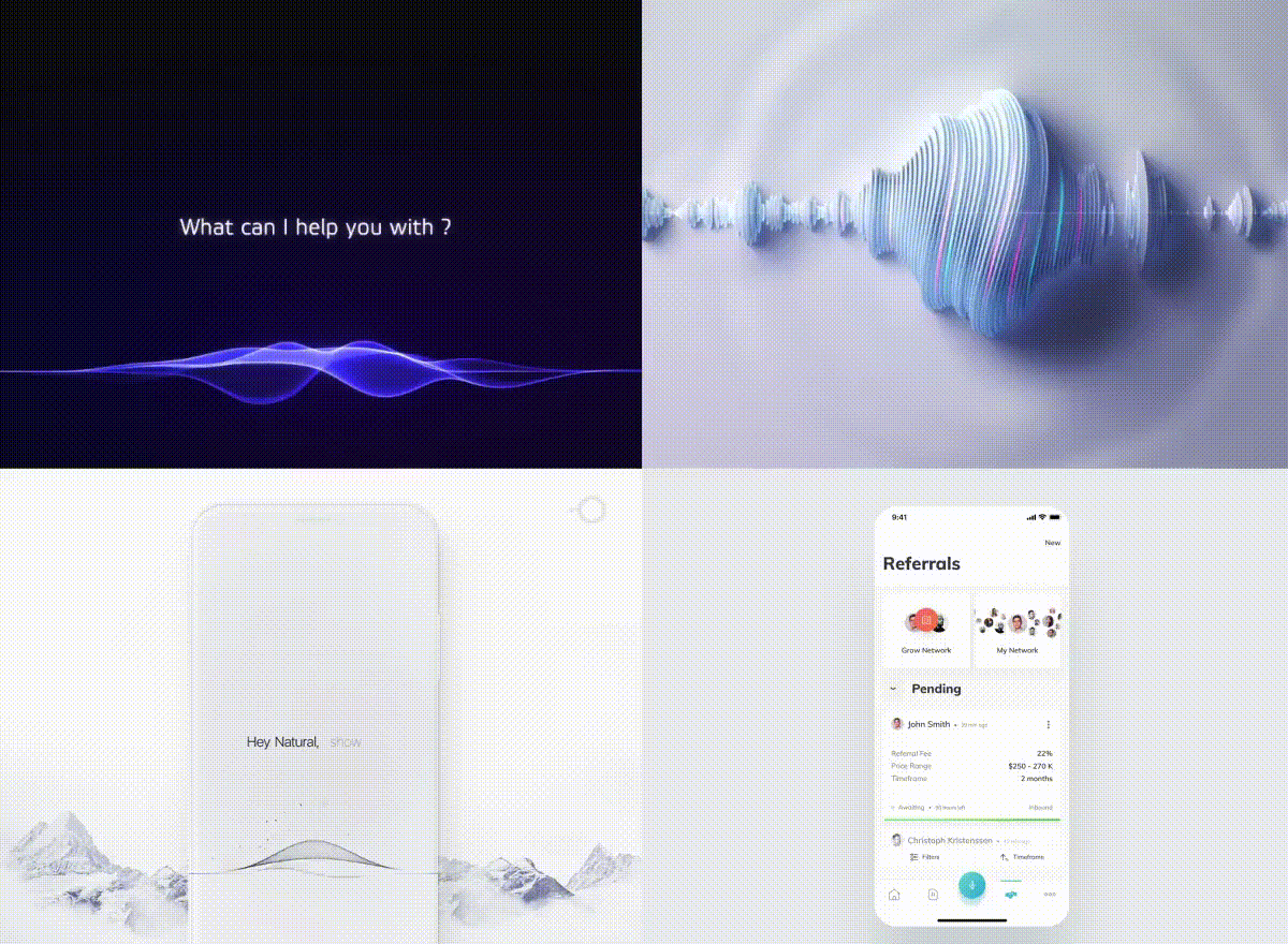
5. Voice-based technology
Voice-based technology is on the rise. According to the Infinite Dial survey, more than 62% of respondents say they use voice-based virtual assistants – mainly on their phone or computer.
This trend is further confirmed by Statista’s research, which indicates that 50% of respondents use a voice-user interface (VUI). Since more tech-savvy consumers are keen on smart devices, the usage of voice-based technology is predicted to grow.
In fact, it’s forecast that by 2023, the number of digital voice assistants will rise to around eight billion units, which is higher than the world’s population.
What’s more, the rise of voice assistants have also positively impacted tech accessibility for the visually impaired. All this indicates that voice-based interfaces are here to stay.
Source: Medium
6. Storytelling
Humans are naturally intrigued by narratives. A narrative makes it easier for brands to captivate people’s attention and get them ‘hooked’ on a product or service. No wonder that it’s becoming an increasingly popular trend not only in marketing, but also UX design.
In simple terms, storytelling in UX comes down to conveying information to users in a comprehensible, informative, and (if possible) entertaining way. This can mean anything from engaging a UX or creative writer in the process to creating a balance between animation, video, and typography.
With the Interaction Design Foundation and Nielsen Norman Group creating more and more resources on the subject, UX storytelling is surely a trend you need to keep an eye on.
7. Internet of Things
Through the rise in IoT solutions, the Internet has paved its way into our lives well beyond computer and mobile screens. With connected devices, such as smartbands, Alexa, or home appliances, more and more UX specialists will need to build experiences for a variety of touchpoints.
This might mean, for instance, that designers will need to develop not just a mobile app for the remote management of a washing machine, but also another app for a low-fi, 128x64 px display built into the appliance.
UX designers need to take note and start thinking beyond flat, high-fidelity screens, and put the omnichannel experience at the forefront.
8. Designing for transparency
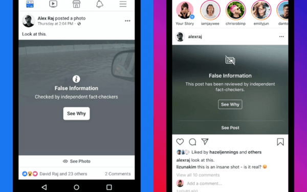
With misinformation and deep fake videos becoming a reality, brands need to design their UX not only for usability. They also need to evoke users’ trust and protect their audience from fake news. While this might seem, at first glance, as the sole responsibility of communication departments, it’s also becoming a concern of UX teams.
Brands like Facebook and YouTube, for instance, have decided to introduce disclaimers on potentially fake information – rather than delete suspicious content altogether:
Source: UXdesign.cc
What’s more, Adobe has recently announced that they would be launching a tool that will help detect manipulated images.
As reported in the “The State of UX in 2020”, designers have a lot of work ahead of them in this area, such as:
designing tools to filter out fake content, making users more aware of the treachery of deep fakes, and stopping the spread of misinformation. But even more importantly, we will be responsible for raising awareness inside of our organizations, establishing principles around truth and reporting how our platforms might be misused by agents with hidden agendas.
Accessibility
As we’re approaching the end of this UX design guide, we thought it might be a good idea to include a few popular UX design terms worth knowing:
Accessibility
Accessibility is a concept, which assesses whether the product can be used by anyone. It was designed with disabled users in mind, however, designers should aim at accommodating all potential users, irrespective of the context.
Designing with accessibility in mind not only helps customers with disabilities but can greatly enhance the overall user experience.
For example, adding video captions not only aids people with hearing difficulties but can also help people watching the video on mute. Designing for all ability levels results in products or services that anyone can use and enjoy.
Here are a few types of accessibility issues that you should be aware of:
- Visual (e.g. color blindness)
- Motor/mobility (e.g. wheelchair-user concerns)
- Auditory (hearing difficulties)
- Seizures (especially photosensitive epilepsy)
- Learning/cognitive (e.g. dyslexia)
Design Thinking
Design Thinking is a very broad term, used to describe the:
“non-linear, iterative process that teams use to understand users, challenge assumptions, redefine problems and create innovative solutions to prototype and test”.
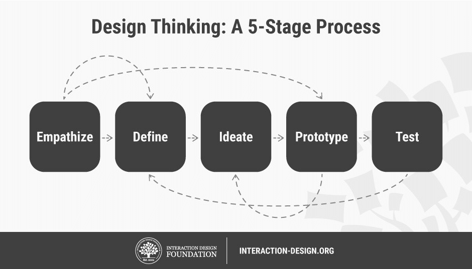
The steps of the Design Thinking Process were first defined by the Hasso Plattner Design School at Stanford, also known as the d.school, and are as follows:
Source: Interaction Design Foundation
1. Empathize – UX professionals start off by researching their users’ expectations and needs.
2. Define – The needs and goals of users are formulated, which allows UX specialists to create user personas.
3. Ideate – UX specialists use their current knowledge on users to generate ideas and turn problems into potential solutions. At this stage, designers often conduct brainstorming sessions and create user flow diagrams to visualize their ideas.
4. Prototype – With the main hypotheses defined, designers proceed to creating low-fidelity prototypes in the form of wireframes. They might also limit themselves to storyboards and post-it walls, anything that will help them convey the idea in a simple and quick manner.
5. Test – Last, but not least, designers share their prototypes, run the concepts by potential users, and gather feedback. Once the feedback is collected, as shown on the diagram above, designers can return to the previous stages, apply the improvements, and eventually – once again – test the designs in the next iteration.
Effective UX design process as the key to creating good user experience
Providing a great user experience is no longer an option but rather a necessity if brands want to retain their customers for longer.
This can only be achieved through user-centric design – and this is what the UX design process is all about. Time after time, companies including Swap, Babbel, and Artemest have proven that building products tailored to customer needs translate into tangible business results. These include improved conversion and ROI, reduced development costs, and enhanced customer loyalty.
However, in order to achieve this, you need a talented UX designer on board, whose skills go beyond wireframing and prototyping. They should be first-class researchers and great collaborators with impeccable communication skills.
It’s crucial to bear in mind that the most successful products focus on accessibility, which not only extends their usage to those with disabilities but also makes them pleasant to use for other user groups.
Agata Rączewska
Agata is an UX Practice Expert & Team Leader with over 15 years of experience in designing and delivering digital products. She currently takes care of the User Research team in Netguru.


-%20copy.jpeg?width=1200&height=630&name=What%20is%20Mobile%20Cloud%20Computing%20(MCC)-%20copy.jpeg)
