Design Systems. What, How, and Why Your Digital Product Needs One

In the world of digital design, this concept rings truer each and every day.
A design system is one thing that developers, designers and CEOs alike can use to increase the speed of the design process and ensure the product is designed in a coherent manner.
But what on earth is a design system?
Well, if you’ve come here seeking an answer to this question, you’re in the right place.
This article will explain what a design system is and how it can be advantageous to a digital product.
You’ll even see how some of the digital realm’s leading brands, like Airbnb, Atlassian, and Shopify are leveraging their design systems to spread brand awareness.
“Design systems are an investment. Many companies don't employ people to focus on design systems until the inefficiencies of not having one become too painful to bear,” said Diana Mounter from GitHub in her fantastic presentation on design systems.
If your digital brand values:
- a well-crafted user-experience,
- a consistent and easy-to-use environment for designers,
- and a robust and versatile problem-solving.
Then a design system is going to be the next thing you should set your sights on.
What is a design system?
Let's define the basic terms first.
Design: The art of creating and arranging imagery, shapes, and colours to create something visually appealing and/or functional.
System: A series of things working together in harmony; a complex whole.
So with these two concepts now clearly defined, are you able to figure out what a design system, in theory, actually is?
A design system consists of two things: the library and the documentation. Together, they define a brand design system with core UX and UI elements, such as visual assets, your logo, typography, colors, grid. A strong UI design system also includes UI components, their documentation, and the code snippets to facilitate developers using them across existing products.
It’s the rules, constraints, and principles implemented in both design and code.
These elements apply to everything – color, typography, spacing, and layout. Interestingly, a design system should also encompass non-visual elements such as the tone of voice, vocabulary, grammar, and audio cues.
All these components are designed separately, but are brought together to create a single source of truth.
It all can be compared to front-end and back-end in design. On one hand, we have all the reusable components (which are visual), and on the other hand, we have the codified counterparts of those elements, and thus they can be used by developers.
Let’s take a look at all this in action.
Within your design system are the standards that creators adhere to when designing, for example, a user’s default icon. The design system doesn’t say how it needs to look (that’s up to the creative mind of your designer), but it indicates the process to be followed in order to create it.
Simply put, a design system consists of your visual (and non-visual) elements and the processes according to which they can be altered.
It’s worth noting that a good visual design system also includes naming conventions, a file structure, and other administrative aspects of working in a digital environment. These principles are key regardless of the end product. A website design system must account for these elements on desktop and mobile sites, while building for mobile apps requires incorporating those principles into the mobile experience.
After all, the sole purpose of a design system is to speed up and simplify the way designers work – this also includes many file management procedures.
Let’s dig a little deeper by taking a step back for a moment.
Style guide vs design system
Let me introduce you to some basic terms, which will be helpful in learning how to build a design system:
- A pattern library is a set of reusable components and interactions. It is a repository of buttons, modals, and page layouts. A pattern library relies on a consistent look and feel. That’s why it is strongly related to the second part of a design system – the style guide.
- A style guide focuses mainly on style (thank you Captain Obvious!), which means that it’s a repository of colors, fonts, logos, and any other brand attributes used in product design. Style guides and pattern libraries are frequently used by designers and marketing specialists.
- A code snippet is a resource used by coders (Captain Obvious strikes again!). It’s essentially a chunk of code representing styles and patterns included in the previous two repositories.
Pattern library, style guide, code snippet – this trifecta of product design makes up a design system.
The main difference between a style guide and design system is the scalability and dynamics of the latter.
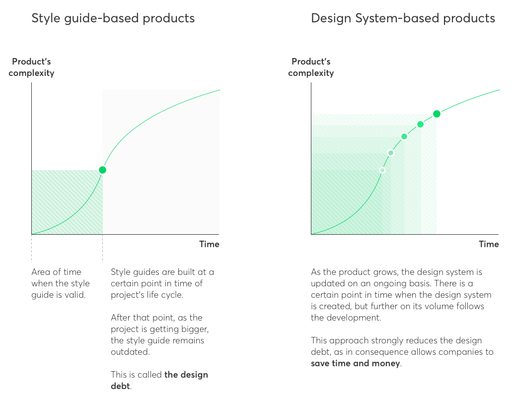
While style guides are static and closed, design systems are dynamic and expandable. As opposed to handing off a style guide at a certain point in time, in design systems, the collaboration between designers and developers is ongoing.
It brings us down to the simple conclusion: design systems support the agile methodology, whereas style guides seem to make for a better match with the waterfall approach. In consequence, design systems allow companies to save a lot of time and money.
Why is user experience so important?
It’s obvious that our world is getting more digitized. We’re using apps for everything. You may even be reading this on your phone, using your favorite browser.
It’s your favorite browser because it is easy to use. You don’t need to read a manual to learn how to use it.
So, in this digital world, the success of your app or software relies heavily on its design, its user interface, and the experience of the user.
Let me explain a little more.
Many businesses are familiar with the correlation between success and design.
If a user has to be shown, explained to, or taught how to do something, there’s a problem with the design.
Good user experience is rooted in good design – and when a user enjoys a good experience, important metrics (like loyalty, retention, time in app, and conversion rates) go through the roof.
It doesn’t take a genius to know that these metrics are the be-all and end-all of a digital product.
So the next question is the most obvious one: how can my digital product be designed in the best way possible?
Let’s look at some examples of successful design systems.
The current state in the industry
The biggest players on the market, like Atlassian, Dropbox, AirBnb, Shopify, and Audi, to name a few, are investing in design systems. It isn’t another buzzword that will come and go. It’s more like a revolutionary approach to design – putting design & development at heart.
The companies above are big, but is a particular size required to start thinking about creating a design system? Having one is valuable regardless of the company’s size. It just comes more inevitably to those who have a wider array of digital products.
From the design in tech report we can learn that 5 out the top 10 companies (as ranked by market capitalization) are either exclusively growing by producing software, or software is an important part of their revenue stream.

Source: UXpin
Over the past 12 months, these companies increased their design headcount by an average of 65%. Moreover, the designer-to-developer ratio improved by 2.5x in 5 years. The demand for designers has never been bigger. However, with the new scale, new problems arise. New methods had to be developed to bridge the gap between design and custom software development. Such a demanding industry requires appropriate tools to keep up the pace with the competition.
Sources:
- 6 major tech companies have doubled their design hiring goals in last half decade
- Design in Tech Report 2017
- Evangelizing a Design System

Best practices
So now we know the what and why, let’s take a look at the who and the how.
As we’ve mentioned already, many digital companies are seeing the benefits of using a design system.
Who are the pioneers in this field that have built commercial design systems for their company and platform?
Commercial Design Systems
Shopify
Shopify is a company that creates a product that their customers spend all day using. One look at their ‘Polaris’ design system and you can see that this ecommerce platform is no stranger to the importance of good design.
Below, you can see in simple terms, the dos and don’ts of the text/colour relationship.
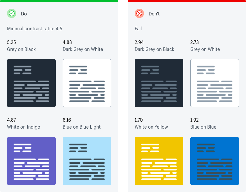
The art of starting an online store is not a single task – more like a series of repetitive tasks that need to constantly be improved as your business grows.
Polaris has been designed with this in mind – not only to make the product as fatigue-free as possible, but also to make it consistent over all touch points.
A built-in onboarding procedure leads the user to their ‘ah-ha’ moment, thus adding even more value.
Shopify drives their growth through their design system.
Atlassian
Atlassian is a company that has a design system that we truly admire.
Comprehensive, advanced, and constantly evolving – it’s something all design systems should aspire to be.
One look at the landing page and you’ll see why we’re in love with the Atlassian design system:
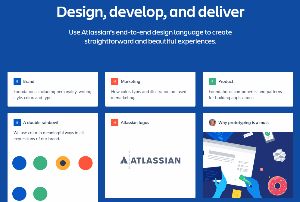
It has resources for branding, marketing, colour usage – if a designer needs a logo, it’s there, as well as the way that the logo can be modified.
As a company that has a wide array of digital products spanning different industries, this design system ensures consistency and simplicity for designers, developers, marketers, and anyone else involved.
IBM
Of all the companies mentioned in this article, IBM is the oldest.
And with age, comes wisdom.
Recently, the company ‘needed to build out the entire foundation for the way IBM would practice design’.
And they did that by building the IBM design language.
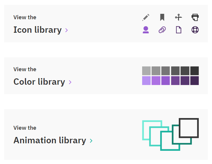
This is just a snapshot of the wealth of resources the IBM have created for their design team.
The benefits? Joni Saylor, the IBM design lead says “we could see these aren’t just updated UIs. The concept, fundamentally, was and is striking a chord with our clients and users.”
A few years later, IBM's design team swore by their design system, with ripple effects coming in in marketing and sales.
IBM’s design system is one of the most in-depth and comprehensive on this list. It’s rivaled only by Google’s design system, Material Design.
Spotify
Spotify, a completely digital product, knows the importance of a design system. As a piece of software that’s used by the same person over multiple devices, the design had to be not only easy, but also consistent.
And a few years ago, that’s exactly what was lacking.
When the design lead Stanley Wood took the helm in 2012, he was “shocked at the lack of consistency in elements across Spotify’s product.”
Over the next 12 months, steps were taken to create Spotify’s design system, G.L.U.E (Global Language for a Unified Experience).
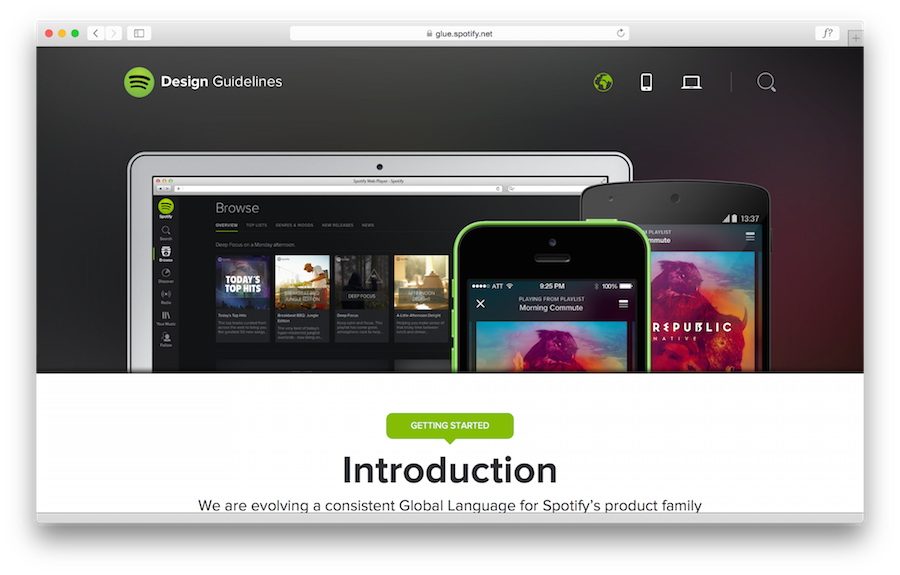
So how has GLUE changed the way Spotify does design?
“Instead of two designers looking at the same thing and unintentionally creating totally different solutions, design systems provide a shared platform to create, collaborate, and build a deliberate outcome.”
Spotify is revolutionary in its concept. Ensuring that design nurtures and compliments this concept is a testament to the brand’s ongoing success.
Salesforce Lightning
Salesforce developed the Lighting Design System for its large diverse set of apps across desktop and mobile platforms.
The company says the Salesforce design system is aimed at focusing on “application logic” instead of pixels, giving designers a better opportunity to focus on user experience review and more.
Airbnb
Anyone that’s used Airbnb to book a holiday is no stranger to how easy it is to use and how visually appealing it is.
Airbnb’s design system works hand in hand with simple product design in order to take the chaos out of booking somewhere to stay.
Below, you can see an example of the clear and concise templates that Airbnb uses in the desktop version.
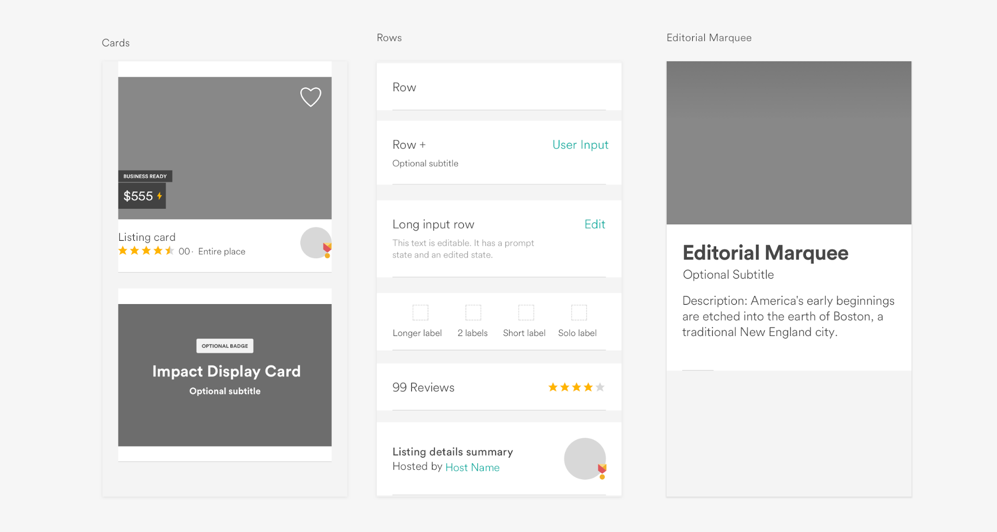
The Airbnb design system is extensive. Below, you can see their constraints for type sizes, colour usage and spacing.
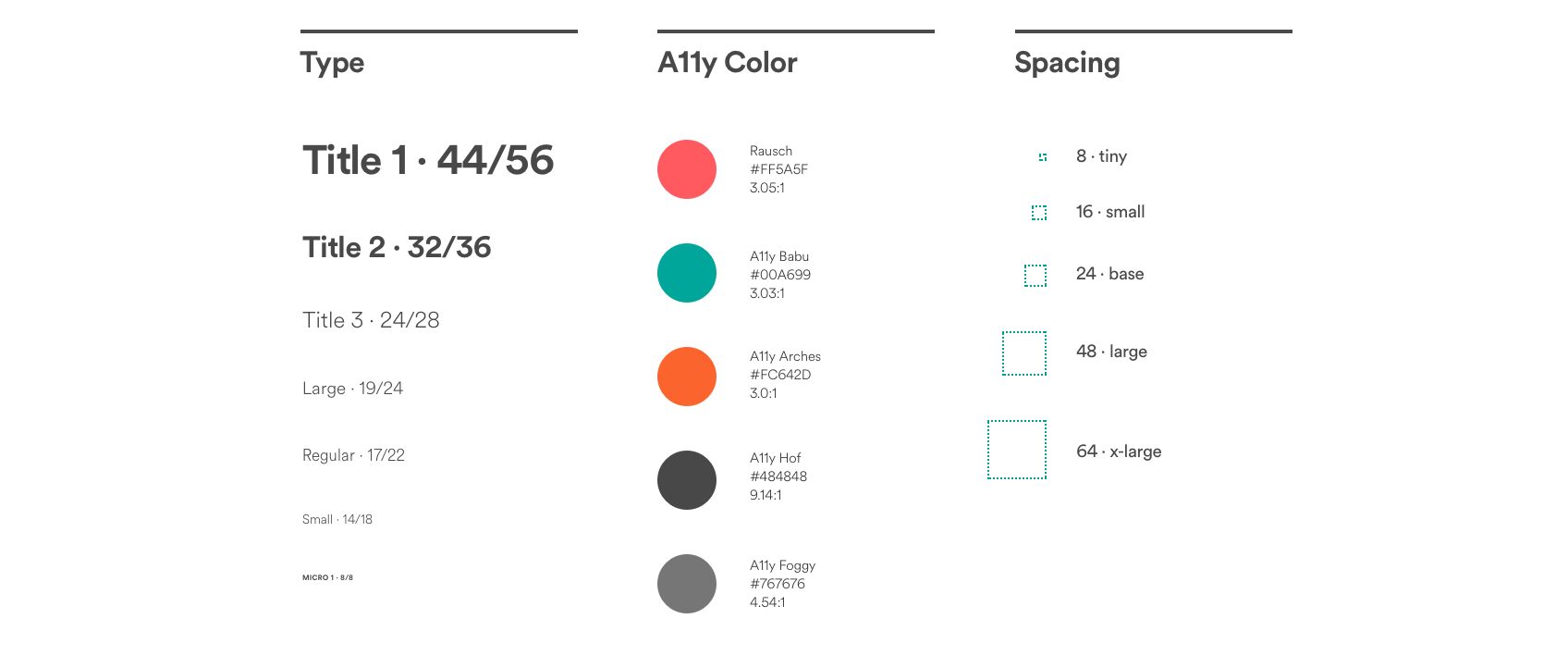
Airbnb has a world-class design system, and you can’t help but feel that it’s part of their HR department’s plan.
By sharing their assets with the general public, and sharing the story of how it came to be, they’re showing to skilled talent that Airbnb is a place where their skill will be put to good use.
A great design system, and perhaps a great recruitment device!
Why design systems mean success
Asking what role a design system plays is important, but you can really see the value of a design system when you ask why.
According to the enterprise UX industry report, one of the greatest challenges is lack of design consistency which leads to expensive design debt.
From the same report, we also learn that collaboration becomes more difficult as developers outnumber designers. It probably sounds familiar to you if your company has not developed a proper solution yet. A well-crafted design system serves as single source of truth and provides the following types of business value:
1 - Consistency across products
Want your brand logos to be echoed through into the default user avatars of your app? Your design system will take care of that. It will outline the process that a designer should take when designing something, and the standards to which they must adhere. The end result is your users having a smooth and consistent experience throughout your product.
2 - Clear guidelines
Regardless of its role in the company, documentation enables comprehension for everyone. If you have ever wondered how to get product managers, designers and engineers on the same page, now you know the secret.
3 - Design systems create a good working environment
Using a design system means that if your wonderful designer’s creative mind goes off into some magic world and forgets the relevant font size, they will know how to find it. Your designers won’t be lost. They will have an up-to-date play book to refer to if something isn’t clear. As a result, this will increase productivity and the happiness of your designer’s creative mind.
4 - More efficient production process
Whether your design team is you and one other person, or a team of 45, ensuring that they’re all on the same page is going to make the process much smoother. It not only helps prevent errors, but shows what to do in the event of an error – be it minor or colossal.
Long story short: Make your design system proactive to avoid having problems, rather than reactive, in which you’d have to fix problems.
Who can build a design system
Now let’s focus on three primary roles that are present when creating a digital product.
We have product managers, designers and developers. Each of them have different requirements and expectations. Let’s take a closer look from three different perspectives.
The finished product is a contribution of entire team
For a product manager, the most important thing is to deliver a working product with all the features that customers want. They hate moving slowly, so the less time is spent on design and development, the better and healthier it is for the business.
From a designer’s standpoint, the wishlist starts from having consistent designs by keeping track of the changes when more than one designer works on the same project. Being able to make some adjustments quickly isn’t less important, though. On the other hand, they hate seeing their designs disrupted by neglectful development. Even small things matter, because the difference between an excellent and a very good product lies in the details. As the product team gets bigger, the contributions generate inconsistencies. Centralized design version control might be a remedy.
Finally, developers expect to get thoroughly documented designs, ideally with no further changes. They don’t want to guess what the designer’s intention was. They hate moving pixels back and forth. They want to work with mockups smoothly. However, oftentimes it’s more like a struggle than a pleasant process.
Does it sound familiar to you? There’s no silver bullet for every problem a product team can face, though. However, based on our experience, knowledge, and our clients’ successes, having a design system is worth the initial investment. A design system is supposed to address those pains and reduce the friction in the process.
Think about your product and company for a while with the following questions in mind:
- Do you agree that your product’s user interface is consistent? Does it share the same design basics and patterns?
- Are you happy with the overall pace of your product’s development?
- How much time and money could you save by cutting down the time needed for design and development?
- How much time and money could you save by reducing the time needed for cleaning up the design and technical debt?
Having doubts? Let’s talk about your case!
How to create design system?
It takes only 5 steps to get started:
- Do an audit – check all the designs that you’ve made so far and try to extract basic repetitive elements.
- Organize the elements that you’ve extracted – build all three repositories we’ve mentioned earlier and create subcategories in every repository to make everything searchable and easy to use.
- Put all elements in one place, make them easy to access for everybody engaged in the product design process – every designer, coder, and marketing specialist involved in the process needs to have equally streamlined access to all parts of the design system to work effectively.
- Sell the design system to everybody in the organization – internal communication is vital to making good use of the system. If nobody knows that it exists and how it can be used, they simply won’t.
- Always update your repositories – evaluate your stash every once in a while and make sure that if any new elements appear they are included in your repositories
So why do you need a design system?
By now, you should have a good idea of what a design system is and how it can be of benefit to your business:
- A single-source of truth for designers and devs, enabling more control over multiple versions and scaling design,
- A well-planned design system help solve common problems that designers face your product team will be able to jump into a new project more easily,
- Your design system will work toward creating the best possible user experience.
Furthermore, seeing how some of the biggest digital brands leverage their design system should have you feeling motivated and inspired to create your own.
Whether you’re a seasoned veteran, who’s designed a few graphic design systems already, or you’re fresh to the idea, it’s worth noting that there’s no such thing as a bulletproof design system.
As many digital products constantly grow and change, so should your branding, message, and ultimately your design system.
What’s the best way to get started building your design system, though?
Well before creating, it’s worth it to take stock of your current position. Conducting a UI/UX audit can show you what’s working and what’s not. This ensures that any major inconsistencies in your current processes are revealed, and can continue using what works.
What are some of the best design systems you’ve seen? Any tips for creating and developing one yourself?


